Overall Style and Aesthetic
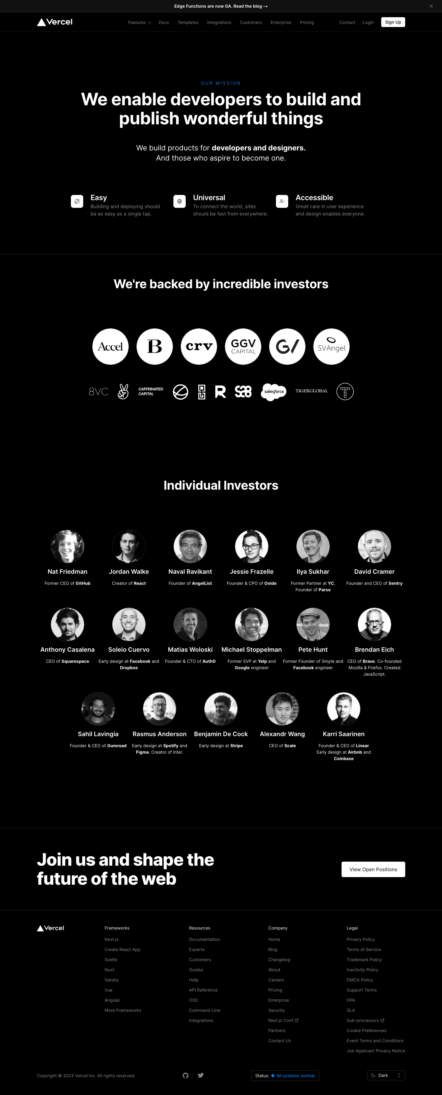
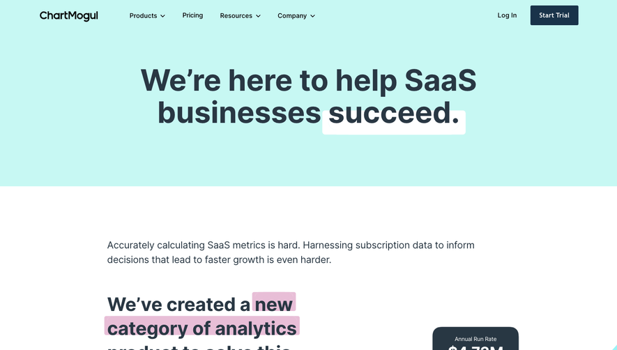
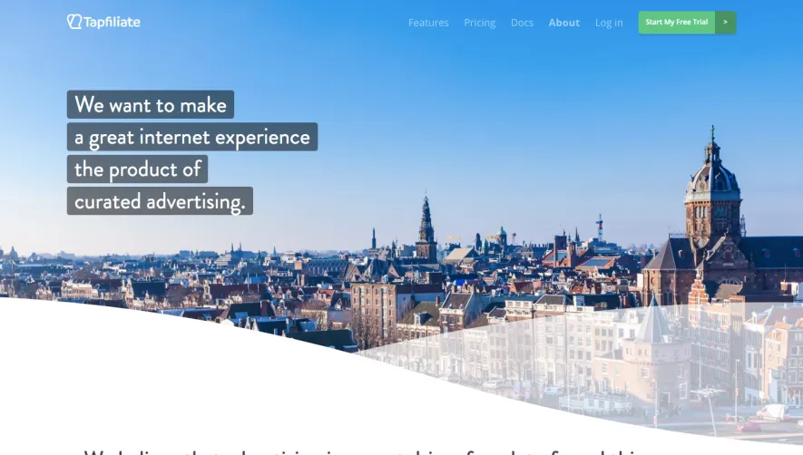
Vercel’s About page embodies a distinctly minimalist and modern aesthetic, radiating confidence through restraint. The interface is crisp and uncluttered, leveraging abundant white space to showcase content while subtle gradients and glassmorphism overlays inject a sense of depth and futuristic energy. The look is professional yet energetic, striking a balance that feels both trustworthy and innovative. Layout and Structure
The page flows intuitively from a bold hero section—featuring a concise value proposition and signature Vercel animation—into an engaging, story-driven introduction. Clean, alternating content sections blend impactful copy with employee spotlights, brand visuals, and clear calls to action. Essential company stats, a globally-dispersed team showcase, and a comprehensive yet unobtrusive footer offer a thorough yet digestible narrative arc. Visual Elements
Dynamic animations and geometric abstractions animate the brand without detracting from readability. Profile photography feels authentic and approachable, while intricate map graphics illustrate global reach. Playful, lo-fi spot illustrations punctuate the text, delivering human warmth and visual interest. Videos and interactive states further enliven the experience, fostering engagement. Color Palette and Typography
The palette juxtaposes deep blacks and luminous whites with pops of Vercel’s signature gradient hues—cool blues, violets, and cyans—creating vibrant yet balanced contrasts. Stark, elegant sans-serif typography (Inter) underscores clarity and hierarchy, while varying font weights and sizes direct attention seamlessly between headlines, body text, and CTAs. User Experience Patterns
A sticky navigation bar ensures easy exploration, with smooth scroll effects and crisp hover states providing delightful micro-interactions. CTAs are visually prominent but never overbearing. The entire experience feels curated yet fluid, reducing friction and guiding users organically through the Vercel story. Unique or Notable Design Choices
Noteworthy touches include subtle ambient animations, a globally oriented about section with real team imagery, and inventive use of gradients to create visual cohesion. The tone is undeniably contemporary—Vercel’s page communicates credibility and innovation through both voice and interaction, providing a stellar SaaS design blueprint.