Overall Style and Aesthetic
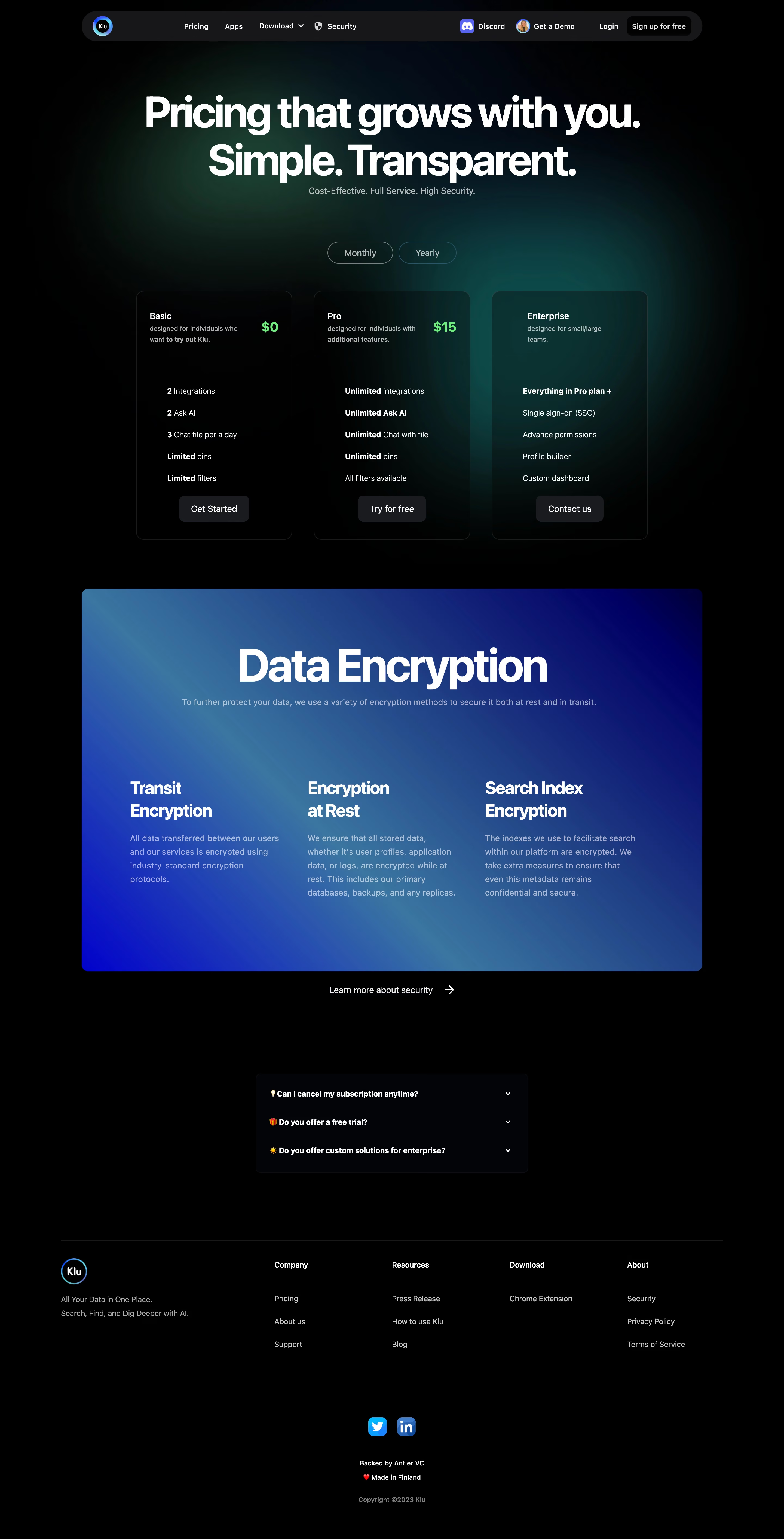
Klu’s pricing page radiates a crisp, modern minimalism with subtle playful touches. The clean white canvas is punctuated by bursts of lively accent colors and sleek iconography, striking an inviting balance between professional assurance and approachable warmth. Spacing is generous, with plenty of breathing room around each content block—amplifying a sense of order and calm clarity. Layout and Structure
The page’s structure is intuitively linear. Visitors are immediately greeted by a succinct hero section: a reassuring headline, subtext, and prominent call-to-action. The main event—a clear, table-styled pricing module—sits front-and-center, comparing plans with visual emphasis on the recommended tier. Supporting sections follow, presenting a succinct feature comparison, concise FAQ, and a trust-building footer. Plan details expand on hover or click, reducing cognitive load while offering quick access to deeper info. Visual Elements
Vivid icons and soft shadowing infuse energy and guide the eye. Animated accent graphics add subtle, delightful movement, highlighting interaction points or underscoring value props without distraction. Plan cards subtly “lift” on hover, reinforcing interactivity and inviting further exploration. Color Palette and Typography
The design features a bright, optimistic palette—clean whites, deep navy for headings, and gradient purples and blues for highlights. Sans-serif headlines are bold and friendly, while body text is lighter and ultra-legible, establishing clear visual hierarchy and effortless readability throughout. User Experience Patterns
Sticky navigation ensures effortless access to key sections. Primary CTAs are consistent and visually distinguishable. Forms are pared down with helpful microcopy, and pricing toggles animate smoothly between annual/monthly views. Comparison checkmarks and feature breakdowns support quick, confident decision-making. Unique or Notable Design Choices
Klu stands out with its gentle animated indicators, the visually prioritized “Best Value” plan, and micro interactions on toggle switches. The page maintains a genuinely trustworthy and energetic tone, driven by strategic color use, concise copy, and intuitive interface cues—making it a potent source of inspiration for SaaS teams seeking a user-first, design-forward approach.