Design with AI
Generate a new design based on this screen using your own content.
# Design from Reference: June Landing Page
Create an original, high-fidelity visual design inspired by the reference. Prioritize composition, typography, colors, spacing, and component styling over technical implementation.
## Reference
- **Product:** June
- **Category:** Landing Page
- **Screenshot:** https://cdn.prod.website-files.com/5e9dc792e1210c5325f7ebbc/6acb726ab10d21a746c47bf0_6acb6f10516caa34e8062db9_cms-a8ed57db9e45a3d41421a5f1.webp
Analyze the screenshot first. If inaccessible, request it rather than guessing.
## Content
{{content.instructions}}
{{content.data}}
Preserve essential messaging and factual accuracy. Adapt structure and copy length for visual balance; never invent product claims.
## Visual Design
### Overall aesthetic
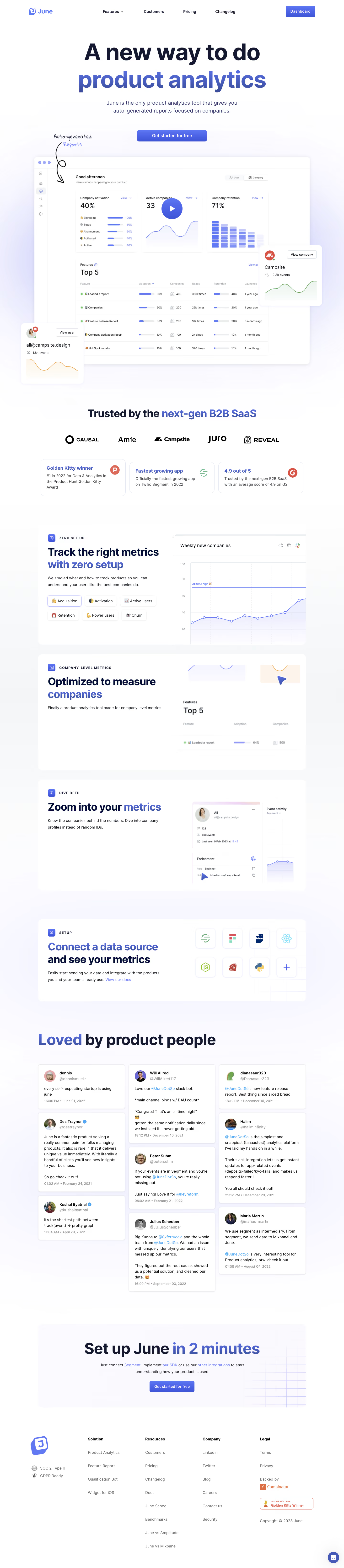
- **Character:** Polished analytics marketing page with oversized navy type, blue-violet gradients and luminous product screenshots.
### Page composition
- **Capture:** 1440 × 6563 screenshot pixels; estimated CSS scale approximately 1×.
- **Structure:** Centered hero/action, large dashboard demo with floating profile cards, customer logos/award trio, four split feature panels, testimonial masonry, closing CTA and multi-column footer.
### Information hierarchy
- **Priority:** Two-line hero highlights product analytics in gradient lettering. Product evidence leads into feature explanations, integration logos and social proof.
### Typography
- **Family:** Heavy sans-serif display headings and regular sans-serif body; exact families unverified.
- **Estimated CSS sizes:** Hero 88–96px, section titles 48–60px, feature titles 40–44px, body 16–18px and eyebrow labels 12px with tracking.
### Colors & surfaces
- **Measured surfaces:** White #FFFFFF with lavender-white variations #FEFEFF, #FCFCFF, #FBFBFF, #F9F9FF and #FAFAFF.
- **Accents:** Dark navy headings, blue-violet gradient words/buttons, pale lavender glows and subtle gray card outlines.
### Components
- **Elements:** Rounded dashboard frame and play button, handwritten arrow annotation, floating chart cards, metric tabs, integration tiles, tweet-style testimonials and fine-grid CTA background.
- **Estimated geometry:** Content approximately 1120px wide, feature radii 20px, 48px CTA buttons and 40px panel padding.
### Visual rhythm
- **Spacing:** Large hero/demo footprint gives way to repeated split feature cards; three-column testimonials add density before a spacious final action.
### Responsive
- **Suggested adaptation:** Reduce hero to 44–52px, stack split panels, simplify floating overlays and collapse testimonial columns. Mobile composition is not shown.
### Adaptation guidance
- **Transfer:** Preserve the navy/gradient hierarchy and screenshot-led proof. Replace metrics, awards and testimonials with verified material.
Use this context to reproduce the reference's visual language: layout, typography, colors, spacing, borders, radii, and distinctive elements. The screenshot takes priority if descriptions conflict.
## Direction
{{preferences.fidelityInstructions}}
## Output
{{output.instructions}}
Deliver a polished, cohesive design with precise alignment, hierarchy, and spacing. Produce the requested visual artifact, not just a description. If unsupported, explain the limitation.