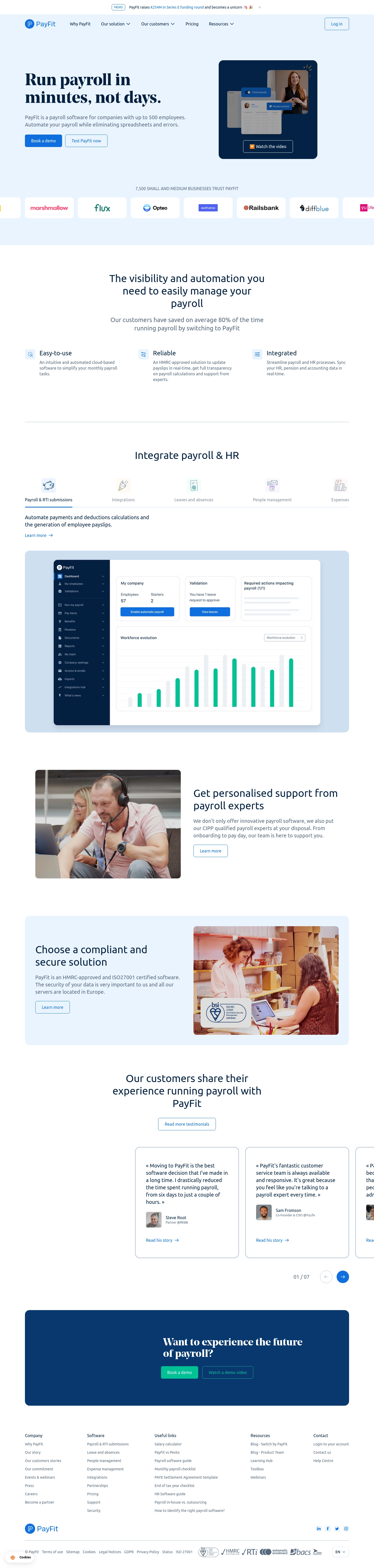
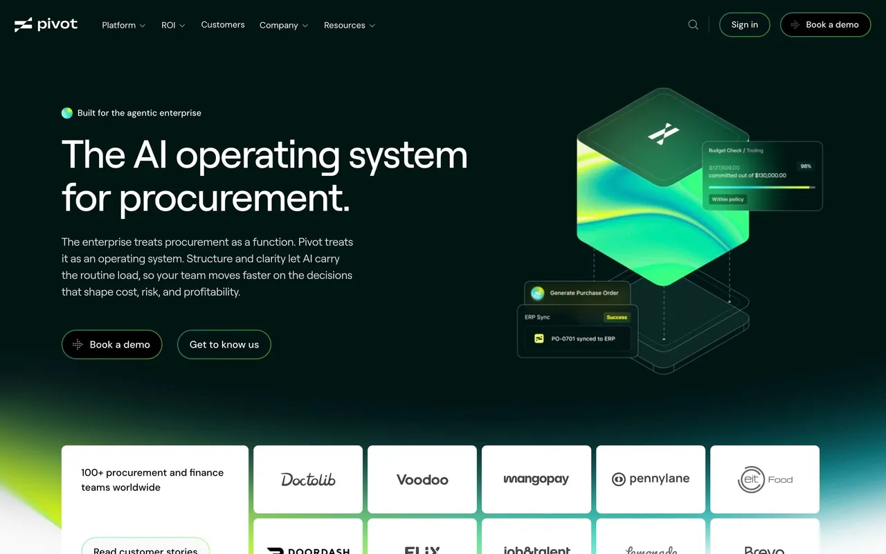
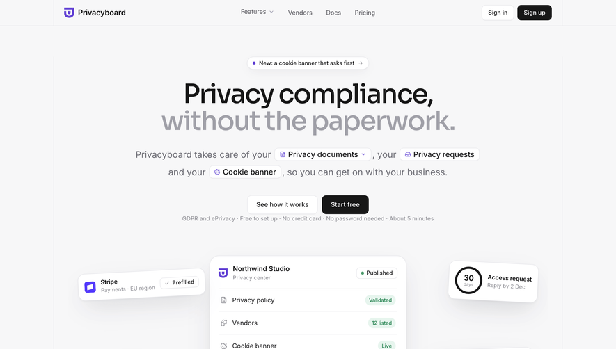
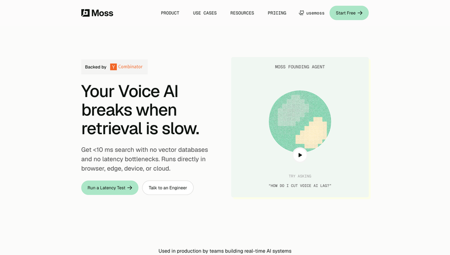
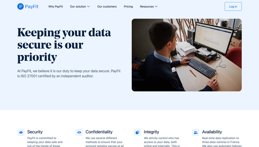
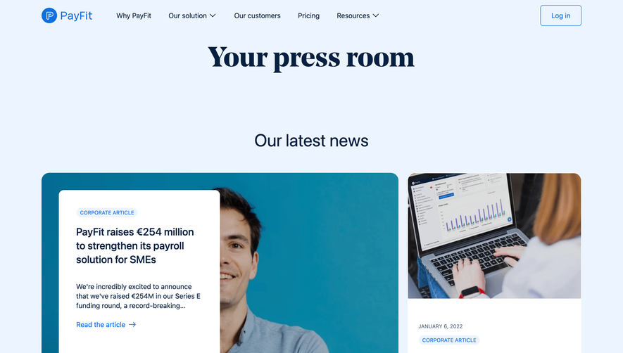
The headline "Run payroll in minutes, not days" hits hard. Big, bold serif type paired with a simple product screenshot and a video thumbnail. Two CTAs sit side by side without competing. The trust bar of logos underneath does its job quietly. Nothing fancy, just confidence.
Smart use of whitespace and structure
PayFit keeps things breathing. The three-column feature section with icons is simple but effective. Below that, the tabbed "Integrate payroll & HR" section is a standout. It shows a full product UI screenshot which builds credibility fast. You actually see the software, not just abstract illustrations. That's a bold move and it works.
Warm photography breaks the SaaS mold
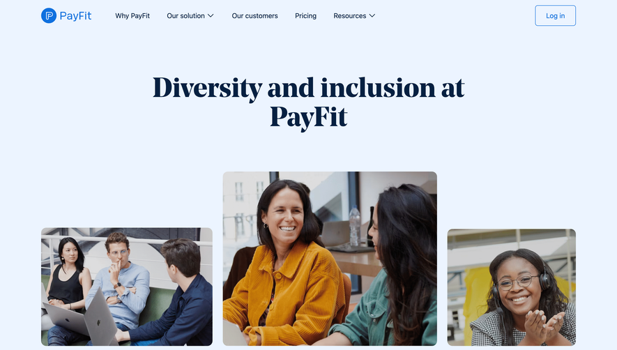
The support section uses real-looking photos of people working together. It feels human, not stock-y. The testimonial carousel at the bottom pairs quotes with headshots and keeps it personal. Color palette stays tight with deep navy, white, and that signature blue accent.
What makes it distinct
The mix of serif and sans-serif typography gives it personality without being messy. That final CTA block with the dark background creates solid visual closure.
 SaaSFrame