Design with AI
Generate a new design based on this screen using your own content.
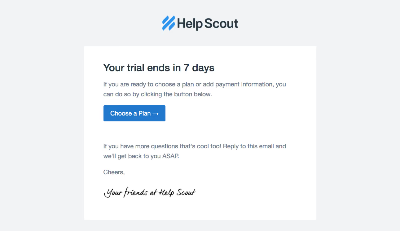
# Design from Reference: Help Scout Free Trial Emails
Create an original, high-fidelity visual design inspired by the reference. Prioritize composition, typography, colors, spacing, and component styling over technical implementation.
## Reference
- **Product:** Help Scout
- **Category:** Free Trial Emails
- **Screenshot:** https://cdn.prod.website-files.com/5e9dc792e1210c5325f7ebbc/6acbcb6d8313d4c6c0cc77d1_6acbc90998e00e46ca120130_cms-f96cce1d0a19b8d471c7a71b.webp
Analyze the screenshot first. If inaccessible, request it rather than guessing.
## Content
{{content.instructions}}
{{content.data}}
Preserve essential messaging and factual accuracy. Adapt structure and copy length for visual balance; never invent product claims.
## Visual Design
### Overall aesthetic
- **Style:** A concise trial-reminder email on a pale blue-gray canvas, with a white message sheet, blue primary action, and handwritten sign-off.
- **Character:** Friendly and direct, using a simple text-led composition without promotional imagery or multiple competing actions.
### Page composition
- **Capture and scale:** The screenshot measures 1291 × 746 pixels. Sizes below are approximate screenshot pixels; CSS scale is unverified.
- **Frame:** The Help Scout logo is centered above a roughly 750 px-wide white rectangular sheet. The message body uses about 60 px side padding.
- **Sequence:** A left-aligned trial-expiry heading leads into two lines of explanatory copy and a blue Choose a Plan button. A larger vertical gap separates the action from a reply invitation, short closing, and handwritten brand signature.
### Information hierarchy
- **Primary message:** The trial deadline is the strongest text element.
- **Action:** The blue plan-selection button is the only prominent control and follows the explanatory sentence directly.
- **Human close:** The reply invitation and script signature soften the billing reminder without creating another strong visual action.
### Typography
- **Family:** Body and heading use a clean sans serif resembling a common email-safe family; exact identity is unverified.
- **Heading:** Approximately 32 px, weight 600–700, with compact 38 px line-height.
- **Body:** Approximately 20 px with 30–32 px line-height, in muted blue-gray. The button label is about 20 px, white, with a trailing right arrow.
- **Signature:** A black handwritten script graphic contrasts with the otherwise plain typography; do not treat it as the interface body font.
### Colors & surfaces
- **Foundation:** Sampled sRGB #F1F3F5 defines the outer canvas; #FFFFFF defines the email sheet.
- **Primary action:** Sampled blue #2178CC fills the button. Brighter sampled #2E93EE appears in the logo mark.
- **Ink:** Sampled blue-gray #73808E supports body copy; darker #2A3B47 and #243642 support headings and brand text.
### Components
- **Message sheet:** A flat white rectangle with square corners and no conspicuous border or shadow.
- **Button:** Approximately 200 × 52 px, with a small 3–4 px radius and balanced horizontal padding. The arrow remains inline with the label.
- **Brand lockup:** A centered blue symbol and dark wordmark sit outside the sheet, separated from it by around 45–50 px.
- **Closing:** The signature is a small horizontal script graphic, left aligned with the prose. No footer navigation or secondary button is visible.
### Visual rhythm
- **Spacing:** Use approximately 24 px between heading and body, 24 px before the button, and roughly 65–75 px before the reply paragraph.
- **Alignment:** Keep headline, paragraphs, button, closing, and signature on a single left edge. The logo alone is centered.
- **Breathing room:** Generous inner padding and outer margins maintain a calm message despite the time-sensitive subject.
### Responsive
- **Observed state:** Only the captured email layout is visible.
- **Recommended email reflow:** Use a fluid white sheet with a maximum width, reduce inner padding to 24 px on small screens, and allow the heading and body to wrap naturally.
- **Accessibility:** Keep the action as readable live text and supply useful alternative text for the logo/signature images.
### Adaptation guidance
- **Preserve:** Retain the centered brand, simple white sheet, deadline-first hierarchy, single blue action, and personal reply invitation.
- **Adapt:** Use the recipient's real trial status and appropriate billing destination. Match the tone to the new brand without copying the handwritten identity.
- **Avoid:** Do not imply a deadline, plan availability, or response commitment that has not been supplied.
Use this context to reproduce the reference's visual language: layout, typography, colors, spacing, borders, radii, and distinctive elements. The screenshot takes priority if descriptions conflict.
## Direction
{{preferences.fidelityInstructions}}
## Output
{{output.instructions}}
Deliver a polished, cohesive design with precise alignment, hierarchy, and spacing. Produce the requested visual artifact, not just a description. If unsupported, explain the limitation.