
Thank you! Your submission has been received!
Oops! Something went wrong while submitting the form.
Get SaaSFrame Pro
Monthly
$18
Quarterly
$48
Yearly
$180
Upgrade to access this feature
Browse all screens & flows
Filter and search screens & flows
Access Figma files
Access mobile versions
Bookmark screens & flows
Join now
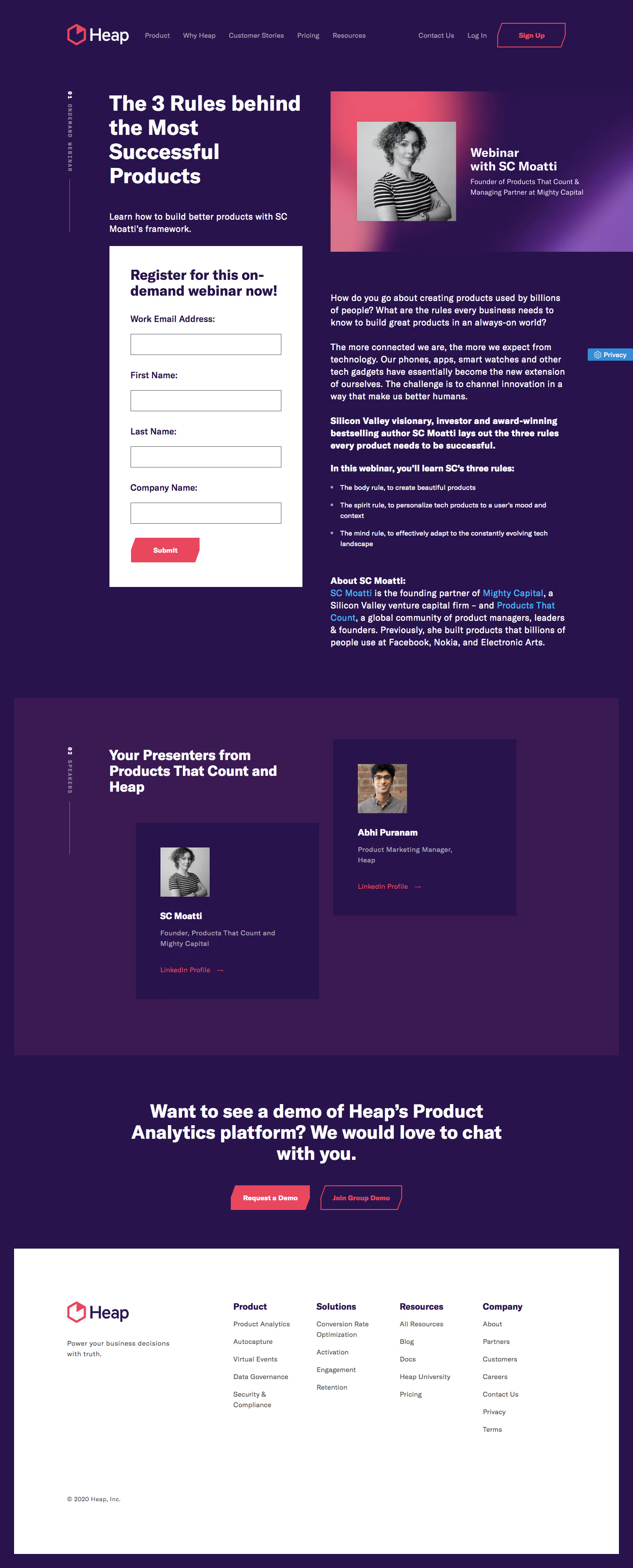
Heap Webinars

Heap
The New Standard in Product Analytics
Designed by
No items found.

Bookmark
Bookmark

Design with AI
Thank you! Your submission has been received!
Oops! Something went wrong while submitting the form.
# Design from Reference: Heap Webinars
Create an original, high-fidelity visual design inspired by the reference. Prioritize composition, typography, colors, spacing, and component styling over technical implementation.
## Reference
- **Product:** Heap
- **Category:** Webinars Page
- **Screenshot:** https://cdn.prod.website-files.com/5e9dc792e1210c5325f7ebbc/6acbc7547369a31d47fc6dd3_6acbc5d180dd38e7e7576719_cms-60a865afcb42fdd2cdcf7dcd.webp
Analyze the screenshot first. If inaccessible, request it rather than guessing.
## Content
{{content.instructions}}
{{content.data}}
Preserve essential messaging and factual accuracy. Adapt structure and copy length for visual balance; never invent product claims.
## Visual Design
### Overall aesthetic
- **Character:** Bold webinar-registration landing page with deep purple backgrounds, white heavy typography, coral angular controls and speaker photography.
- **Evidence and scale:** Screenshot is 1440 × 3569 image pixels. Sizes estimate 1× CSS capture; actual DPR and font family remain unverified.
### Page composition
- **Header:** Wide horizontal navigation places brand left and contact/login/signup actions right, all on deep purple.
- **Main split:** A left column around 440px contains the large webinar title, short subtitle and white registration form. A right column around 560px contains a gradient speaker banner and long event description with bullets and biography.
- **Section marker:** A narrow vertical on-demand label and coral rule sit to the far left of the content.
- **Speakers:** A slightly lighter purple region contains a bold introductory heading and two staggered dark-purple speaker cards, each with portrait, name, role and profile link.
- **Conversion/footer:** Centered demo invitation and two angular buttons precede a large inset white footer with brand description, four link groups and copyright.
### Information hierarchy
- **Hero priority:** The multi-line title is the largest text, followed by speaker banner identity and the white registration panel.
- **Form emphasis:** Registration heading, four field labels and coral Submit button create a clear task sequence.
- **Editorial structure:** White paragraphs, bold introduction fragments, a three-item list and biography heading structure the right-hand copy.
- **Secondary conversion:** Demo actions appear after speaker proof, separate from the webinar registration.
### Typography
- **Hero:** Approximately 48px CSS bold sans-serif with 55px leading, broken into four compact lines.
- **Section headings:** Form/speaker headings around 30–34px bold; demo invitation around 40–42px, centered.
- **Body:** Approximately 20px in the main explanatory copy, with 28px leading. Bullet details and footer links reduce toward 15–16px.
- **Labels:** Field labels are around 20px bold; navigation around 15px medium. Exact family and computed weight remain unverified.
### Colors & surfaces
- **Measured grounds:** Deep purple #29134D dominates; #3B1952 forms the broad speaker-section surface.
- **Measured action:** Coral-pink #E9475E appears in brand and action treatments.
- **Measured contrast:** White #FFFFFF fills the form/footer and primary text. Muted lavender supports navigation and role descriptions.
- **Banner treatment:** Speaker art uses a coral-to-purple gradient behind a monochrome portrait; blue inline links provide local emphasis in biography copy.
### Components
- **Registration panel:** Approximately 440px CSS wide, square corners, white fill and about 48px padding. Four vertically stacked fields collect email, first/last name and company.
- **Inputs:** Approximately 342 × 48px CSS, thin gray border, white fill and almost square corners; labels sit well above each field.
- **Angular actions:** Coral filled Submit and demo buttons have clipped/slanted edges rather than rounded pills. Outlined variants retain coral borders/text.
- **Speaker banner:** Wide rectangular image pairs a monochrome portrait with white speaker identity on gradient purple/coral ground.
- **Speaker cards:** Dark-purple rectangles around 418px wide with approximately 56px padding, small square portraits, bold names, muted roles and coral profile links.
- **Footer:** Large white rectangular inset with substantial padding and five total columns including the brand region. A small blue Privacy utility appears along the right page edge.
### Visual rhythm
- **Columns:** Main content begins around x248px, with a roughly 64px gap between form and event-description columns.
- **Vertical cadence:** Tight hero text leads into a long form, while the adjacent text continues at its own rhythm; broad breaks separate event, speakers and demo regions.
- **Staggering:** Speaker cards are offset vertically, adding visual movement within a regular two-column framework.
- **Contrast rhythm:** Purple page, white form, lighter-purple speaker band and white footer create distinct structural phases.
### Responsive
- **Observed limit:** Only desktop is shown; form validation, submission, privacy interaction and mobile layout are unobserved.
- **Recommended stacking:** Place event summary and registration in a clear linear order, then speaker content; remove decorative vertical labels if they crowd the viewport.
- **Recommended controls:** Make fields fluid, preserve generous label spacing and allow demo buttons to stack.
- **Recommended type/footer:** Scale large headings down moderately, keep body copy readable and collapse footer columns without shrinking links.
### Adaptation guidance
- **Preserve the identity:** Use deep purple, coral clipped-corner actions and bold white typography, with portrait-led speaker proof.
- **Clarify conversion:** Keep webinar registration distinct from later product-demo actions.
- **Implementation:** Use real form labels, accessible validation, visible focus and descriptive portraits. Webinar claims, dates and speaker affiliations belong to the captured page and require separate verification before reuse.
Use this context to reproduce the reference's visual language: layout, typography, colors, spacing, borders, radii, and distinctive elements. The screenshot takes priority if descriptions conflict.
## Direction
{{preferences.fidelityInstructions}}
## Output
{{output.instructions}}
Deliver a polished, cohesive design with precise alignment, hierarchy, and spacing. Produce the requested visual artifact, not just a description. If unsupported, explain the limitation.


Category
Patterns
No items found.
Tech Stack



Added on
February 4, 2023
Similar screens
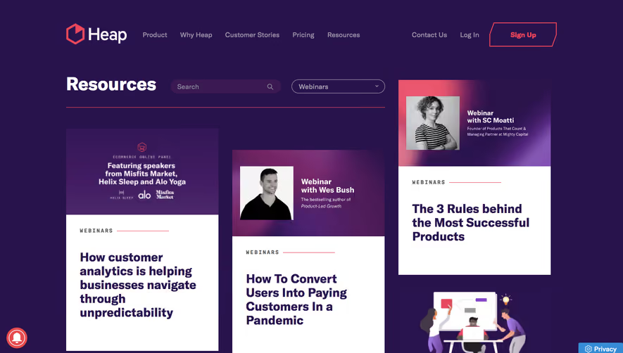



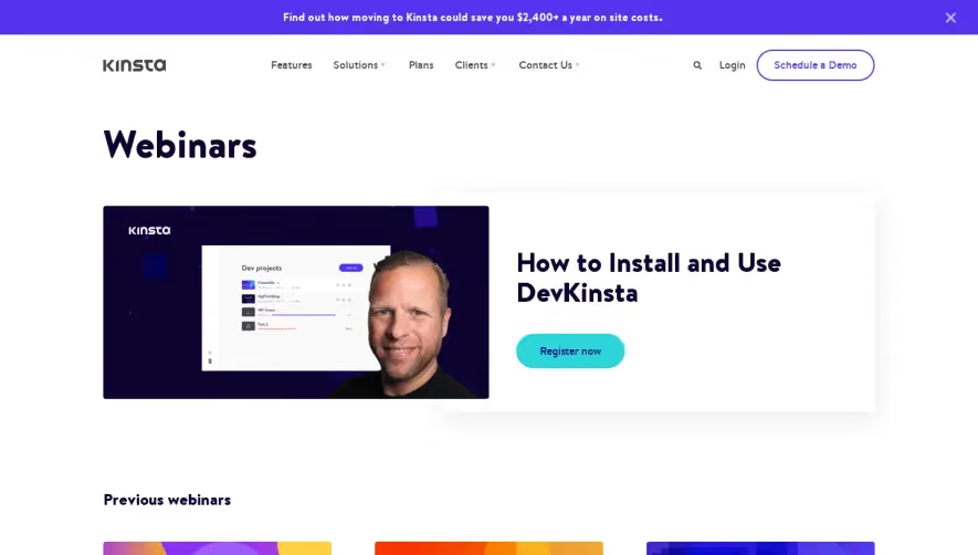

Upgrade to SaaSFrame Pro now to see similar examples.
Monthly
$18 /month
Billed $18 monthly
Browse all screens & flows
Filter and search screens & flows
Search text in screenshots
Access Figma files
Access mobile versions
Join now
Quarterly
$16 /month
Billed $48 quarterly
Browse all screens & flows
Filter and search screens & flows
Search text in screenshots
Access Figma files
Access mobile versions
Join now
Yearly
$15 /month
Billed $180 yearly
Browse all screens & flows
Filter and search screens & flows
Search text in screenshots
Access Figma files
Access mobile versions
Join now