Prompt 1,497 words Copy
# Design from Reference: Kinsta Webinars Page

Create an original, high-fidelity visual design inspired by the reference. Prioritize composition, typography, colors, spacing, and component styling over technical implementation.

## Reference

- **Product:** Kinsta
- **Category:** Webinars Page
- **Screenshot:** attached to this message (also available at https://media.saasframe.io/o/0046b26f08c2eb5107d4.webp)
- **Source:** https://kinsta.com/webinars/

Analyze the attached screenshot first. If no image is attached, open the screenshot link; if neither is accessible, ask for it rather than guessing.

## Visual Design Context

### Overall aesthetic
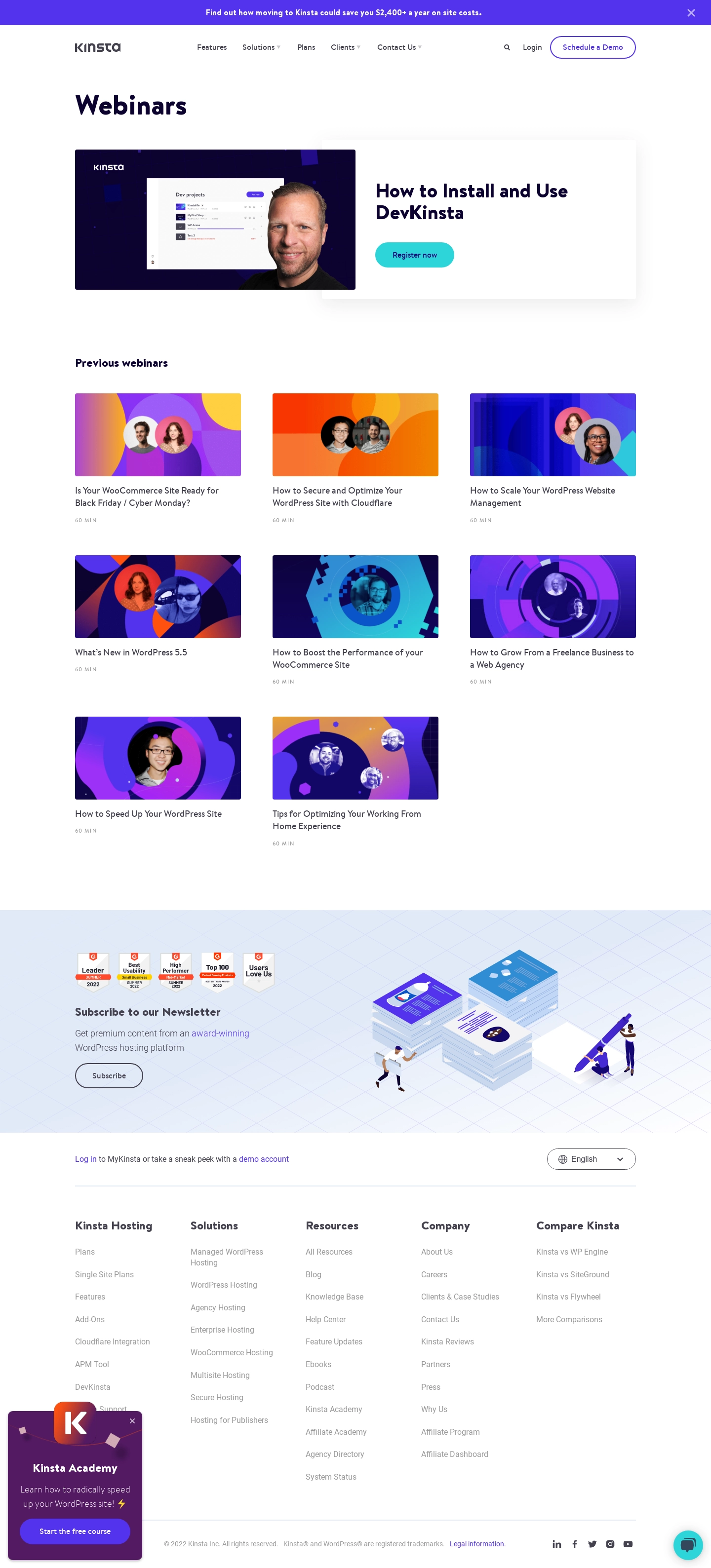
- **Character:** A clean webinar archive pairs dark purple headings, white space, colorful geometric thumbnails, and pill-shaped actions.
- **Brand expression:** Purple is the dominant accent, while cyan highlights the featured registration action. Speaker portraits sit within vivid abstract artwork.
- **Observed scale:** The source measures 1440 × 3177 pixels. Approximate dimensions below refer to image pixels; CSS estimates assume an unverified 1× capture.

### Page composition
- **Announcement strip:** A full-width purple bar at the top contains centered white promotional text and a close symbol at right.
- **Header:** Kinsta branding sits left, navigation spans the middle, and search, Login, and an outlined Schedule a Demo pill align right.
- **Page heading:** Webinars appears as a large dark title within a centered content container roughly 1135 pixels wide.
- **Featured event:** A broad horizontal module pairs a large landscape thumbnail at left with a bold two-line title and cyan Register now button at right.
- **Archive grid:** Previous webinars introduces eight entries in three columns: two complete rows and a final two-card row. Each entry has a thumbnail, title, and small duration label.
- **Newsletter band:** A full-width pale blue geometric-grid section pairs rating badges, newsletter heading/copy, and Subscribe action at left with an isometric publishing illustration at right.
- **Footer:** A login/demo-account row and language selector sit above five link columns, followed by legal text and social icons.
- **Overlays:** A purple academy promotion overlaps the lower-left footer area; a cyan chat launcher sits near the lower-right edge.

### Information hierarchy
- **Archive identity:** The large page title establishes the content type before the featured event.
- **Featured priority:** The larger thumbnail, bold title, and colored registration button distinguish the highlighted session from the archive.
- **Archive scan:** Titles beneath images are the main textual cue; small uppercase duration labels are secondary.
- **Newsletter conversion:** Rating badges and a separate illustrated band introduce a subscription action after browsing.
- **Secondary promotion:** The academy popup adds another CTA and close control, visually independent from the webinar content.
- **Historical scope:** Event topics, duration labels, promotional savings, badges, and offers are captured historical content, not verified current schedules or claims.

### Typography
- **Typeface appearance:** Headings use a rounded, slightly distinctive sans-serif with strong bold weights. Exact font family is unverified.
- **Page title:** Approximately 52–56 pixels, bold, with compact line-height.
- **Featured title:** Around 34–38 pixels, bold, wrapping to two lines with approximately 42-pixel line-height.
- **Archive heading:** Approximately 21–23 pixels and bold. Entry titles are roughly 16–17 pixels with 25-pixel line-height.
- **Metadata:** Duration labels use around 10–11-pixel uppercase text with expanded tracking and muted gray.
- **Newsletter/footer:** Newsletter heading and footer group labels are around 20–22 pixels and bold; descriptions and links use approximately 16 pixels.
- **Utility controls:** Navigation and button labels are around 14–15 pixels, medium/semibold.

### Colors & surfaces
- **Measured base:** #FFFFFF dominates the page; #F9F9F9 appears in subtle neutral details.
- **Measured purple:** #5333ED supplies the vivid purple family used in the announcement/actions.
- **Measured dark:** #0C032F and #120766 support the deep purple text/thumbnail palette.
- **Measured pale blue:** #E1EAF7 and nearby #E1EAF9 occur in the newsletter background family.
- **Measured overlay purple:** #531A62 contributes to the academy promotion’s dark plum treatment.
- **Cyan accent:** The featured registration button and chat launcher use a bright turquoise/cyan appearance.
- **Depth:** The featured text area has a very soft shadow; archive entries are unboxed. The academy popup and chat control have stronger elevation.

### Components
- **Announcement control:** A slim purple strip has compact centered copy and a small x-shaped dismiss affordance.
- **Featured thumbnail:** A roughly 570 × 285-pixel image combines a dark purple background, software screenshot, and a large speaker portrait.
- **Featured content:** A white text region carries the title and cyan pill button, with generous internal whitespace.
- **Archive entry:** A landscape thumbnail around 335 × 168 pixels has slight corner rounding. The title sits directly below, followed by a small 60-minute-style duration label.
- **Thumbnail artwork:** Abstract circles, arcs, gradients, and angular shapes frame one or two circular speaker portraits. Colors vary across orange, cyan, purple, and deep blue.
- **Newsletter badges:** Five small review/ranking badges form a compact row above the subscription heading.
- **Newsletter illustration:** Stacks of papers/cards, small figures, and a large pen sit over an isometric grid.
- **Subscribe control:** A dark-outlined pill uses a transparent/pale background and compact centered label.
- **Language selector:** An outlined pill contains a globe, language text, and downward chevron.
- **Footer columns:** Hosting, Solutions, Resources, Company, and comparison links form five aligned groups.
- **Academy popup:** A dark plum rounded card includes a raised K tile, close symbol, heading, short copy, and purple course CTA.
- **Chat launcher:** A cyan circular button contains an outlined message symbol.
- **Unshown states:** Registration, video playback, newsletter form, dismissed overlays, open menus, and language choices are not visible.

### Visual rhythm
- **Wide main gutters:** Heading, feature, archive, and footer align within a broad centered container.
- **Featured-to-grid transition:** The large horizontal event module gives way to a regular three-column archive.
- **Archive spacing:** Generous row gaps keep titles and duration labels separate from the next row’s imagery.
- **Color concentration:** Vivid color is primarily inside thumbnails, while white space and dark text organize the page.
- **Newsletter reset:** A full-width pale illustrated band breaks the archive rhythm before the dense footer.
- **Overlay interruption:** The academy card covers part of the footer rather than occupying a normal grid position.

### Responsive
- **Evidence limit:** Only a desktop page is captured. Mobile layout, sticky behavior, and overlay timing are unverified.
- **Recommended header:** Collapse navigation into a menu while retaining a clear primary action.
- **Recommended feature:** Stack thumbnail above title/action and preserve the image’s landscape ratio.
- **Recommended archive:** Reduce from three columns to two and then one, allowing titles to wrap naturally.
- **Recommended newsletter/footer:** Stack copy and illustration, then wrap footer groups with readable link spacing.
- **Recommended overlays:** Keep promotions dismissible and prevent them from covering essential actions on small screens.

### Adaptation guidance
- **Preserve featured versus archive:** Use one prominent session and a simpler repeated archive-entry component.
- **Use consistent artwork rules:** Maintain thumbnail ratio, title placement, duration style, and speaker-portrait treatment despite varying colors.
- **Validate live content:** Confirm event availability, registration destinations, badges, durations, and promotional copy before reuse.
- **Implement accessible media links:** Provide descriptive link names, image alternatives, keyboard focus, and captions/transcripts where videos are offered.
- **Control secondary promotions:** Define popup timing and dismissal behavior deliberately; the screenshot only establishes its visible state.
- **Build from measured tokens:** White, deep purple, vivid purple, pale blue, and selective cyan provide a coherent palette.

## Content

**Instructions:**

Generate realistic example content that fits the selected design reference.

Create appropriate headlines, descriptions, labels, buttons, and supporting copy based on the type of interface being designed.

If a product or business description is provided, use it to guide the content.

Otherwise, invent a plausible fictional SaaS product appropriate for the reference.

Keep the content concise, coherent, and visually balanced.

Do not present fictional statistics, customer names, or testimonials as verified facts.

## Design Direction

**Instructions:**

Use the reference screenshot as the main source of visual inspiration rather than a strict layout template.

Preserve its most distinctive design characteristics, such as typography, visual rhythm, color relationships, component treatments, and overall aesthetic.

Feel free to modify section arrangements, proportions, spacing, and individual components to better suit my content.

Introduce original design decisions where they improve usability, composition, or brand consistency.

The result should clearly reflect the reference's visual language without looking like a direct reproduction.

Follow the visual identity of the reference design.

Use its typography, color palette, component styling, and overall aesthetic as the primary design direction.

Do not introduce an unrelated visual identity.

## Output

**Instructions:**

Generate a high-fidelity visual mockup of the requested interface.

Present the design as a polished, realistic website or product UI screenshot.

Prioritize visual composition, typography, spacing, colors, alignment, and component details.

Use the available image-generation or visual-design capabilities.

Do not replace the mockup with source code, a written design specification, or a textual description.

If direct visual generation is unavailable, clearly explain the limitation.

## Constraints

- Use the actual screenshot as the primary visual reference.
- Preserve essential messaging and factual accuracy.
- Prioritize visual quality and consistency.
- Do not invent unsupported product claims.
- Adapt structure and copy length for visual balance.
Reference image Attach it to your message: assistants can’t open image links. Open in ChatGPT ↗ Open in Claude ↗
Build it in Lovable ↗ v0 ↗ Figma Make ↗
Opening a tool copies the screenshot so you can paste it with your prompt.
 SaaSFrame