Generate a new design based on this screen using your own content.
Thank you! Your submission has been received!
Oops! Something went wrong while submitting the form.
# Design from Reference: GoFundMe Foundraiser Setup
Create an original, high-fidelity visual design inspired by the reference. Prioritize composition, typography, colors, spacing, and component styling over technical implementation.
## Reference
- **Product:** GoFundMe
- **Category:** Account Setup
- **Screenshot:** https://cdn.prod.website-files.com/5e9dc792e1210c5325f7ebbc/6acad5225a5fdf4c30310ec4_6acad448b2165b6c7f00b208_cms-1eedeea296e70aaff7297c2f.webp
Analyze the screenshot first. If inaccessible, request it rather than guessing.
## Content
{{content.instructions}}
{{content.data}}
Preserve essential messaging and factual accuracy. Adapt structure and copy length for visual balance; never invent product claims.
## Visual Design
Use this context to reproduce the reference's visual language: layout, typography, colors, spacing, borders, radii, and distinctive elements. The screenshot takes priority if descriptions conflict.
## Direction
{{preferences.fidelityInstructions}}
## Output
{{output.instructions}}
Deliver a polished, cohesive design with precise alignment, hierarchy, and spacing. Produce the requested visual artifact, not just a description. If unsupported, explain the limitation.
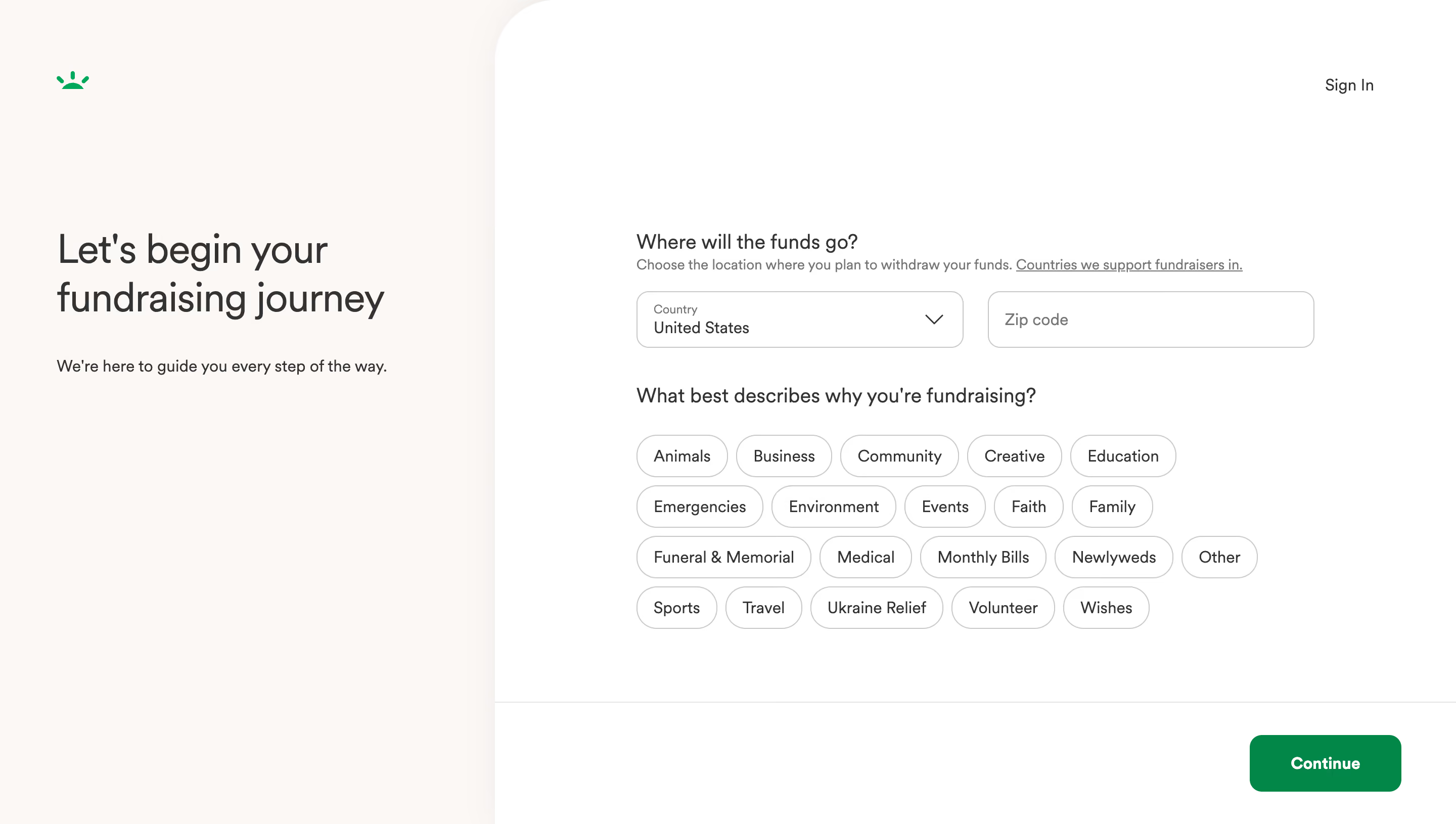
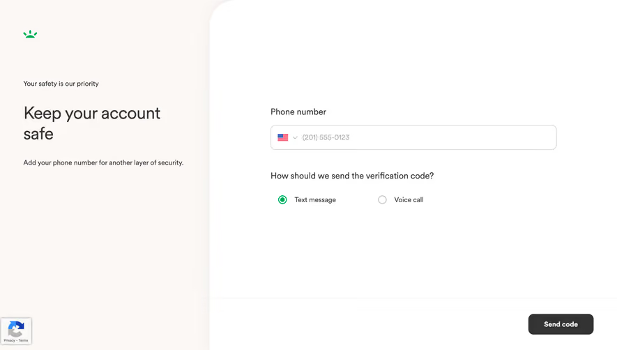
GoFundMe's fundraiser creation page nails the "don't overwhelm me" approach. The split layout is doing heavy lifting here. Left side: big, friendly heading with a reassuring subline. Right side: the actual form. It feels like a conversation, not a chore.
Smart Use of Restraint
The category selector is the star. Those pill-shaped buttons are easy to scan and tap. Animals, Business, Medical, Ukraine Relief. Everything laid out in a loose grid that doesn't feel cramped. No icons, no colors per category. Just text in rounded containers. It works because it keeps things fast.
Typography That Stays Out of the Way
The type hierarchy is quiet but effective. Bold serif-ish heading on the left, clean sans-serif for everything else. The "Country" dropdown with "United States" pre-filled reduces friction instantly. One green CTA button anchored bottom-right. That GoFundMe green pops hard against all the white and gray.
What Makes It Stand Out
It's generous with whitespace. Almost aggressively so. That confidence in simplicity is what makes the whole page feel trustworthy before you even type anything.