Design with AI
Generate a new design based on this screen using your own content.
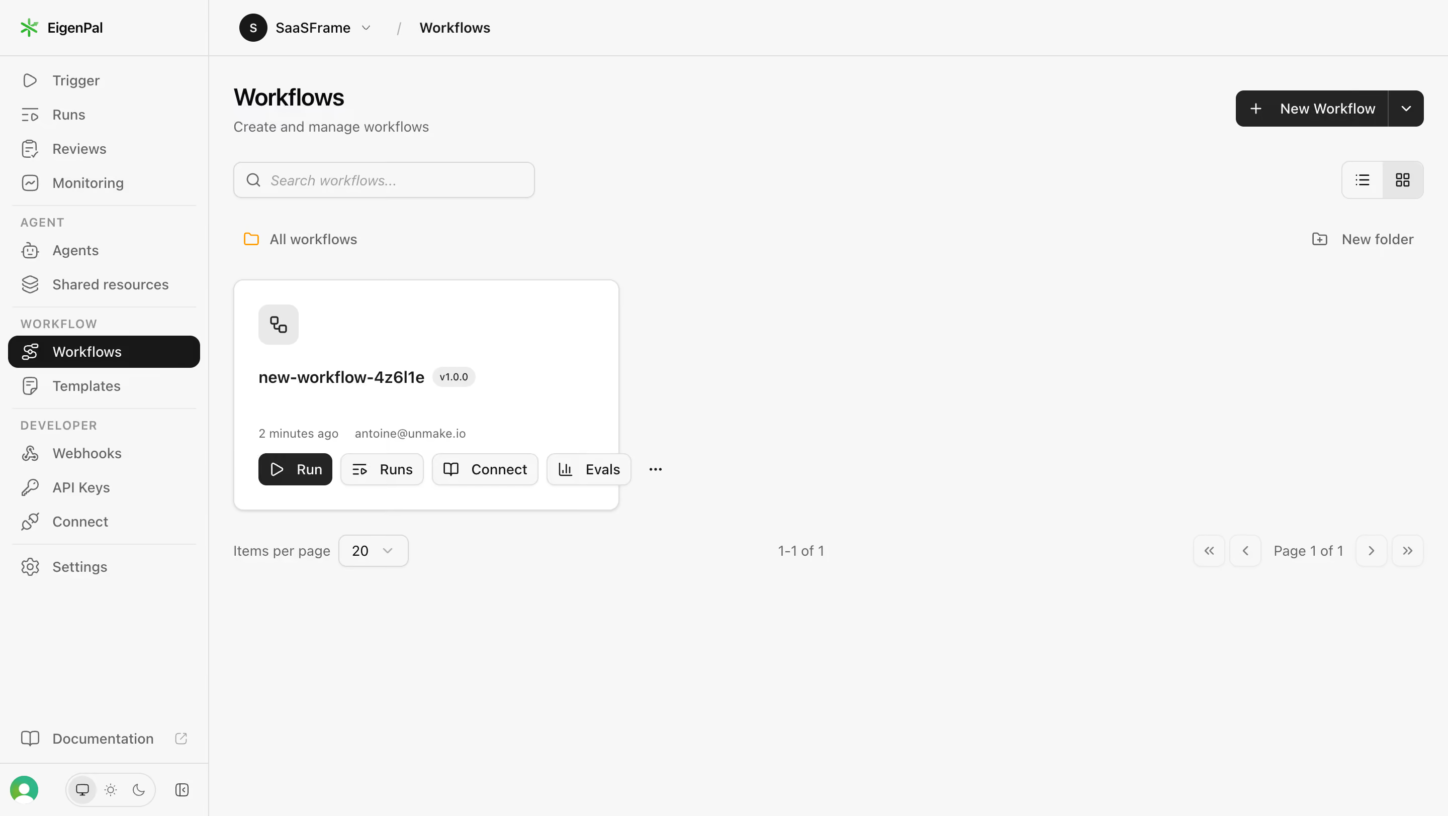
# Design from Reference: EigenPal Workflows list
Create an original, high-fidelity visual design inspired by the reference. Prioritize composition, typography, colors, spacing, and component styling over technical implementation.
## Reference
- **Product:** EigenPal
- **Category:** Table
- **Screenshot:** https://cdn.prod.website-files.com/5e9dc792e1210c5325f7ebbc/6acad04934c900e8fc1b48c6_6acacfd63ce5f4104ebcf823_cms-bab6ec7ab841adde2493f0cd.webp
Analyze the screenshot first. If inaccessible, request it rather than guessing.
## Content
{{content.instructions}}
{{content.data}}
Preserve essential messaging and factual accuracy. Adapt structure and copy length for visual balance; never invent product claims.
## Visual Design
### Overall aesthetic
- **Style:** Neutral workflow dashboard with pale-gray canvas, white cards, black selected states and compact outline icons.
- **Scale:** Source 2880 × 1624px; dimensions estimate a 1440px-wide CSS viewport at 2× capture scale.
### Page composition
- **Shell:** A roughly 208px left rail groups execution, agent, workflow and developer tools; workspace breadcrumbs occupy the top bar.
- **Main region:** Workflows heading, subtitle and search sit left, with New Workflow and view-mode controls right.
- **List:** An All workflows folder label precedes one workflow card; pagination spans the row beneath.
### Information hierarchy
- **Current location:** Workflows is selected in the rail with black fill.
- **Item identity:** The card presents a workflow glyph, bold generated name, small version badge, recency and owner metadata.
- **Actions:** Run, Runs, Connect, Evals and overflow controls sit along the card bottom.
### Typography
- **Family:** Compact sans-serif; exact font identity is unverified.
- **Roles:** Estimated heading 24px semibold, card name 16px bold, navigation/actions 14px and metadata 12px.
- **Secondary copy:** Subtitle, timestamps and pagination use medium gray.
### Colors & surfaces
- **Sampled palette:** ICC-aware sRGB samples include #F7F7F7, white #FFFFFF, dark #242424 and #181818, and border #DEDEDE.
- **Accents:** Small green brand symbol and orange folder icon add restrained color.
- **Depth:** Card has a thin border, 12px corners and faint lower shadow.
### Components
- **Workflow card:** Approximately 384 × 230px with 24px padding, gray icon tile and compact action buttons.
- **Creation:** Black split button combines plus-prefixed New Workflow and dropdown segment.
- **Search/view:** Outlined search field and two-option list/grid segmented control.
- **Pagination:** Items-per-page select, range label and four compact arrow buttons; only one item is present.
### Visual rhythm
- **Spacing:** Broad empty canvas surrounds the single card; toolbar elements retain stable horizontal alignment.
- **Grouping:** Card metadata and actions are compact relative to the large content region.
### Responsive
- **Recommended adaptation:** Only desktop is observed. Collapse the rail and wrap toolbar/card actions on narrow screens.
- **List handling:** Keep workflow identity and Run prominent while allowing metadata to wrap.
### Adaptation guidance
- **Preserve:** Keep creation, search, view mode and per-workflow actions distinct.
- **Adapt:** Use actual workflows and versions; do not fabricate additional cards to fill empty space.
Use this context to reproduce the reference's visual language: layout, typography, colors, spacing, borders, radii, and distinctive elements. The screenshot takes priority if descriptions conflict.
## Direction
{{preferences.fidelityInstructions}}
## Output
{{output.instructions}}
Deliver a polished, cohesive design with precise alignment, hierarchy, and spacing. Produce the requested visual artifact, not just a description. If unsupported, explain the limitation.