
Thank you! Your submission has been received!
Oops! Something went wrong while submitting the form.
Get SaaSFrame Pro
Monthly
$18
Quarterly
$48
Yearly
$180
Upgrade to access this feature
Browse all screens & flows
Filter and search screens & flows
Access Figma files
Access mobile versions
Bookmark screens & flows
Join now


Dimension Blog Feed

Dimension
The developer integration platform
Designed by
No items found.

Bookmark
Bookmark

Design with AI
Thank you! Your submission has been received!
Oops! Something went wrong while submitting the form.
# Design from Reference: Dimension Blog Feed
Create an original, high-fidelity visual design inspired by the reference. Prioritize composition, typography, colors, spacing, and component styling over technical implementation.
## Reference
- **Product:** Dimension
- **Category:** Blog Feed
- **Screenshot:** https://cdn.prod.website-files.com/5e9dc792e1210c5325f7ebbc/6acad8a5d05a3f53c0a74cf1_6acad81d782887bd39751944_cms-469ff26ab33983ce5fdf6ddc.webp
Analyze the screenshot first. If inaccessible, request it rather than guessing.
## Content
{{content.instructions}}
{{content.data}}
Preserve essential messaging and factual accuracy. Adapt structure and copy length for visual balance; never invent product claims.
## Visual Design
### Overall aesthetic
- **Style:** Dark developer-product blog with deep navy canvas, pale lavender text, subtle outlined cards, and pink-to-orange gradient branding.
- **Character:** Restrained glow, fine orbital arcs, dotted star-like decoration, and soft layered action outlines.
- **Density:** Small three-article grid followed by a large atmospheric waitlist section and sparse footer.
### Page composition
- **Capture and scale:** 2880 × 4858 image px. CSS estimates assume a 2× capture, approximately 1440 × 2429 CSS px; scale is unverified.
- **Header:** Gradient app icon and brand left, rounded four-link navigation capsule center, small waitlist action right.
- **Content container:** Approximately 870px wide, centered.
- **Filters:** Three category tabs above a thin rule; All Posts has pill treatment and a small underline marker.
- **Article grid:** Two columns, three cards total, leaving lower-right blank.
- **Cards:** Large image, category pill, title, author portrait/name/role, and date.
- **Closing CTA:** Large gradient brand tile over faint orbital arcs, centered headline with gradient word, short subtitle, and gradient waitlist button.
- **Footer:** Brand left and Product/Company/Contact groups right, with legal/copyright row beneath a fine rule.
### Information hierarchy
- **Category state:** All Posts is repeated as the section heading.
- **Article identity:** Image/title lead each card; category and author/date metadata are secondary.
- **Brand emphasis:** Gradient app mark and selected words provide the strongest color.
- **Conversion:** Glowing waitlist action anchors the closing atmospheric area.
- **Footer:** Muted links remain subdued against the navy background.
### Typography
- **Family:** Neutral proportional sans serif; exact identity is unverified.
- **Section heading:** Approximately 32px medium.
- **Article titles:** Approximately 18px regular with 26px line-height.
- **Metadata / tabs:** Approximately 14px; role/date smaller around 12px.
- **Closing heading:** Approximately 40px medium with 48px leading.
- **Closing subtitle:** Approximately 16px.
- **Precision:** CSS sizes and weights are visual estimates.
### Colors & surfaces
- **Main navy:** Sampled #050522.
- **Nearby navy:** Sampled #050521.
- **Card / glow tones:** Sampled #080825, #060623, #070724, and #10102C.
- **Warm dark artwork:** Sampled #100521.
- **Bright image details:** Sampled #FFFFFF.
- **Text hierarchy:** Pale lavender headings, muted lavender metadata, and darker date/footer copy.
- **Gradient accents:** Violet, pink, coral, and warm yellow in brand tile, selected words, and waitlist action.
- **Treatment:** Thin low-contrast outlines and subtle glow replace prominent raised white cards.
### Components
- **Navigation capsule:** Thin dark-lavender outline, fully rounded ends, four text links, small careers-count chip.
- **Category tabs:** Compact text controls; selected item has rounded dark fill and fine border.
- **Article cards:** Approximately 423 × 430px, 16px radius, thin outline, inset image, and roughly 32px content padding.
- **Thumbnails:** Wide rounded artwork: product launch scene, large gradient funding figure, and pale product screenshot.
- **Category pills:** Dark-lavender fill, fine outline, fully rounded ends.
- **Author row:** Small circular portrait, two-line identity block, and right-aligned muted date.
- **CTA tile:** Large rounded gradient app icon surrounded by multiple thin rounded outlines.
- **Waitlist action:** Gradient rectangle around 132 × 44px, small radius, and layered dark outline/glow.
- **State limits:** No category results, article view, or waitlist form is open.
### Visual rhythm
- **Grid consistency:** Equal card widths and repeated image/metadata structure.
- **Asymmetry:** Third card occupies only the left column, leaving intentional-looking open space in the captured layout.
- **CTA spacing:** Large vertical gap separates article content from the atmospheric closing section.
- **Footer rhythm:** Three short link groups and broad spacing maintain the quiet dark presentation.
### Responsive
- **Observed state:** Desktop only; mobile behavior is unverified.
- **Grid recommendation:** Stack cards in one column.
- **Header recommendation:** Collapse the central capsule while preserving brand/waitlist access.
- **Typography recommendation:** Reduce closing heading toward 30–32px.
- **Decoration recommendation:** Crop arcs/dots without obscuring text and provide reduced-motion handling if animated.
- **Footer recommendation:** Stack link groups with clear labels.
### Adaptation guidance
- **Preserve:** Deep navy atmosphere, fine outlined cards, gradient brand emphasis, and a distinct waitlist close.
- **Starting geometry:** Approximately 870px content width, 423px cards, 16px radii, and 32px content padding under the unverified 2× assumption.
- **Content fidelity:** Use actual article metadata and approved imagery; captured funding figures are historical content.
- **Contrast recommendation:** Test muted metadata for readability rather than blindly reproducing faint pixels.
- **Implementation recommendation:** Provide accessible filters, links, and waitlist feedback; static visuals do not establish behavior.
Use this context to reproduce the reference's visual language: layout, typography, colors, spacing, borders, radii, and distinctive elements. The screenshot takes priority if descriptions conflict.
## Direction
{{preferences.fidelityInstructions}}
## Output
{{output.instructions}}
Deliver a polished, cohesive design with precise alignment, hierarchy, and spacing. Produce the requested visual artifact, not just a description. If unsupported, explain the limitation.


Category
Patterns
No items found.


Added on
October 17, 2023
Similar screens
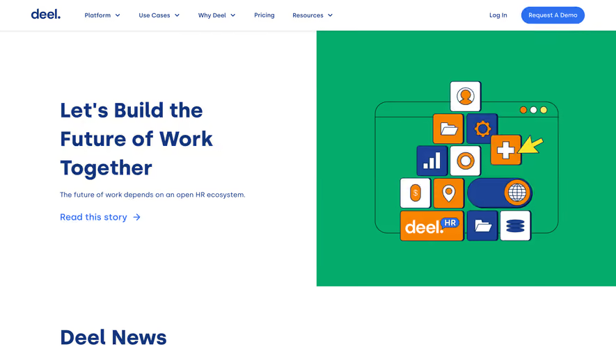


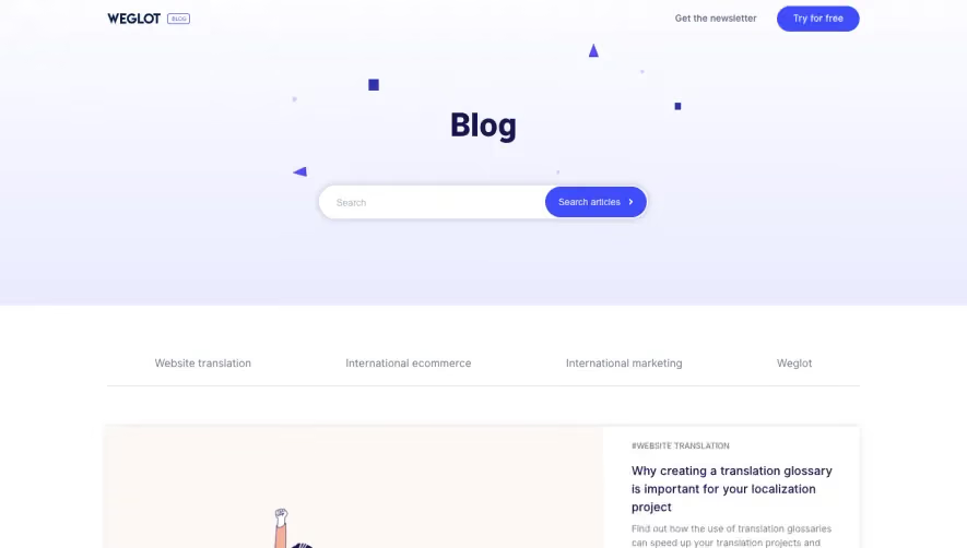



Upgrade to SaaSFrame Pro now to see similar examples.
Monthly
$18 /month
Billed $18 monthly
Browse all screens & flows
Filter and search screens & flows
Search text in screenshots
Access Figma files
Access mobile versions
Join now
Quarterly
$16 /month
Billed $48 quarterly
Browse all screens & flows
Filter and search screens & flows
Search text in screenshots
Access Figma files
Access mobile versions
Join now
Yearly
$15 /month
Billed $180 yearly
Browse all screens & flows
Filter and search screens & flows
Search text in screenshots
Access Figma files
Access mobile versions
Join now