Overall Style and Aesthetic
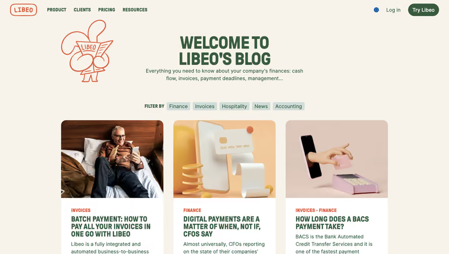
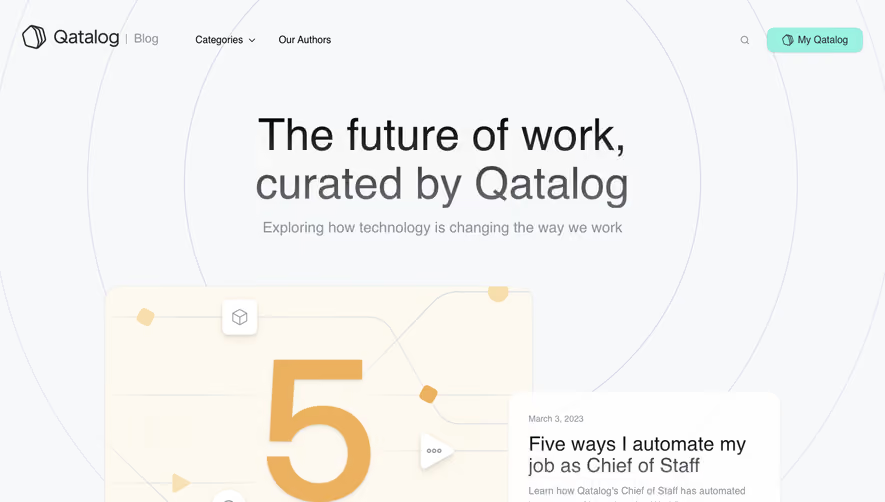
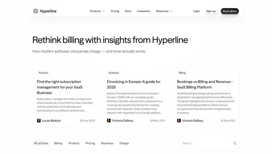
Weglot’s blog page exudes a crisp, modern professionalism merged with approachable charm. The design is clean yet lively, balancing functional simplicity with friendly visual touches. Subtle animations and whitespace pair with clear, structured sections, creating a site that feels both contemporary and welcoming—perfect for a forward-thinking SaaS brand. Layout and Structure
The page opens with a compact navigation and a search-centric hero, immediately channeling visitors toward discovery. Blog content is smartly organized into featured posts and categorized cards, each with generous padding and consistent alignment. The sticky sidebar and floating categories enhance browsing ease, while the page ends on a streamlined footer, favoring clarity over clutter. Visual Elements
Bold feature images lead each blog post, incorporating soft gradients and overlays for depth. Custom icons and occasional subtle illustrations punctuate the page, breaking up text and adding unique visual interest. There’s minimal reliance on photography—most impact comes from color and graphical accents, lending a distinctive SaaS flair. Color Palette and Typography
A predominantly white canvas is energized by Weglot’s signature blue, paired with mild grays and purples for emphasis. Typographically, the site employs a sans-serif font that’s readable yet characterful, using clear typographic hierarchy: large headings, punchy excerpts, legible body text, and well-defined CTAs. User Experience Patterns
Navigation is intuitive, with a sticky menu, highlighted category filters, and an always-accessible search function. Prominent CTAs—like “Read more” and digest signups—are instantly recognizable, guiding user flow. Smooth hover states and gentle micro-interactions enhance engagement without distraction. Unique Design Choices & Tone
Distinctive use of pill-shaped category tags and floating filters encourages exploration. The visual cohesion between branded colors and custom graphics bolsters recognition. The overall tone feels innovative yet reliable, inviting visitors to explore—a perfect muse for SaaS teams seeking both inspiration and UX clarity.