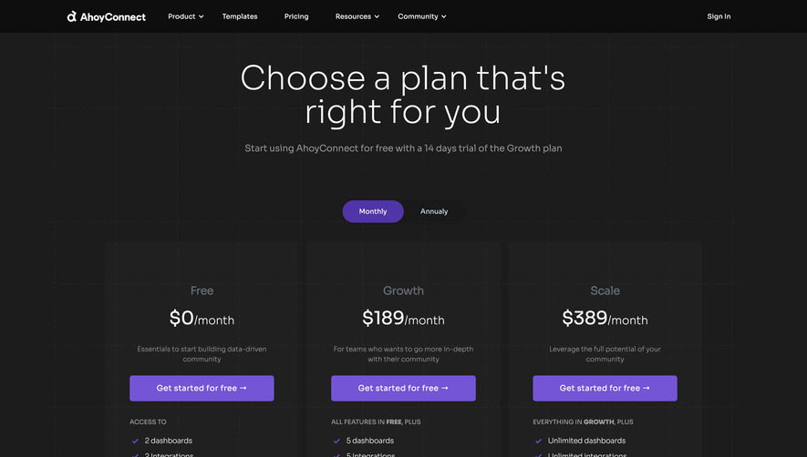
Generate a new design based on this screen using your own content.
Thank you! Your submission has been received!
Oops! Something went wrong while submitting the form.
# Design from Reference: Crisp Pricing Page
Create an original, high-fidelity visual design inspired by the reference. Prioritize composition, typography, colors, spacing, and component styling over technical implementation.
## Reference
- **Product:** Crisp
- **Category:** Pricing Page
- **Screenshot:** https://cdn.prod.website-files.com/5e9dc792e1210c5325f7ebbc/6acad45c886583e9d96b6e08_6acad307857335a2ffbdb5f9_cms-85ccd28d246ab85a1ff36ebb.webp
Analyze the screenshot first. If inaccessible, request it rather than guessing.
## Content
{{content.instructions}}
{{content.data}}
Preserve essential messaging and factual accuracy. Adapt structure and copy length for visual balance; never invent product claims.
## Visual Design
Use this context to reproduce the reference's visual language: layout, typography, colors, spacing, borders, radii, and distinctive elements. The screenshot takes priority if descriptions conflict.
## Direction
{{preferences.fidelityInstructions}}
## Output
{{output.instructions}}
Deliver a polished, cohesive design with precise alignment, hierarchy, and spacing. Produce the requested visual artifact, not just a description. If unsupported, explain the limitation.
Crisp’s pricing page exemplifies a fresh, approachable aesthetic. The design leans into a modern and clean style, balancing whitespace with playful custom illustrations. Friendly curves, rounded elements, and soft drop shadows evoke a sense of approachability and warmth, making the page feel uniquely engaging yet fully professional.
Layout and Structure
The page presents a laser-focused structure: the hero text leads with absolute clarity, followed by a horizontally-arranged pricing section. Each pricing card uses distinct borders and backgrounds for easy comparison. Strategic use of sticky navigation ensures quick access to FAQs and feature breakdowns. Below, testimonials and a customer showcase create trust by highlighting real-world use.
Visual Elements
Vivid, vector-based illustrations and animated icons punctuate the content, guiding the eye and adding a lively yet sophisticated touch. The absence of stock images underscores a brand-first, purpose-driven design language. Subtle microinteractions—such as animated hover effects on pricing toggles and call-to-action buttons—add interactivity without distraction.
Color Palette and Typography
A bright, optimistic palette dominated by blues, greens, and pops of yellow communicates energy and reliability. Clean, sans-serif fonts with a clear hierarchy—bold titles, regular-weight body text—make navigation effortless. The color contrast between buttons and backgrounds maximizes CTA visibility without overwhelming the user.
User Experience Patterns and Notable Choices
Compact, sticky navigation maintains context as you scroll. Pricing cards use persuasive copy and iconography for standout features, while transparent footers and accessible help options reinforce trust. Overall, the tone is energetic, transparent, and customer-first, reflecting a SaaS brand that prioritizes clarity and ease-of-use alongside delightful visuals.