
Thank you! Your submission has been received!
Oops! Something went wrong while submitting the form.
Get SaaSFrame Pro
Monthly
$18
Quarterly
$48
Yearly
$180
Upgrade to access this feature
Browse all screens & flows
Filter and search screens & flows
Access Figma files
Access mobile versions
Bookmark screens & flows
Join now


ConvertKit Compared to Mailchimp

ConvertKit
Email Marketing for Online Creators
Designed by
No items found.

Bookmark
Bookmark

Design with AI
Thank you! Your submission has been received!
Oops! Something went wrong while submitting the form.
# Design from Reference: ConvertKit Compared to Mailchimp
Create an original, high-fidelity visual design inspired by the reference. Prioritize composition, typography, colors, spacing, and component styling over technical implementation.
## Reference
- **Product:** ConvertKit
- **Category:** Comparison Page
- **Screenshot:** https://cdn.prod.website-files.com/5e9dc792e1210c5325f7ebbc/62ec9c76eb86d334cf840bf2_1659622893393-screenshot-device-06f728ed0354ab3a61f59d2f73ac78d9-1659602978934.webp
Analyze the screenshot first. If inaccessible, request it rather than guessing.
## Content
{{content.instructions}}
{{content.data}}
Preserve essential messaging and factual accuracy. Adapt structure and copy length for visual balance; never invent product claims.
## Visual Design
### Overall aesthetic
- **Style:** Warm editorial comparison page with navy serif headings, cream surfaces, and green conversion actions.
- **Visual character:** Spacious text layouts, softly curved section boundaries, product collages, and personal testimonial portraits.
- **Decoration:** Coral hand-drawn mail motifs, small handwritten feature numbers, an underline, and large closing script artwork.
- **Surface treatment:** Most content is unboxed; comparison table and testimonial cards provide structured contrast.
### Page composition
- **Screenshot size:** 1440 × 7157 image px; capture-to-CSS ratio unverified. Dimensions below use screenshot pixels.
- **Header:** Logo left, compact navigation and outlined signup pill right, sharing a centered roughly 1120 px width.
- **Hero:** Cream background, uppercase eyebrow, centered comparison title, two-line supporting copy, and green trial button.
- **Hero artwork:** Layered analytics/email/automation screenshots overlap the curved cream-to-white transition.
- **Benefits:** Section introduction followed by four numbered benefits, grouped around two alternating product collages.
- **Proof/conversion:** Centered testimonial and portrait precede a cream trial/demo block.
- **Comparison:** Cream section with centered heading, explanatory paragraph, and three-column comparison table.
- **Closing sequence:** Three testimonial cards, migration offer with coral illustration, pale-green final CTA/script artwork, and six-column navy footer.
### Information hierarchy
- **Primary headline:** Product comparison is the dominant hero text, with supporting creator-oriented message below.
- **Benefit hierarchy:** Numbered sans serif titles precede short body paragraphs; screenshots substantiate each group.
- **Evidence hierarchy:** Personal migration testimonial, tabular comparison, and three creator quotes form distinct proof layers.
- **Action hierarchy:** Green trial buttons repeat; blue migration action and quieter demo links serve secondary paths.
- **Table emphasis:** Target-product middle column has a warm tinted fill and green top rule.
### Typography
- **Heading family:** Traditional editorial serif; exact family unverified.
- **Body family:** Humanist proportional sans serif; exact family unverified.
- **Hero heading:** Approximately 46 screenshot px, weight 600, line-height 56 px.
- **Section headings:** Approximately 36 px serif, line-height 44 px.
- **Benefit titles:** Approximately 23 px sans serif, medium weight; body 16–18 px with 26 px leading.
- **Eyebrows/navigation:** Approximately 14 px; eyebrows uppercase with mild tracking.
- **Testimonials:** Approximately 23 px italic, with selected bold emphasis; card quotes around 18 px.
- **Precision:** Sizes and weights are visual estimates; screenshot does not supply font metadata.
### Colors & surfaces
- **Main surface:** Sampled sRGB #FFFFFF.
- **Cream hero/comparison:** Sampled #FEF8F1.
- **Warm table/detail tint:** Sampled #FAEDDB.
- **Navy headings/footer:** Sampled #20304F.
- **Final CTA surface:** Sampled pale green #EFF6F3.
- **Large script accent:** Sampled #CDE6D9.
- **Primary action:** Sampled green #3EA47F.
- **Supporting pale surface:** Sampled #F5F9FC and #F3F5F9.
- **Local accents:** Coral brand/mail illustrations and muted blue secondary action complement the restrained palette.
### Components
- **Primary CTA:** Approximately 224 × 64 screenshot px, green fill, 6 px corners, white semibold label.
- **Header signup:** Thin navy outline with pill shape.
- **Product collages:** Flat screenshots with subtle shadows, cream organic backplates, and small floating metric/email cards.
- **Feature numbering:** Warm handwritten 1–4 beside the benefit titles.
- **Comparison table:** Approximately 975 px wide, thin warm borders, about 18 px outer corners, three aligned columns, and six comparison rows.
- **Testimonial cards:** Three equal white cards, roughly 300 px wide, 20 px corners, pale border, soft warm shadow, quote mark, and bottom avatar/name block.
- **Migration CTA:** Centered illustration, serif title with coral underline, explanatory paragraph, and blue rectangular action.
- **Footer:** Dense six-column links, lighter uppercase labels, separated legal/social row.
- **Observed states:** Static comparison and testimonials only; migration/signup behavior is not demonstrated.
### Visual rhythm
- **Content alignment:** Benefits, table, quote cards, and footer use a common centered width near 1120 px.
- **Section rhythm:** Broad 100–160 px vertical intervals separate narrative groups.
- **Feature balance:** Image-left/text-right flips for the second benefit pair.
- **Curve transitions:** Shallow cream arcs soften the move from hero and testimonial areas.
- **Proof rhythm:** Single centered quote contrasts with three aligned quote cards later.
- **Closing contrast:** Pale-green CTA with oversized script yields to a solid navy footer.
### Responsive
- **Observed version:** Desktop only.
- **Hero recommendation:** Reduce title toward 32–36 px and scale collage as one composition.
- **Benefits recommendation:** Stack image/text groups while preserving 1–4 reading order.
- **Table recommendation:** Allow horizontal scrolling with feature labels visible.
- **Proof recommendation:** Stack testimonial cards and preserve author attribution.
- **Footer recommendation:** Wrap link columns; keep conversion controls comfortably separated.
### Adaptation guidance
- **Preserve:** Editorial serif/sans pairing, cream/navy/green palette, numbered benefits, product proof, and repeated trial hierarchy.
- **Content fidelity:** Replace audience totals, comparative capabilities, prices, testimonials, and migration terms with verified target content.
- **Starting dimensions:** Approximately 46 px hero, 36 px section headings, 16–18 px body, and 64 px action height.
- **Artwork adaptation:** Use supplied product screenshots and original mail motifs rather than copying creator/customer material.
- **Interaction fidelity:** Keep signup/demo/migration paths distinct and define their behavior from actual requirements.
Use this context to reproduce the reference's visual language: layout, typography, colors, spacing, borders, radii, and distinctive elements. The screenshot takes priority if descriptions conflict.
## Direction
{{preferences.fidelityInstructions}}
## Output
{{output.instructions}}
Deliver a polished, cohesive design with precise alignment, hierarchy, and spacing. Produce the requested visual artifact, not just a description. If unsupported, explain the limitation.


Category
Patterns
No items found.
Tech Stack



Added on
May 17, 2020
Similar screens
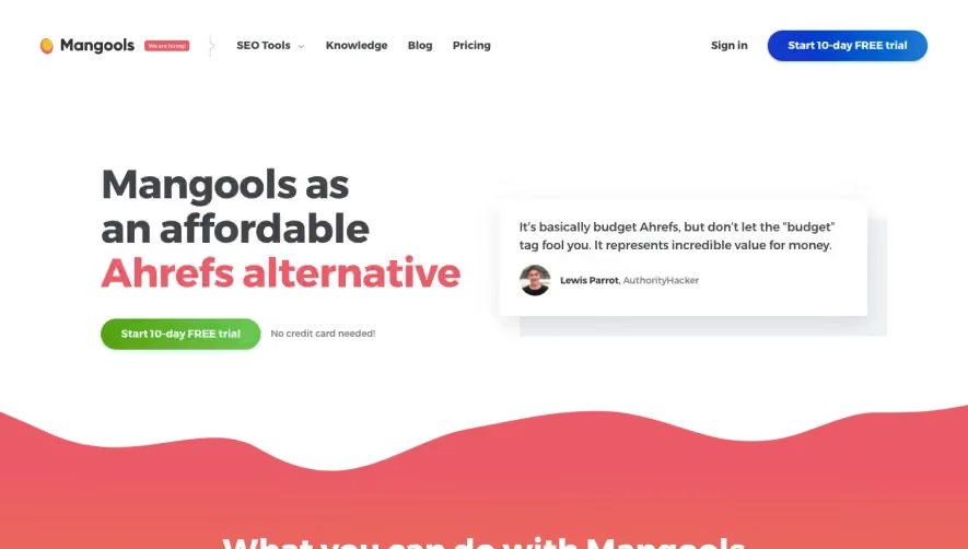




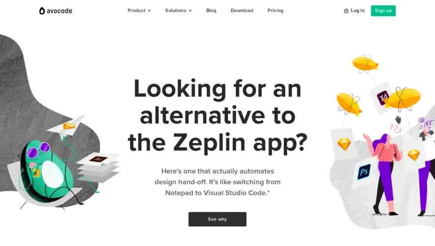

Upgrade to SaaSFrame Pro now to see similar examples.
Monthly
$18 /month
Billed $18 monthly
Browse all screens & flows
Filter and search screens & flows
Search text in screenshots
Access Figma files
Access mobile versions
Join now
Quarterly
$16 /month
Billed $48 quarterly
Browse all screens & flows
Filter and search screens & flows
Search text in screenshots
Access Figma files
Access mobile versions
Join now
Yearly
$15 /month
Billed $180 yearly
Browse all screens & flows
Filter and search screens & flows
Search text in screenshots
Access Figma files
Access mobile versions
Join now