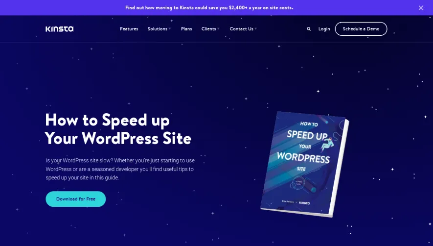
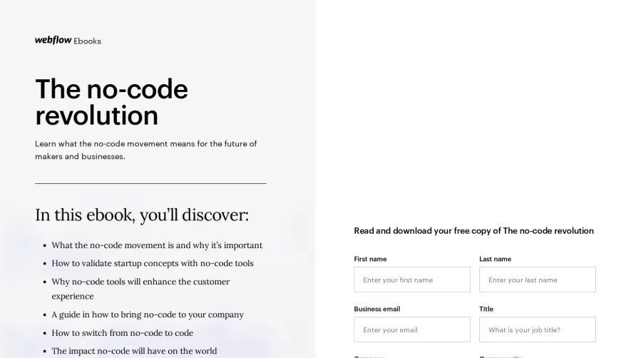
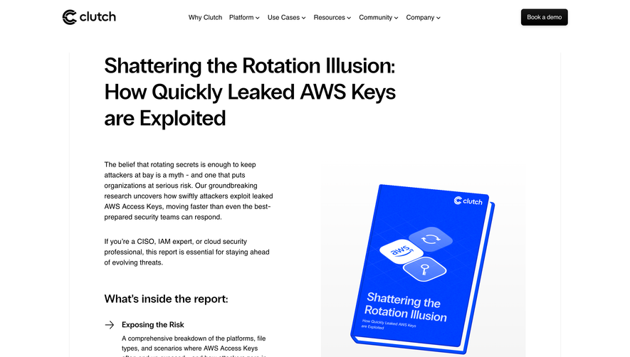
Generate a new design based on this screen using your own content.
Thank you! Your submission has been received!
Oops! Something went wrong while submitting the form.
# Design from Reference: Contractbook eBook Page
Create an original, high-fidelity visual design inspired by the reference. Prioritize composition, typography, colors, spacing, and component styling over technical implementation.
## Reference
- **Product:** Contractbook
- **Category:** Ebook Page
- **Screenshot:** https://cdn.prod.website-files.com/5e9dc792e1210c5325f7ebbc/62ec9c67f0eb3d4d2f7f29a2_1659621205946-screenshot-device-6a2229b9738e04ed23d8a4021ccacb00-1659600158106.webp
Analyze the screenshot first. If inaccessible, request it rather than guessing.
## Content
{{content.instructions}}
{{content.data}}
Preserve essential messaging and factual accuracy. Adapt structure and copy length for visual balance; never invent product claims.
## Visual Design
Use this context to reproduce the reference's visual language: layout, typography, colors, spacing, borders, radii, and distinctive elements. The screenshot takes priority if descriptions conflict.
## Direction
{{preferences.fidelityInstructions}}
## Output
{{output.instructions}}
Deliver a polished, cohesive design with precise alignment, hierarchy, and spacing. Produce the requested visual artifact, not just a description. If unsupported, explain the limitation.
The bright yellow hero section with that blue and red illustrated ebook cover grabs you instantly. It's confident and warm without being obnoxious. The cover art has this chunky, almost Bauhaus-inspired geometric style that feels modern but approachable. Right next to it, a clean lead capture form sits on white. Smart move putting the download form above the fold with zero friction.
Content That Breathes
Below the fold, the page shifts into a straightforward editorial layout. Generous whitespace, dark text on white, simple hierarchy. The section titles are large and weighted well. Body copy is set at a comfortable reading size. Nothing fancy, just solid typographic discipline. The advantages section uses bullet points that are easy to scan, which is exactly what you want for a page trying to educate and convert simultaneously.
The Bottom CTA Hits Hard
That dark navy banner at the bottom with "Let us tell you more about contracts" and an orange "Request a demo" button is a strong closer. High contrast, impossible to miss. The footer is dense but well organized into clear columns. Overall this page does one thing really well: it stays out of its own way.