Design with AI
Generate a new design based on this screen using your own content.
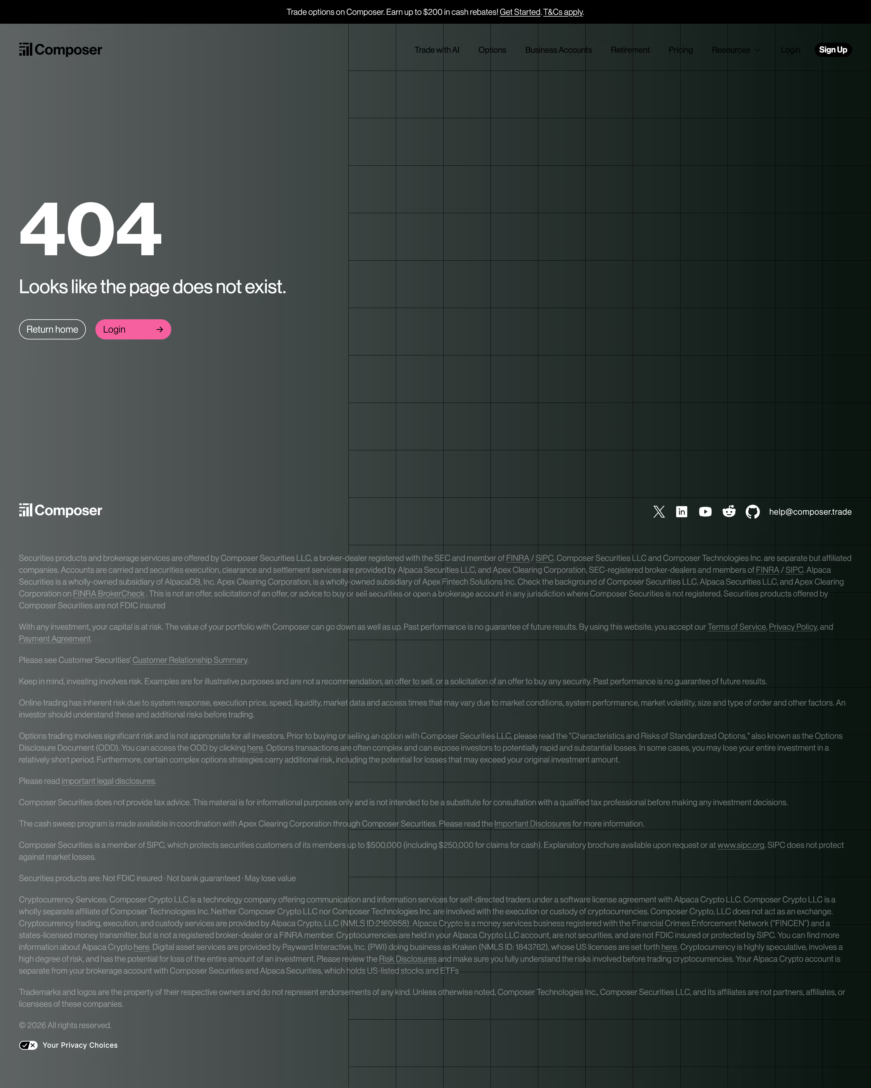
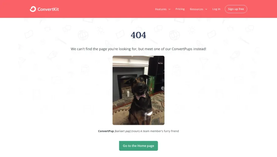
# Design from Reference: Composer 404 Page
Create an original, high-fidelity visual design inspired by the reference. Prioritize composition, typography, colors, spacing, and component styling over technical implementation.
## Reference
- **Product:** Composer
- **Category:** 404 Page
- **Screenshot:** https://cdn.prod.website-files.com/5e9dc792e1210c5325f7ebbc/696513b41cf829ad19136336_2smmh76wpk1pa0hbhn2wt4tfjsxv4tqk.avif
Analyze the screenshot first. If inaccessible, request it rather than guessing.
## Content
{{content.instructions}}
{{content.data}}
Preserve essential messaging and factual accuracy. Adapt structure and copy length for visual balance; never invent product claims.
## Visual Design
### Overall aesthetic
- **Style:** Branded 404 page with a dark green-gray gradient and large geometric background grid.
- **Character:** Oversized white error code, sparse recovery actions, pink accent, and dense muted legal footer.
### Page composition
- **Canvas:** 2940 × 3670 image px; CSS estimates assume an unverified 2× capture.
- **Header:** Thin black promotional strip above logo and horizontal navigation.
- **Main:** Left-aligned 404, short explanation, and two recovery buttons with broad empty space on the right.
- **Background:** Large grid begins around 40% of page width and extends through the footer.
- **Footer:** Brand and social row, followed by multiple full-width disclosure paragraphs and privacy control.
### Information hierarchy
- **Primary:** Very large 404 numeral.
- **Secondary:** One-line error explanation.
- **Actions:** Outlined Return home and pink Login button.
- **Footer:** Legal content is smaller and lower contrast, separated from the primary recovery area.
### Typography
- **Family:** Neutral sans serif; exact family unverified.
- **404:** Approximately 120 CSS px, weight 700 under assumed 2×.
- **Explanation:** Approximately 30px, regular to medium.
- **Buttons:** Approximately 14px.
- **Header navigation:** Approximately 12px.
- **Legal copy:** Approximately 13px with 19px line-height.
- **Precision:** Font values are visual estimates.
### Colors & surfaces
- **Background:** Dark green-black gradient with sampled shades #0B1611, #0B1511, and #131D19.
- **Promotional strip:** #000000.
- **Primary error text:** Near-white.
- **Grid:** Low-contrast near-black lines.
- **Login accent:** Saturated pink; exact flat token unverified.
- **Footer copy:** Muted gray.
- **Precision:** Gradient has no single canvas color; samples identify local regions.
### Components
- **Recovery buttons:** Small pills approximately 34 CSS px high under assumed 2×.
- **Return home:** Transparent with white outline.
- **Login:** Pink fill, dark label, right arrow.
- **Header signup:** Compact black pill.
- **Social row:** White platform icons and support contact.
- **Footer:** Text links embedded in long disclosure paragraphs.
### Visual rhythm
- **Hero:** Large left inset and wide vertical gap from navigation.
- **Whitespace:** Recovery content occupies a small portion of the broad canvas.
- **Grid rhythm:** Repeated square cells add structure to the otherwise empty right side.
- **Footer density:** Many small paragraphs create a deliberate contrast with the simple error state.
### Responsive
- **Observed:** Desktop only.
- **Recommendation:** Reduce error-code scale, wrap explanation, and keep recovery actions above long legal content.
- **Grid:** Crop background decor rather than forcing horizontal scrolling.
- **Navigation:** Collapse secondary links.
### Adaptation guidance
- **Preserve:** Bold error identifier, concise explanation, two recovery choices, and restrained branded backdrop.
- **Content:** Use appropriate navigation destinations and supplied legal text.
- **Palette:** Retain contrast while treating sampled gradients as visual guidance.
- **Interaction:** The image shows recovery controls, not their resulting navigation.
Use this context to reproduce the reference's visual language: layout, typography, colors, spacing, borders, radii, and distinctive elements. The screenshot takes priority if descriptions conflict.
## Direction
{{preferences.fidelityInstructions}}
## Output
{{output.instructions}}
Deliver a polished, cohesive design with precise alignment, hierarchy, and spacing. Produce the requested visual artifact, not just a description. If unsupported, explain the limitation.