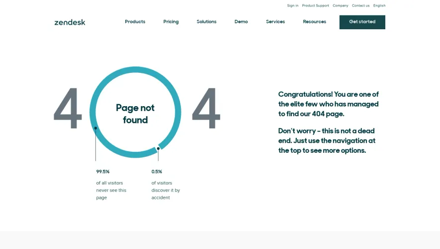
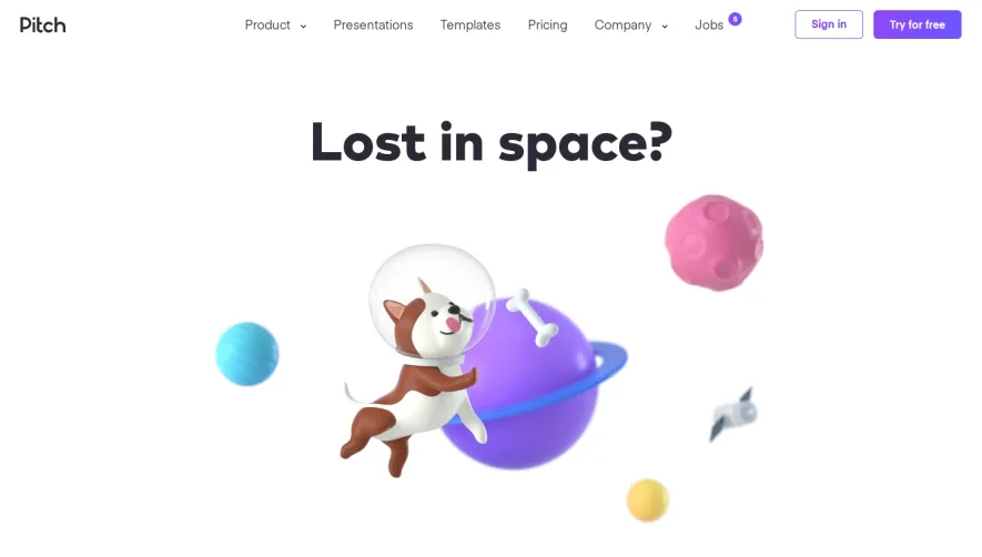
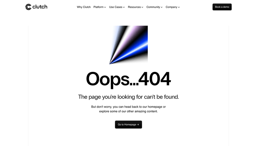
Generate a new design based on this screen using your own content.
Thank you! Your submission has been received!
Oops! Something went wrong while submitting the form.
# Design from Reference: ConvertKit 404 Page
Create an original, high-fidelity visual design inspired by the reference. Prioritize composition, typography, colors, spacing, and component styling over technical implementation.
## Reference
- **Product:** ConvertKit
- **Category:** 404 Page
- **Screenshot:** https://cdn.prod.website-files.com/5e9dc792e1210c5325f7ebbc/62ec9c6bbf75bb2153ce6cb8_1659621436843-screenshot-device-9591da6379c57bae59a6d177a3f13f67-1659600656418.webp
Analyze the screenshot first. If inaccessible, request it rather than guessing.
## Content
{{content.instructions}}
{{content.data}}
Preserve essential messaging and factual accuracy. Adapt structure and copy length for visual balance; never invent product claims.
## Visual Design
Use this context to reproduce the reference's visual language: layout, typography, colors, spacing, borders, radii, and distinctive elements. The screenshot takes priority if descriptions conflict.
## Direction
{{preferences.fidelityInstructions}}
## Output
{{output.instructions}}
Deliver a polished, cohesive design with precise alignment, hierarchy, and spacing. Produce the requested visual artifact, not just a description. If unsupported, explain the limitation.
ConvertKit’s 404 page embraces a delightfully playful and modern aesthetic that reinforces the brand’s approachable spirit. The minimal layout removes distraction, focusing the visitor’s attention on a single prominent illustration and a succinct textual message. Humor and empathy blend to turn a user’s moment of friction into a moment of delight.
Layout and Structure
The page structure is streamlined. At its core, it centers a bold illustration above a concise header and subtext, offering immediate clarity on the error. Beneath the messaging, a highly visible call-to-action button invites visitors to return to the homepage. The familiar top navigation bar and footer remain, maintaining continuity with the main site and empowering effortless navigation.
Visual Elements
A standout, whimsical illustration occupies center stage—a light-hearted but professional graphic that signals “lost” without diminishing the brand’s authority. The use of gentle animations (like the drifting paper airplane) creates a sense of movement and engagement without overwhelming the visual hierarchy. No stock photography or video distracts from the core message; instead, illustration does the storytelling.
Color Palette and Typography
Subdued off-whites and cool blues create a calm, trustworthy mood, accented by the brand’s signature coral for emphasis. Clean, friendly sans-serif typography ensures legibility, with clear weight variations establishing hierarchy between headings, body text, and CTAs.
User Experience Patterns & Notable Choices
Persisting navigation elements are a thoughtful UX touch, reducing navigational dead ends. The prominent CTA is inviting and action-oriented, turning a negative (404) into an opportunity for re-engagement. Overall, the warm, personable tone balances professionalism with just the right dose of charm—making a missing page feel intentional and even uplifting.