Design with AI
Generate a new design based on this screen using your own content.
# Design from Reference: Cake Equity Create A Raise
Create an original, high-fidelity visual design inspired by the reference. Prioritize composition, typography, colors, spacing, and component styling over technical implementation.
## Reference
- **Product:** Cake Equity
- **Category:** Add & Edit
- **Screenshot:** https://cdn.prod.website-files.com/5e9dc792e1210c5325f7ebbc/6acb6342adcf005a3c5c3132_6acb628e3f1023ca376fcc12_cms-69921f0669881a9d01b0843b.webp
Analyze the screenshot first. If inaccessible, request it rather than guessing.
## Content
{{content.instructions}}
{{content.data}}
Preserve essential messaging and factual accuracy. Adapt structure and copy length for visual balance; never invent product claims.
## Visual Design
### Overall aesthetic
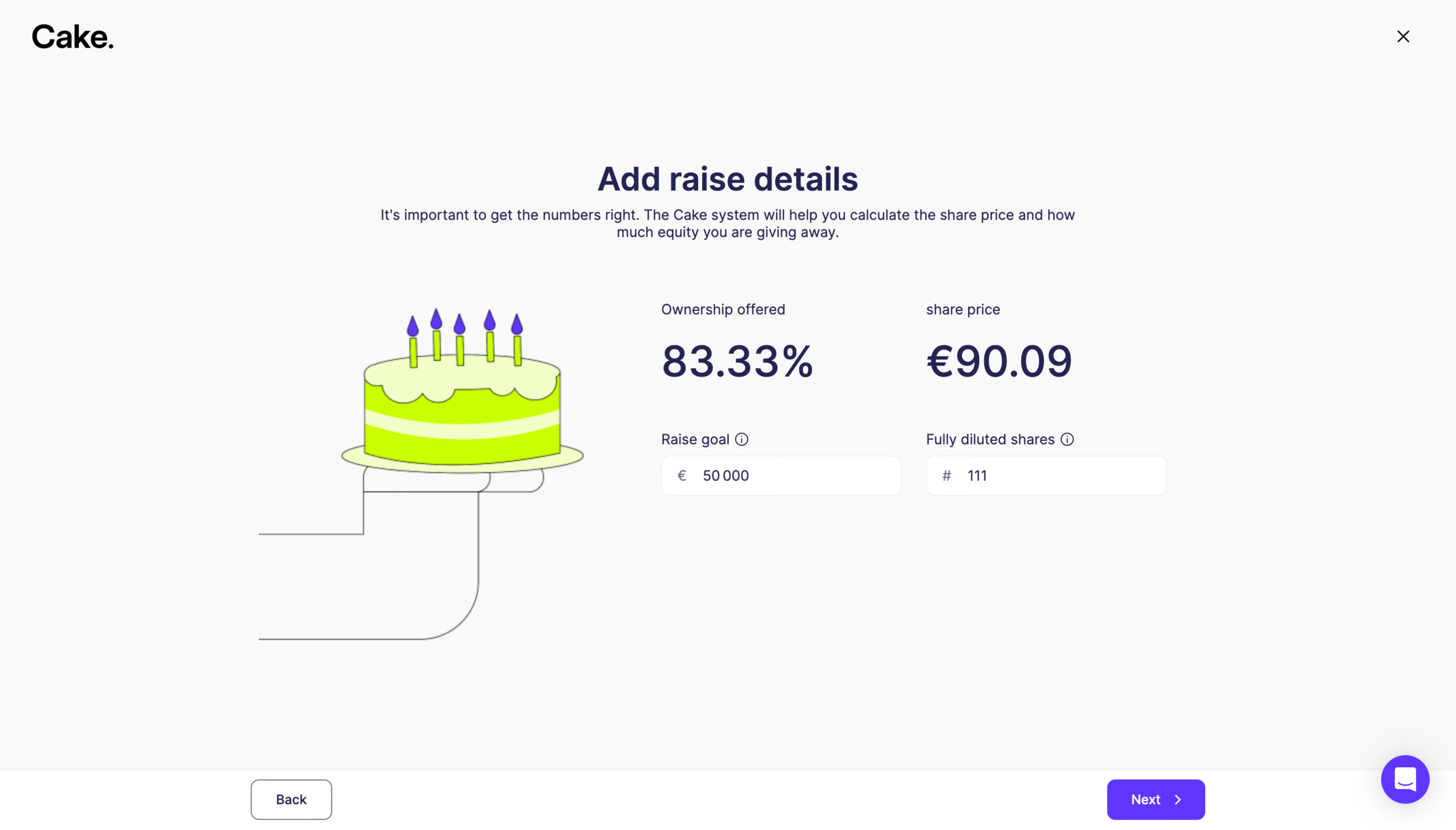
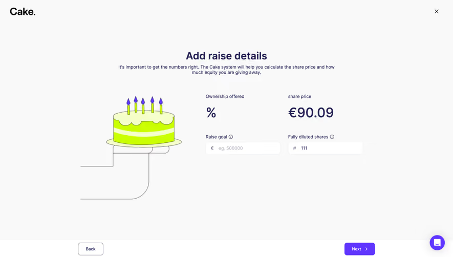
- **Style:** Minimal fundraising setup screen with playful cake illustration and vivid lime/violet brand accents.
- **Character:** Pale neutral canvas, dark violet typography, large calculated outputs, and sparse fields.
### Page composition
- **Canvas:** 5760 × 3284 image px; CSS estimates use an unverified 4× reconstruction.
- **Header:** Cake wordmark left and close X right.
- **Intro:** Centered Add raise details heading and short supporting sentence.
- **Main:** Illustration at left, two-column metric/input block at right.
- **Outputs:** Ownership offered and share price displayed prominently above their respective inputs.
- **Footer:** Fixed-looking white action bar with Back left and violet Next right; circular help control near lower right.
### Information hierarchy
- **Primary:** Setup heading and two large computed values.
- **Inputs:** Raise goal and fully diluted shares appear below outputs.
- **Guidance:** Small info icons accompany field labels.
- **Progression:** Violet Next action anchors the lower-right corner.
### Typography
- **Family:** Friendly sans serif; exact identity unverified.
- **Title:** Approximately 32 CSS px, bold under assumed 4×.
- **Computed values:** Approximately 44px, medium to semibold.
- **Body:** Approximately 14px.
- **Labels and field text:** Approximately 14px.
- **Buttons:** Approximately 14px, medium.
- **Precision:** Font sizes and scale are reconstruction estimates.
### Colors & surfaces
- **Canvas:** #F9F9F9.
- **Inputs and footer:** #FFFFFF.
- **Primary text:** #242452.
- **Violet action:** #6036FF.
- **Cake lime:** #C9FF00.
- **Cake pale icing:** #F4FFCA.
- **Subtle outlines:** Approximately #EBF1F2.
- **Precision:** Flat colors sampled from screenshot after profile conversion where applicable.
### Components
- **Illustration:** Line-drawn hand holding a lime cake with violet candle flames.
- **Metrics:** Large unboxed percentage and currency value.
- **Inputs:** White rounded rectangles approximately 238 × 40 CSS px under assumed 4×, with currency/hash prefix.
- **Info icons:** Small circled symbols beside labels.
- **Back:** White outlined button.
- **Next:** Violet rounded button with right chevron.
- **Help:** Circular violet chat launcher.
### Visual rhythm
- **Whitespace:** Large open margins around a compact central form.
- **Alignment:** Two metric columns align directly above their inputs.
- **Footer:** Full-width horizontal divider separates navigation from content.
- **Color:** Bright illustration balances an otherwise subdued form.
### Responsive
- **Observed:** Desktop only.
- **Recommendation:** Stack illustration and fields, retain large readable outputs, and keep footer controls clear of safe areas.
- **Inputs:** Use full-width fields on small screens.
- **Help:** Avoid overlap with Next.
### Adaptation guidance
- **Preserve:** Simple raise-entry hierarchy, calculated-value emphasis, playful brand illustration, and clear Back/Next controls.
- **Data:** Use actual supplied financial values rather than screenshot examples.
- **Behavior:** Calculations and validation are not demonstrated.
- **Scale:** Treat 4× CSS conversions as approximate.
Use this context to reproduce the reference's visual language: layout, typography, colors, spacing, borders, radii, and distinctive elements. The screenshot takes priority if descriptions conflict.
## Direction
{{preferences.fidelityInstructions}}
## Output
{{output.instructions}}
Deliver a polished, cohesive design with precise alignment, hierarchy, and spacing. Produce the requested visual artifact, not just a description. If unsupported, explain the limitation.