Design with AI
Generate a new design based on this screen using your own content.
# Design from Reference: Bonsai Sign Up Flow
Create an original, high-fidelity visual design inspired by the reference. Prioritize composition, typography, colors, spacing, and component styling over technical implementation.
## Reference
- **Product:** Bonsai
- **Category:** Account Setup
- **Screenshot:** https://cdn.prod.website-files.com/5e9dc792e1210c5325f7ebbc/6acbca2f8313d4c6c0cc3fa4_6acbc820edc235600abd5375_cms-cab67e13a1499b51ff9fef7d.webp
Analyze the screenshot first. If inaccessible, request it rather than guessing.
## Content
{{content.instructions}}
{{content.data}}
Preserve essential messaging and factual accuracy. Adapt structure and copy length for visual balance; never invent product claims.
## Visual Design
### Overall aesthetic
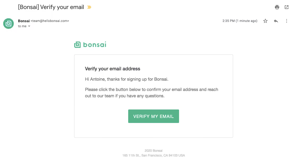
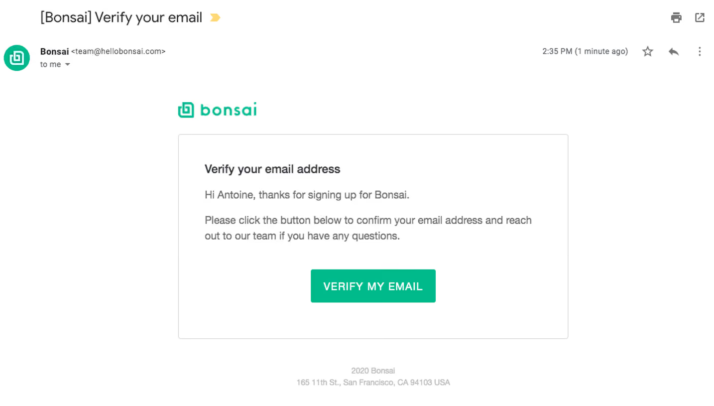
- **Character:** A restrained email-verification message with green branding, a thin outlined content card and one centered action.
- **Context:** The capture includes the surrounding email-client subject/sender toolbar above the branded message.
### Page composition
- **Capture:** The source is 1110 × 624 image pixels. Measurements refer to image pixels; email CSS scale is unverified.
- **Client chrome:** Subject, sender row and utility icons occupy the upper area outside the email design.
- **Email region:** A roughly 600-pixel-wide content group begins near x=280, with a green Bonsai logo above a bordered white card.
- **Card:** The panel is approximately 600 × 315 pixels, containing a heading, two short paragraphs and a centered green verification button.
- **Footer:** Small centered copyright/address text appears below the card.
### Information hierarchy
- **Purpose:** “Verify your email address” is the strongest text inside the message.
- **Explanation:** A greeting/thanks line precedes a short instruction to confirm the address or contact the team.
- **Action:** VERIFY MY EMAIL is the only filled button.
- **Secondary details:** Footer text is much smaller and lighter; client controls remain visually separate from the branded content.
### Typography
- **Family:** A conventional sans serif is visible; exact identity is unverified.
- **Heading:** Approximately 18 image pixels, semibold.
- **Body:** Around 16 pixels with a 24-pixel line height and medium gray color.
- **Action:** Approximately 16 pixels, medium to semibold, uppercase with slight tracking.
- **Footer:** Around 12 pixels in light gray.
### Colors & surfaces
- **Measured palette:** ICC-aware sRGB sampling yields white #FFFFFF, green #58B38A, border #D8D8D8, body gray #6D6D6D and darker heading #34373C.
- **Flat treatment:** The card uses a fine gray outline, roughly 3-pixel corners and no prominent shadow.
- **Action contrast:** White button text sits on the same green family as the logo.
### Components
- **Brand lockup:** A green outlined symbol and lowercase wordmark align above the card's left edge.
- **Verification button:** A roughly 192 × 52-pixel green rectangle centers within the lower card area.
- **Text block:** Approximately 40-pixel card padding aligns heading and paragraphs.
- **Client controls:** Star, reply and overflow icons belong to the email viewer, not the verification flow itself.
### Visual rhythm
- **Spacing:** Short paragraph gaps lead into a larger blank interval before the action.
- **Alignment:** Email copy is left aligned; the button and small footer are centered.
- **Whitespace:** Broad white margins keep the short transactional message calm and easy to scan.
### Responsive
- **Recommendation:** Make the card fluid with 20–24 CSS-pixel gutters and preserve comfortable text/CTA sizes on phones.
- **Recommendation:** Let the instruction wrap naturally and keep the action centered. The surrounding email-client mobile interface is not shown.
### Adaptation guidance
- **Preserve:** Retain the single-purpose heading, concise instruction and one verification action.
- **Implement:** Use a descriptive verification link and email-safe styling, with adequate button contrast.
- **Privacy:** Use generic greeting/footer examples and keep email-client metadata outside the reusable template.
Use this context to reproduce the reference's visual language: layout, typography, colors, spacing, borders, radii, and distinctive elements. The screenshot takes priority if descriptions conflict.
## Direction
{{preferences.fidelityInstructions}}
## Output
{{output.instructions}}
Deliver a polished, cohesive design with precise alignment, hierarchy, and spacing. Produce the requested visual artifact, not just a description. If unsupported, explain the limitation.