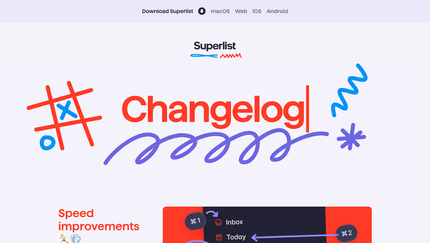
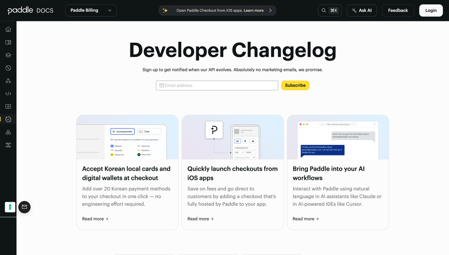
Design with AI
Generate a new design based on this screen using your own content.
# Design from Reference: Bento Changelog
Create an original, high-fidelity visual design inspired by the reference. Prioritize composition, typography, colors, spacing, and component styling over technical implementation.
## Reference
- **Product:** Bento
- **Category:** Changelog
- **Screenshot:** https://cdn.prod.website-files.com/5e9dc792e1210c5325f7ebbc/6acb6f563156cd8dbc4713cf_6acb6e7eddc9482c9279be2b_cms-3b32e132fe96449af408afcf.webp
Analyze the screenshot first. If inaccessible, request it rather than guessing.
## Content
{{content.instructions}}
{{content.data}}
Preserve essential messaging and factual accuracy. Adapt structure and copy length for visual balance; never invent product claims.
## Visual Design
### Overall aesthetic
- **Character:** Playful visual changelog composed of rounded modular widgets, social previews and colorful product examples.
### Page composition
- **Canvas:** 1440 × 7466 screenshot pixels; CSS estimates are near screenshot scale, with capture scale unverified.
- **Structure:** Large left identity/title block and a wider right chronological feed. Each dated release combines an asymmetric grid of images, widgets and launch links.
### Information hierarchy
- **Priority:** Changelog title/description establishes context; bold date/title lines introduce releases. Visual examples dominate rather than long prose.
### Typography
- **Family:** Neutral sans-serif; exact font is unverified.
- **Scale:** Estimated CSS title 44–48px bold, intro 20px, release headings 18px and widget copy 14–18px.
### Colors & surfaces
- **Sampled palette:** White #FFFFFF; pale blue #F6FAFE; warm pale pink #FAF1F0; saturated blue #4796DF; orange #DC7645.
- **Accents:** Pastel mint, purple and pink cards mix with service-specific icon colors.
### Components
- **Widgets:** Square, wide and tall rounded cards with roughly 24–28px CSS radii, fine borders and subtle shadows.
- **Examples:** Rich social feeds, contribution grid, profile previews, phone/watch photographs and compact Launch Tweet/Thread cards.
- **Composition:** Some screenshots contain large blank areas; preserve their framing without inventing missing content.
### Visual rhythm
- **Spacing:** Approximately 40px grid gaps and 96–120px release intervals; asymmetric card heights create a varied but aligned rhythm.
### Responsive
- **Guidance:** Mobile is not shown. Move identity above feed and reflow each release into one/two columns while preserving date grouping.
### Adaptation guidance
- **Transfer:** Retain release-by-release widget storytelling and rounded modular system. Use actual target updates and original demonstrations.
Use this context to reproduce the reference's visual language: layout, typography, colors, spacing, borders, radii, and distinctive elements. The screenshot takes priority if descriptions conflict.
## Direction
{{preferences.fidelityInstructions}}
## Output
{{output.instructions}}
Deliver a polished, cohesive design with precise alignment, hierarchy, and spacing. Produce the requested visual artifact, not just a description. If unsupported, explain the limitation.