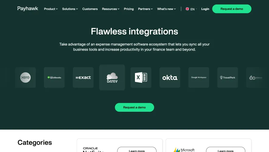
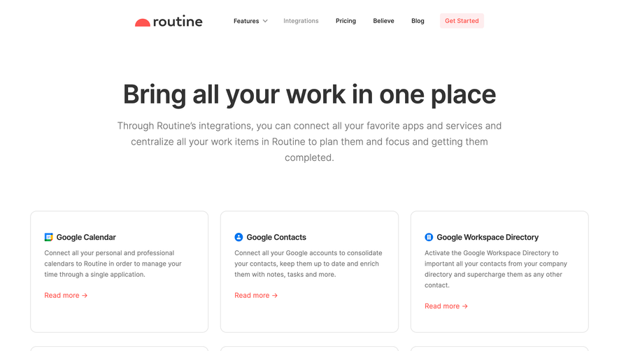
Generate a new design based on this screen using your own content.
Thank you! Your submission has been received!
Oops! Something went wrong while submitting the form.
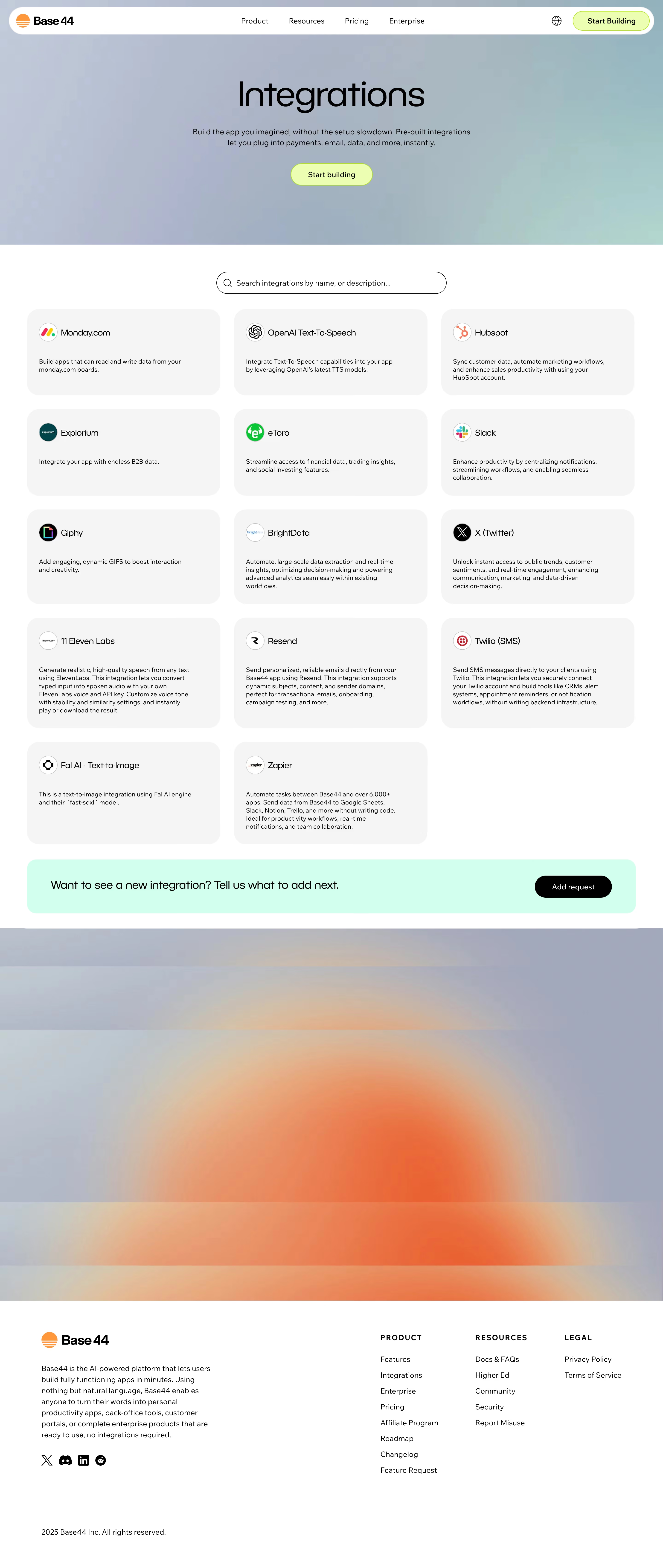
# Design from Reference: Base44 Integrations Library
Create an original, high-fidelity visual design inspired by the reference. Prioritize composition, typography, colors, spacing, and component styling over technical implementation.
## Reference
- **Product:** Base44
- **Category:** Integrations Library
- **Screenshot:** https://cdn.prod.website-files.com/5e9dc792e1210c5325f7ebbc/6acad414c910b3adf9e48e41_6acad1ba567bc9a3079b3a1a_cms-9e8d1a2e09fb47197c36f6a7.webp
Analyze the screenshot first. If inaccessible, request it rather than guessing.
## Content
{{content.instructions}}
{{content.data}}
Preserve essential messaging and factual accuracy. Adapt structure and copy length for visual balance; never invent product claims.
## Visual Design
Use this context to reproduce the reference's visual language: layout, typography, colors, spacing, borders, radii, and distinctive elements. The screenshot takes priority if descriptions conflict.
## Direction
{{preferences.fidelityInstructions}}
## Output
{{output.instructions}}
Deliver a polished, cohesive design with precise alignment, hierarchy, and spacing. Produce the requested visual artifact, not just a description. If unsupported, explain the limitation.
Base44’s Integrations page delivers a modern, minimalist aesthetic with a hyper-professional feel. The design balances clean whitespace with a crisp, uncluttered layout, channeling a sense of confidence and efficiency that’s ideal for a SaaS audience. Playful micro-interactions and soft gradients inject subtle dynamism without sacrificing clarity.
Layout and Structure
The page leads with a concise hero section, clearly stating its integrations offering alongside a subtle, welcoming animation. The main content employs a grid layout to elegantly showcase integrations through easily scannable logo blocks. Notably absent are distractions like testimonials or pricing — focus remains single-mindedly on integrations. Clear navigation in the header and informative footer reinforce site cohesion.
Visual Elements
Distinctive integration icons and partner logos serve as primary visual anchors, rendered in monochrome to unify the look while allowing occasional color pops on hover. Soft drop shadows and card-based containers provide tactile depth, enhancing legibility and visual hierarchy. Minimal motion effects on scroll and hover create a sense of interactivity and polish.
Color Palette and Typography
A soothing, tech-oriented palette of midnight blue, white, and gentle gray underpins the design. Vibrant accent colors — like light blue and lime green — punctuate CTAs for rapid recognition. Typography leverages geometric sans-serifs for headlines, paired with humanist body text for warmth and approachability, ensuring a clear hierarchy and effortless reading.
User Experience Patterns & Notable Choices
Intuitive navigation and sticky CTAs optimize user journeys, while a prominent integration search/filter tool caters directly to user needs. The absence of clutter, paired with personalized interaction cues, reinforces trust and expertise. Notably, the visual cohesion of integration icons, matched with smooth micro-interactions, elevates both usability and memorable brand character.