Overall Style and Aesthetic
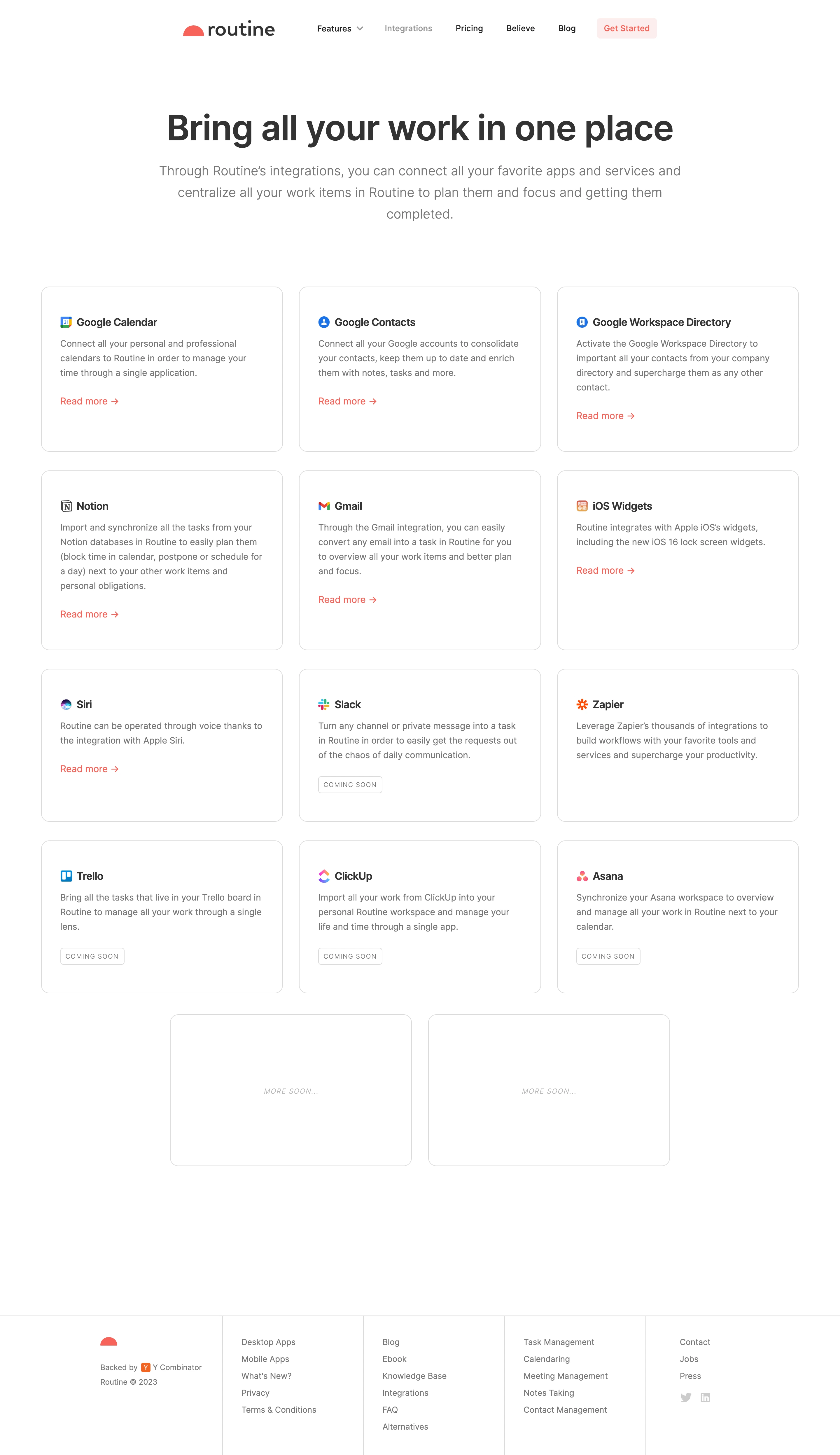
Routine’s Integrations page embodies a polished, modern minimalism that balances professionalism with a warm, approachable tone. Clean lines, abundant white space, and restrained use of color create an inviting atmosphere that never feels sterile. The aesthetic leans toward tech-chic—subtle yet engaging—instilling trust while maintaining a sense of innovation. Layout and Structure
The layout is intuitively structured, starting with a visually impactful hero section that immediately communicates the page’s focus. Integrations are showcased using a well-organized grid, making scanning effortless. Subtle dividing lines and thoughtful groupings establish hierarchy without visual clutter. There’s logical progression: a succinct intro, a grid of integration cards, and simple navigation to related resources and calls to action. Visual Elements
Custom, colorful app icons dominate, imparting vibrancy and clarity to each integration. Micro-interactions enliven the grid—cards subtly lift on hover for tactile feedback. There are no overwhelming illustrations or videos; instead, focused iconography and minimal, purposeful animations maintain user attention and support fast comprehension. Color Palette and Typography
A soothing blend of white, deep navy, and turquoise defines the site’s identity, accented by pops of color from app logos. Sans-serif fonts drive clarity, with bold weights for headlines and comfortable body text, fostering an easy reading flow. Typography and color reinforce hierarchy, guiding the eye seamlessly from section to section. User Experience Patterns
Sticky navigation and prominent CTAs enable quick access to actions and resources. Integration cards are easily clickable, supporting efficient browsing. Responsive design ensures every element feels tailored for any device. The experience feels user-first: clean, intuitive, and never overwhelming. Unique or Notable Design Choices
Standout choices include the concise, distraction-free integration grid, micro-animation details, and branded iconography that doubles as visual navigation. The overall tone is quietly confident and forward-thinking—perfect inspiration for SaaS teams seeking design that’s both inviting and highly functional.