Design with AI
Generate a new design based on this screen using your own content.
# Design from Reference: Baremetrics Activation Emails
Create an original, high-fidelity visual design inspired by the reference. Prioritize composition, typography, colors, spacing, and component styling over technical implementation.
## Reference
- **Product:** Baremetrics
- **Category:** Activation Emails
- **Screenshot:** https://cdn.prod.website-files.com/5e9dc792e1210c5325f7ebbc/6acbceb575891049b18401d8_6acbcd257baf79c89e85b3e8_cms-027efa6679c42383f451771f.webp
Analyze the screenshot first. If inaccessible, request it rather than guessing.
## Content
{{content.instructions}}
{{content.data}}
Preserve essential messaging and factual accuracy. Adapt structure and copy length for visual balance; never invent product claims.
## Visual Design
### Overall aesthetic
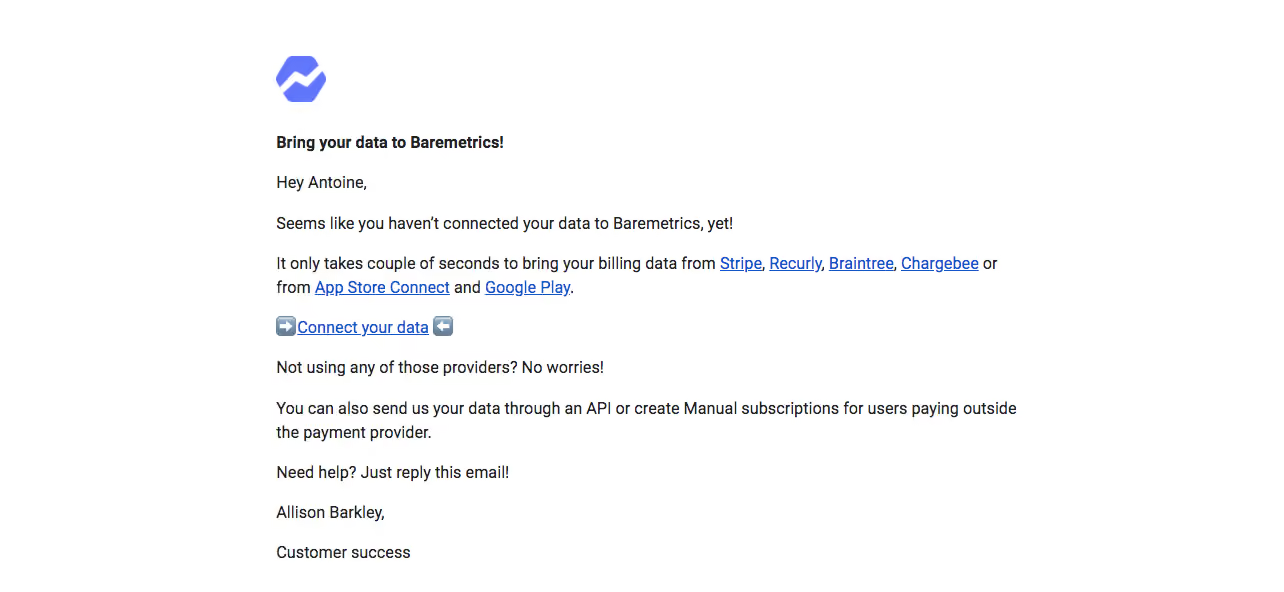
- **Style:** Plain-text-like activation email with a small blue brand mark and inline underlined links.
- **Character:** Direct, compact, personal correspondence rather than a card-based marketing layout.
- **Decoration:** Minimal; logo color and a pair of arrow emoji around the main link supply the only prominent accents.
### Page composition
- **Capture:** 1284 × 592 image px. Measurements describe screenshot pixels; email-client CSS scale and zoom are unverified.
- **Content column:** Begins around x=276px and extends to approximately x=1018px, leaving broad white margins.
- **Brand:** Small blue geometric logo near the top-left content edge, about 50 × 46 image px.
- **Message:** Bold short heading, greeting, reminder paragraph, linked provider list, primary connection link, alternative-method explanation, help sentence, and two-line signature.
- **Layout:** Single left-aligned column with no enclosing border, background panel, or visible footer navigation.
### Information hierarchy
- **Heading:** Bold one-line activation prompt introduces the task.
- **Provider choices:** Blue underlined provider names are embedded in a normal paragraph.
- **Primary link:** Connect your data appears on its own line between directional emoji, making it more conspicuous without a filled button.
- **Fallback:** API/manual-data explanation follows as lower-priority body text.
- **Support:** Reply-for-help sentence and customer-success signature close the message.
### Typography
- **Family:** Arial-like sans serif; exact identity is unverified.
- **Body:** Approximately 16 image px regular with 24px line-height.
- **Heading:** Approximately 16 image px bold, matching body scale rather than using a large display style.
- **Links:** Same approximate size as body, blue and underlined.
- **Signature:** Regular body-size text on two separated lines.
- **Precision:** Image-scale estimates should not be treated as extracted email CSS values.
### Colors & surfaces
- **Canvas:** Sampled #FFFFFF.
- **Text:** Sampled #222222 among dark body pixels.
- **Link blue:** Sampled #1155CC.
- **Brand blue:** Sampled #6077FC.
- **Emoji colors:** Small gray-blue and pale warm pixels belong to rendered emoji details rather than a broader page palette.
- **Surface treatment:** Flat white background with no card shadow or visible rule.
### Components
- **Brand mark:** Compact blue geometric symbol, left aligned above the heading.
- **Inline links:** Several provider names within a wrapping paragraph; conventional underline treatment.
- **Main action:** Standalone underlined link bracketed by arrow emoji, without button padding or enclosing shape.
- **Paragraph groups:** Short text blocks with approximately 16–20 image px of extra vertical separation.
- **Signature:** Name line and role line, with no portrait or promotional banner.
- **State limits:** Static email only; link destinations and connection behavior are not demonstrated.
### Visual rhythm
- **Alignment:** Logo, heading, body, main link, and signature share one left edge.
- **Text density:** Short paragraphs keep the compact email easy to scan.
- **Action pause:** A separate line around the main link creates a clear break in the prose.
- **Whitespace:** Large outer margins keep the letter-like message isolated.
### Responsive
- **Observed state:** One email capture; mobile and email-client variants are unverified.
- **Layout recommendation:** Use a fluid single column with 20–24px side padding on narrow screens.
- **Links recommendation:** Allow provider names and paragraphs to wrap naturally without horizontal overflow.
- **Action recommendation:** Make the connection link comfortably tappable while retaining the simple correspondence style.
### Adaptation guidance
- **Preserve:** Small brand mark, concise activation reminder, inline provider choices, isolated main link, and support close.
- **Content fidelity:** Populate actual supported sources and fallback methods from supplied product information; captured claims are historical copy.
- **Personalization:** Use approved recipient/signature data without copying personal identifiers from the screenshot.
- **Email implementation:** Keep markup simple and compatible with email clients, with meaningful real link labels and destinations.
- **Scale guidance:** Establish the intended email width independently of screenshot dimensions.
Use this context to reproduce the reference's visual language: layout, typography, colors, spacing, borders, radii, and distinctive elements. The screenshot takes priority if descriptions conflict.
## Direction
{{preferences.fidelityInstructions}}
## Output
{{output.instructions}}
Deliver a polished, cohesive design with precise alignment, hierarchy, and spacing. Produce the requested visual artifact, not just a description. If unsupported, explain the limitation.