Design with AI
Generate a new design based on this screen using your own content.
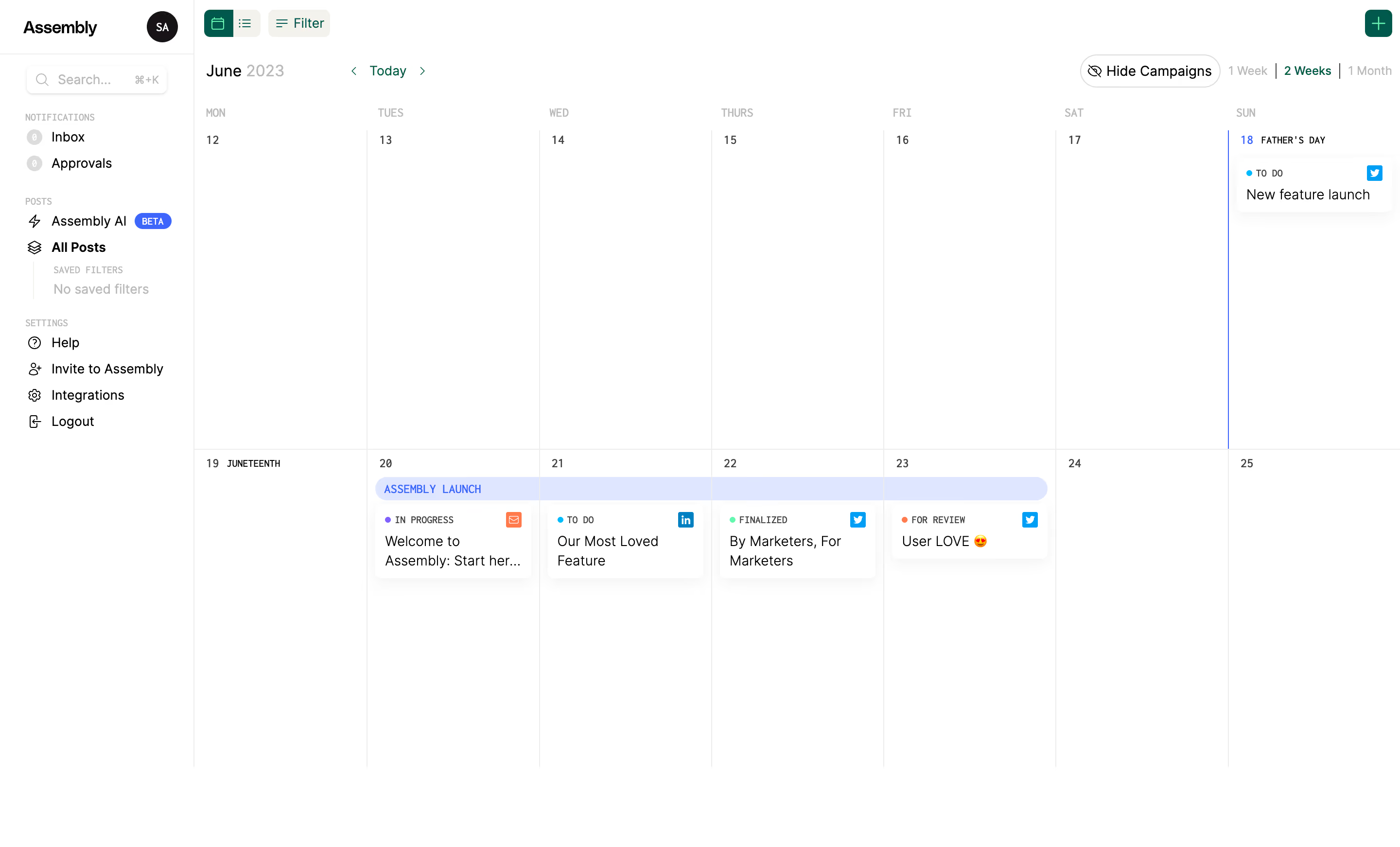
# Design from Reference: Assembly Calendar
Create an original, high-fidelity visual design inspired by the reference. Prioritize composition, typography, colors, spacing, and component styling over technical implementation.
## Reference
- **Product:** Assembly
- **Category:** Calendar
- **Screenshot:** https://cdn.prod.website-files.com/5e9dc792e1210c5325f7ebbc/6acb6756994832179b5604ee_6acb65645391d62536b4fe71_cms-335b104b7362fc497f3f631a.webp
Analyze the screenshot first. If inaccessible, request it rather than guessing.
## Content
{{content.instructions}}
{{content.data}}
Preserve essential messaging and factual accuracy. Adapt structure and copy length for visual balance; never invent product claims.
## Visual Design
### Overall aesthetic
- **Character:** Extremely light calendar workspace with fine rules, compact controls and small colored workflow indicators.
### Page composition
- **Canvas:** 2880 × 1742 screenshot pixels; CSS estimates assume approximately 2× scale.
- **Structure:** Narrow fixed-looking left navigation and a wide seven-column, two-week calendar. Toolbar, month navigation and view-duration controls occupy the top.
### Information hierarchy
- **Priority:** Selected calendar view, current month and date grid lead into sparse scheduled post cards.
- **Grouping:** A pale campaign strip spans multiple days; each post shows status, channel icon and short title.
### Typography
- **Family:** Compact sans-serif with some uppercase/technical metadata; exact font is unverified.
- **Scale:** Estimated CSS body/post titles 14px, sidebar 13px, date labels 11–12px and tiny status metadata 9–10px.
### Colors & surfaces
- **Sampled palette:** White #FFFFFF; lavender campaign #DFE6FF; fine borders #EDEDED; black #000000.
- **Accents:** Deep green toolbar selection and add button, blue campaign/current-date accents and small multicolor status dots/channel marks.
### Components
- **Calendar:** Seven equal day columns and two tall week rows separated by hairline rules.
- **Post cards:** Small white rounded cards with very subtle shadows, compact metadata and clipped long titles. Estimated 6px radius and 10px padding.
- **Sidebar:** Search, notification counts, saved filters and settings groups with tiny icons; top account avatar.
### Visual rhythm
- **Spacing:** Large empty calendar cells dominate; compact cards occupy only their scheduled dates.
- **Alignment:** Fine column lines and repeated card headers make sparse content easy to locate.
### Responsive
- **Guidance:** Mobile is not shown. Offer an agenda view or horizontal date scrolling instead of shrinking seven columns into unreadable cells.
### Adaptation guidance
- **Transfer:** Retain calendar/campaign/post hierarchy and restrained status colors. Adapt channels and workflow states to the target planning process.
Use this context to reproduce the reference's visual language: layout, typography, colors, spacing, borders, radii, and distinctive elements. The screenshot takes priority if descriptions conflict.
## Direction
{{preferences.fidelityInstructions}}
## Output
{{output.instructions}}
Deliver a polished, cohesive design with precise alignment, hierarchy, and spacing. Produce the requested visual artifact, not just a description. If unsupported, explain the limitation.