
Thank you! Your submission has been received!
Oops! Something went wrong while submitting the form.
Get SaaSFrame Pro
Monthly
$18
Quarterly
$48
Yearly
$180
Upgrade to access this feature
Browse all screens & flows
Filter and search screens & flows
Access Figma files
Access mobile versions
Bookmark screens & flows
Join now
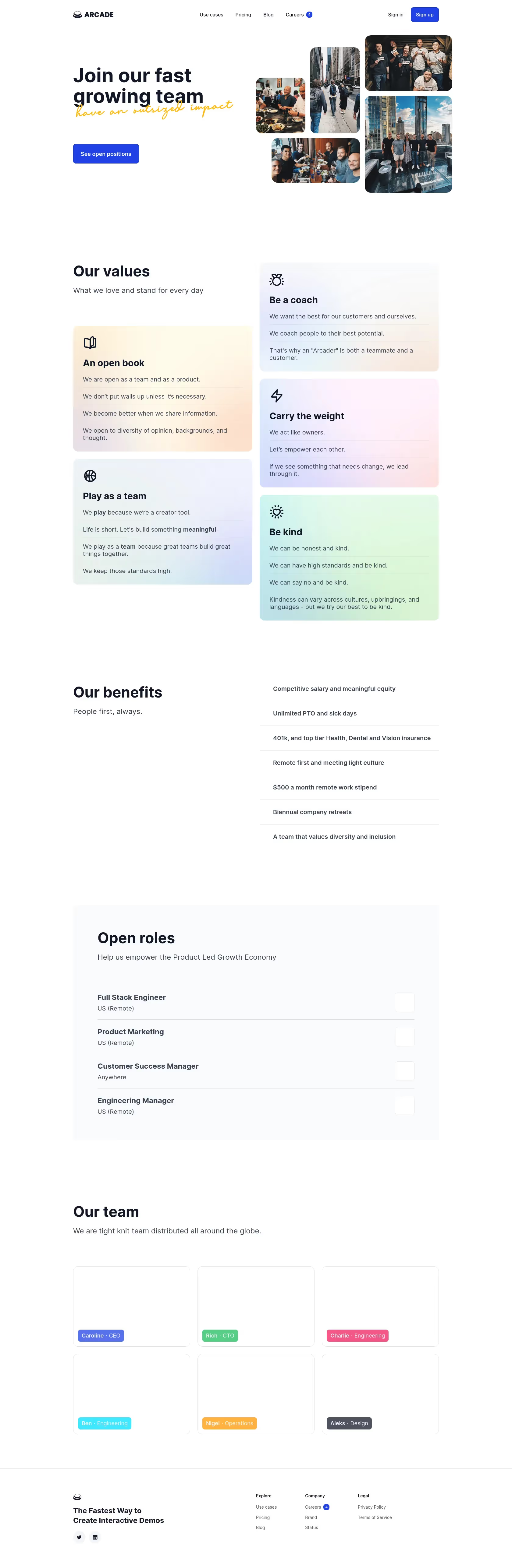

Arcade Careers Page

Arcade
Interactive product demos
Designed by
No items found.

Bookmark
Bookmark

Design with AI
Thank you! Your submission has been received!
Oops! Something went wrong while submitting the form.
# Design from Reference: Arcade Careers Page
Create an original, high-fidelity visual design inspired by the reference. Prioritize composition, typography, colors, spacing, and component styling over technical implementation.
## Reference
- **Product:** Arcade
- **Category:** Careers Page
- **Screenshot:** https://cdn.prod.website-files.com/5e9dc792e1210c5325f7ebbc/63dd9e740bdcdf39ada6dd2a_screenshot.webp
Analyze the screenshot first. If inaccessible, request it rather than guessing.
## Content
{{content.instructions}}
{{content.data}}
Preserve essential messaging and factual accuracy. Adapt structure and copy length for visual balance; never invent product claims.
## Visual Design
### Overall aesthetic
- **Character:** A spacious careers page with dark navy sans-serif typography, vivid blue actions and warm team photography. Pastel gradient value cards and a handwritten yellow hero accent add a friendly company-culture tone.
- **Image basis:** The 1680 × 5150 screenshot was inspected throughout at approximately 1400 px wide in four crops. Dimensions below are inspection-pixel estimates; CSS scale and font identities are unverified.
- **Capture limitation:** Team-profile cards and small role-action squares appear visually blank in the source. No missing portraits or icons are inferred.
### Page composition
- **Header:** A centered approximately 1000 px container places the brand left, navigation in the middle and sign-in/signup right. The Careers link includes a small blue count badge.
- **Hero:** A left text column uses a bold two-line heading, a handwritten accent line and a blue positions button. A five-photo collage fills the right half with staggered rounded rectangles.
- **Values:** The section begins with a left heading and subtitle. Five pastel gradient cards occupy two staggered columns, each with a line icon, title and several statements divided by fine rules.
- **Benefits:** A left title/subtitle pairs with a seven-row right-hand benefit list, separated by thin horizontal lines.
- **Roles:** A broad pale-gray panel contains heading, short description and four job rows. Titles and location metadata align left; blank outlined action squares align right.
- **Team and footer:** A heading and short introduction precede six blank outlined profile cards in a three-column, two-row grid, each with a colored name/role tag near the lower left. A ruled footer contains brand message, social buttons and three small link columns.
### Information hierarchy
- **Hero priority:** The large recruitment headline and blue positions action dominate. The yellow handwritten phrase overlaps the headline's lower region as a supporting accent.
- **Culture:** Value-card titles and icons introduce short statements; internal rules make longer cards easy to scan.
- **Practical details:** Benefits use semibold single-line or wrapping entries. Job titles are bolder than their location metadata.
- **Team:** Colored tags establish profile identity despite the blank image regions. The screenshot does not explain why those regions are empty.
- **Footer:** Small grouped links remain subordinate to the brand statement.
### Typography
- **Hero:** Approximately 54–56 px bold sans-serif with tight line-height. The yellow handwritten phrase is around 38 px with a flowing script appearance; family identity is unverified.
- **Section headings:** Approximately 40–42 px bold, with supporting text around 20 px and 27 px line-height.
- **Value cards:** Titles are around 26 px bold; statements use approximately 17 px regular with 21–23 px line-height.
- **Roles and benefits:** Job titles are around 21 px semibold, locations around 17 px regular, and benefits around 17 px semibold.
- **Utility:** Header links are around 14 px, profile tags around 14–15 px and footer links around 12 px. Exact CSS metrics remain unverified.
### Colors & surfaces
- **Measured base:** White #FFFFFF dominates. Near-white #F9FBFC and #FDFFFF appear in pale surfaces.
- **Measured gradient tones:** Warm pale #FFFBEA and #FFF9E9, plus pink #FFF2FD, occur among the pastel value-card surfaces.
- **Text and actions:** Dark navy headings contrast with medium-gray body text. Saturated royal blue marks signup, the hero action and the careers count badge.
- **Supporting accents:** Yellow script, multicolored profile tags and natural photography provide warmth. Gradient cards mix cream, peach, lavender, mint and pale blue rather than using solid saturated fills.
### Components
- **Hero button:** Approximately 180 × 53 px, blue filled, with roughly 6 px corners and centered white text.
- **Photo collage:** Five differently sized rounded photos form a compact mosaic. The tallest right image is about 238 × 265 px; gaps are narrow and consistent.
- **Value cards:** Approximately 490 px wide with around 14 px corners and roughly 27 px padding. Each has a dark line icon, bold title and separated statement rows.
- **Benefits:** Open text rows use thin gray separators and approximately 67 px vertical cadence, without enclosing cards.
- **Roles panel:** Roughly 1000 px wide, softly tinted, with generous around 66 px side padding. Each row combines title/location and a small approximately 53 px outlined square.
- **Team cards:** Approximately 320 × 220 px, thin gray outlines and roughly 14 px corners. Colored tags sit near the bottom-left; the card interiors are blank as captured.
- **Footer:** A fine top rule separates a four-part layout. Two small pale circular social controls sit below the left brand message. No hover, focus or opened role state is visible.
### Visual rhythm
- **Shared container:** Hero, values, benefits, roles and team align to a roughly 1000 px central width with broad side margins.
- **Macro whitespace:** Large gaps, often around 150–200 px, separate major sections, emphasizing an unhurried recruitment narrative.
- **Staggered values:** Unequal card heights and offset columns create a masonry-like rhythm while preserving consistent widths and gutters.
- **Regular grids:** Roles and team sections return to strict row/grid alignment after the more expressive value section.
### Responsive
- **Evidence limit:** Only the wide page is observed.
- **Recommended hero:** Stack the collage below the text, reduce heading size fluidly and keep the script accent from colliding with body copy.
- **Recommended cards:** Convert staggered values to a single ordered column on narrow screens, preserving statement separators.
- **Recommended lists:** Stack benefits below their heading and allow job titles/locations to wrap with an explicit accessible role action.
- **Recommended team:** Reduce profile columns progressively and use stable image placeholders if portraits are unavailable. Collapse header/footer navigation appropriately.
### Adaptation guidance
- **Preserve:** Retain the broad whitespace, warm photography, pastel value cards, clear role list and strong blue recruitment action.
- **Build:** Use reusable value-card, benefit-row, role-row and team-profile components with consistent widths and spacing.
- **Handle missing media:** Represent unavailable portraits and action icons intentionally rather than inventing content from blank source regions.
- **Validate:** Confirm fonts, responsive card order, gradient-text contrast and role-link behavior. Treat visible recruitment details as screenshot content rather than current vacancies.
Use this context to reproduce the reference's visual language: layout, typography, colors, spacing, borders, radii, and distinctive elements. The screenshot takes priority if descriptions conflict.
## Direction
{{preferences.fidelityInstructions}}
## Output
{{output.instructions}}
Deliver a polished, cohesive design with precise alignment, hierarchy, and spacing. Produce the requested visual artifact, not just a description. If unsupported, explain the limitation.


Category
Patterns
No items found.
Tech Stack


Added on
February 4, 2023
Similar screens



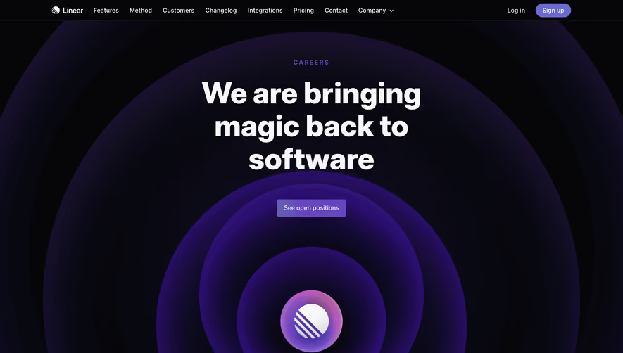



Upgrade to SaaSFrame Pro now to see similar examples.
Monthly
$18 /month
Billed $18 monthly
Browse all screens & flows
Filter and search screens & flows
Search text in screenshots
Access Figma files
Access mobile versions
Join now
Quarterly
$16 /month
Billed $48 quarterly
Browse all screens & flows
Filter and search screens & flows
Search text in screenshots
Access Figma files
Access mobile versions
Join now
Yearly
$15 /month
Billed $180 yearly
Browse all screens & flows
Filter and search screens & flows
Search text in screenshots
Access Figma files
Access mobile versions
Join now