
Thank you! Your submission has been received!
Oops! Something went wrong while submitting the form.
Get SaaSFrame Pro
Monthly
$18
Quarterly
$48
Yearly
$180
Upgrade to access this feature
Browse all screens & flows
Filter and search screens & flows
Access Figma files
Access mobile versions
Bookmark screens & flows
Join now
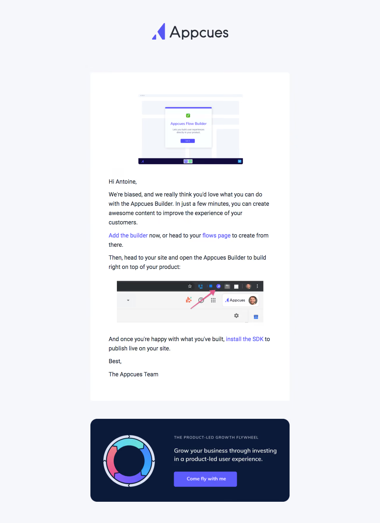
Appcues Onboarding Emails

Appcues
The Product-Led Growth Platform
Designed by
No items found.

Bookmark
Bookmark

Design with AI
Thank you! Your submission has been received!
Oops! Something went wrong while submitting the form.
# Design from Reference: Appcues Onboarding Emails
Create an original, high-fidelity visual design inspired by the reference. Prioritize composition, typography, colors, spacing, and component styling over technical implementation.
## Reference
- **Product:** Appcues
- **Category:** Onboarding Email
- **Screenshot:** https://cdn.prod.website-files.com/5e9dc792e1210c5325f7ebbc/6acbd0438f05a14579f04734_6acbcd28e13ab9df8f058b70_cms-175b8e9f464f997940df8c8b.webp
Analyze the screenshot first. If inaccessible, request it rather than guessing.
## Content
{{content.instructions}}
{{content.data}}
Preserve essential messaging and factual accuracy. Adapt structure and copy length for visual balance; never invent product claims.
## Visual Design
### Overall aesthetic
- **Style:** Branded instructional email with a pale blue-gray background, white content panel and a contrasting navy promotional card.
- **Character:** Violet links, product screenshots and a colorful circular diagram create a polished product-education presentation.
- **Capture:** The image measures 1307 × 1797 pixels. Email scale is unverified; observed dimensions below are screenshot pixels, with CSS suggestions treated as estimates.
### Page composition
- **Brand header:** A large centered Appcues mark sits above the message.
- **Main panel:** A white rounded rectangle approximately 685 image pixels wide contains a product illustration, greeting, instructional paragraphs, inline links, a browser screenshot and team sign-off.
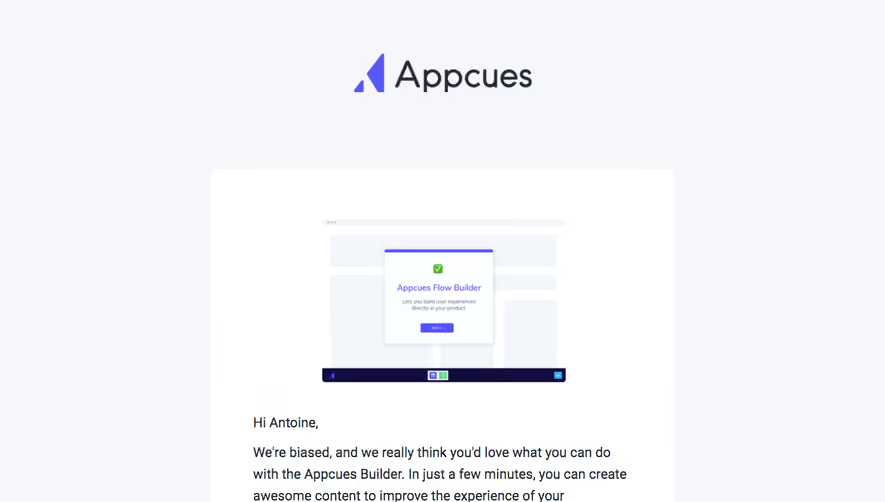
- **Opening media:** A centered simplified builder screenshot precedes the text.
- **Instructional media:** A wide browser-toolbar image sits between explanatory paragraphs, with an arrow pointing to an extension icon.
- **Secondary card:** A separate navy panel below combines a circular growth diagram on the left with eyebrow text, short copy and a violet button on the right.
- **Surround:** Broad pale margins and a clear gap distinguish the two content modules.
### Information hierarchy
- **Brand:** The centered logo anchors the top without a separate email headline.
- **Instruction:** Conversational body copy explains using the builder and links directly to setup destinations.
- **Linked steps:** Violet phrases emphasize adding the builder, opening the flows page and installing the SDK.
- **Visual guidance:** The toolbar screenshot clarifies where the extension is accessed.
- **Secondary promotion:** The lower card has a small uppercase label, a short message and a button, clearly separate from onboarding instructions.
- **State scope:** The images demonstrate product UI; they are not live controls within the email.
### Typography
- **Body family:** A sans-serif is visible; exact identity is unverified.
- **Body scale:** Approximately 19–20 image pixels with around 31-pixel line height; a typical email implementation could use roughly 16-pixel CSS text depending on capture scale.
- **Links:** Violet inline phrases retain the surrounding body size and stand out through color.
- **Promotional label:** Small uppercase text uses increased tracking.
- **Promotional copy:** Approximately 20 image pixels with regular-to-medium weight.
- **Button:** Approximately 16 image pixels, semibold, white and centered.
### Colors & surfaces
- **Measured background:** Pale blue-gray #F5F7FA fills the outer canvas.
- **Measured content:** White #FFFFFF fills the main panel.
- **Measured promotional surface:** Navy #0B1A38 supports the lower card.
- **Measured accent:** Violet #5C5BFC appears in links and button areas.
- **Measured text:** Dark #242A35, #32363A and #282C2F occur among principal text pixels.
- **Supporting surfaces:** #F3F6FB and #F5F5F5 appear in embedded product artwork.
- **Depth:** The email panels are largely flat; the product illustration contains subtle internal shadows.
### Components
- **Logo:** Violet symbol and dark wordmark form a centered header treatment.
- **Main container:** Approximately 685 pixels wide, with small rounded corners and roughly 60-pixel horizontal text inset.
- **Builder illustration:** A compact mock interface depicts a centered in-product message over pale page blocks and a dark lower toolbar.
- **Inline actions:** Text links replace a large primary button in the instructional message.
- **Toolbar screenshot:** A wide browser crop includes a colored pointer arrow and extension/menu details.
- **Sign-off:** A short closing and team name end the white panel.
- **Promotion card:** A rounded navy rectangle approximately 685 × 285 image pixels uses a two-column image/text composition.
- **Diagram:** A segmented multicolor ring occupies the left promotional column.
- **Promotion button:** A violet rectangular action with small corners sits beneath the supporting copy.
- **State scope:** No email-client toolbar, unsubscribe area or later onboarding installment is visible.
### Visual rhythm
- **Centered modules:** Logo, white panel and navy card share the same vertical axis.
- **Instruction spacing:** Short paragraphs and links are separated by modest gaps, with larger pauses around screenshots.
- **Reading measure:** Narrow text width maintains a manageable line length despite the tall email.
- **Module contrast:** The navy card introduces a clear visual shift after the white instructional message.
- **Outer whitespace:** Broad side margins and a generous inter-card gap prevent the lower promotion from merging with the guide.
### Responsive
- **Recommendation — containers:** Use fluid widths capped at a readable email measure.
- **Recommendation — media:** Scale screenshots within the content width and provide useful alternative text.
- **Recommendation — promotion:** Stack the ring illustration above copy on narrow screens.
- **Recommendation — links:** Preserve readable inline link wrapping and clear button targets.
- **Recommendation — typography:** Maintain body size rather than shrinking the entire email. No mobile rendering is evidenced.
### Adaptation guidance
- **Preserve instruction order:** Explain the builder, show where to access it and provide the publishing prerequisite afterward.
- **Separate promotion:** Keep the growth-resource card visually independent from required onboarding guidance.
- **Reuse the palette:** Combine pale surround, white content, navy secondary surface and violet actions.
- **Keep screenshots specific:** Use focused product crops that clarify the described step rather than generic illustrations.
- **Maintain email compatibility:** Use robust block structure, descriptive links and responsive images.
- **Avoid inferring behavior:** The static email does not establish extension installation, SDK status or destination outcomes.
Use this context to reproduce the reference's visual language: layout, typography, colors, spacing, borders, radii, and distinctive elements. The screenshot takes priority if descriptions conflict.
## Direction
{{preferences.fidelityInstructions}}
## Output
{{output.instructions}}
Deliver a polished, cohesive design with precise alignment, hierarchy, and spacing. Produce the requested visual artifact, not just a description. If unsupported, explain the limitation.


Category
Patterns
No items found.
Tech Stack


Added on
May 1, 2020

Similar screens





Upgrade to SaaSFrame Pro now to see similar examples.
Monthly
$18 /month
Billed $18 monthly
Browse all screens & flows
Filter and search screens & flows
Search text in screenshots
Access Figma files
Access mobile versions
Join now
Quarterly
$16 /month
Billed $48 quarterly
Browse all screens & flows
Filter and search screens & flows
Search text in screenshots
Access Figma files
Access mobile versions
Join now
Yearly
$15 /month
Billed $180 yearly
Browse all screens & flows
Filter and search screens & flows
Search text in screenshots
Access Figma files
Access mobile versions
Join now