Overall Style and Aesthetic
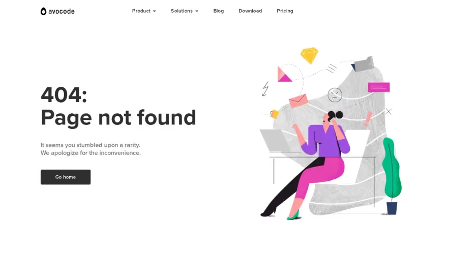
Airtable’s 404 page embodies a playful yet polished aesthetic. The design leans toward minimalism but is brought to life with vivid, whimsical illustration—balancing approachability and professionalism. The unexpected, cheerful visuals transform a potential frustration point into a delightful micro-experience, conveying both brand personality and user empathy. Layout and Structure
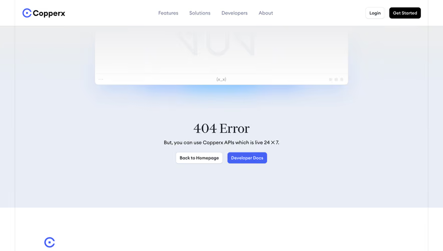
The layout centers content in a prominent hero section, eliminating distractions and keeping the user’s attention focused. There’s a concise headline (“404: Lost in the clouds”), a short, conversational subtext, and a prominent CTA to guide users back to the homepage. No extraneous elements, pricing or testimonials; the structure serves the sole purpose of reorienting the user gracefully. Visual Elements
A standout custom illustration dominates the design: a quirky “cloud explorer” motif with soft gradients and playful curves, lending character and memorability. The whimsical art immediately communicates the error in a gentle, human way. Minimal interface elements and no photographic or video clutter keep the mood light and focused. Color Palette and Typography
Airtable employs a cool, saturated color palette—teals, blues, and soft pastel accents—contrasted with ample white space. Typography is clean, geometric, and sans-serif, with clear hierarchy: bolded headline, supportive subtext, and a visually distinct CTA button. The use of color subtly guides the eye through the message sequence. User Experience and Unique Choices
Navigation is intuitive: the CTA stands out and offers clear direction home, minimizing user frustration. Interaction is single-step and frictionless, with the illustration keeping users engaged. The choice to inject brand whimsy into a 404 error is particularly notable, turning a dead-end page into a memorable, on-brand moment. The page is trustworthy and highly approachable—showcasing how micro-moments in SaaS UX can reinforce both usability and brand delight.