
Thank you! Your submission has been received!
Oops! Something went wrong while submitting the form.
Get SaaSFrame Pro
Monthly
$18
Quarterly
$48
Yearly
$180
Upgrade to access this feature
Browse all screens & flows
Filter and search screens & flows
Access Figma files
Access mobile versions
Bookmark screens & flows
Join now
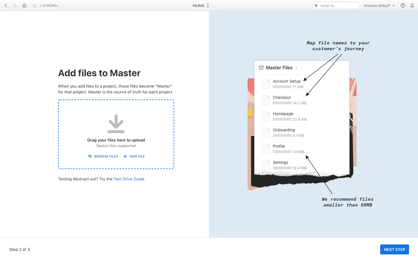
Abstract User Onboarding

Abstract
Version, Collaborate & Share
Designed by
No items found.

Bookmark
Bookmark

Design with AI
Thank you! Your submission has been received!
Oops! Something went wrong while submitting the form.
# Design from Reference: Abstract User Onboarding
Create an original, high-fidelity visual design inspired by the reference. Prioritize composition, typography, colors, spacing, and component styling over technical implementation.
## Reference
- **Product:** Abstract
- **Category:** User Onboarding
- **Screenshot:** https://cdn.prod.website-files.com/5e9dc792e1210c5325f7ebbc/6acbbf754d71070f5fd41483_6acbbe9c39e7f22db4027bc4_cms-9b45850c42f1d2daba968a9e.webp
Analyze the screenshot first. If inaccessible, request it rather than guessing.
## Content
{{content.instructions}}
{{content.data}}
Preserve essential messaging and factual accuracy. Adapt structure and copy length for visual balance; never invent product claims.
## Visual Design
### Overall aesthetic
- **Character:** A split onboarding step pairing a functional file-upload area with a pale blue explanatory collage. The left side is restrained and typographic; the right uses torn-paper layers, arrows and handwritten-style annotations.
- **Image basis:** The 1440 × 900 source was inspected at approximately 1400 × 875. Dimensions below are approximate inspection pixels; CSS scale and typeface identities are unverified.
### Page composition
- **Application chrome:** A thin roughly 36 px top bar contains navigation icons, sync status, a centered workspace selector, a jump field and account/help controls.
- **Main split:** The content is divided equally at x700. The white left half contains a roughly 390 px wide upload block beginning around x195, y233; the right half is pale blue.
- **Upload flow:** A large heading and short explanatory paragraph precede a dashed upload area. A small guide sentence/link sits below it.
- **Instruction artwork:** A white file-list panel sits over layered textured paper on the right, with two black arrow annotations pointing into it.
- **Step footer:** A white bottom bar separated by a fine rule shows Step 2 of 3 left and a blue Next Step button right.
### Information hierarchy
- **Task:** The bold title establishes adding files to the main project branch. A two-line paragraph explains the resulting file role.
- **Upload affordance:** A large downward arrow leads into the drop-zone instruction, supported file-type text and two blue utility actions.
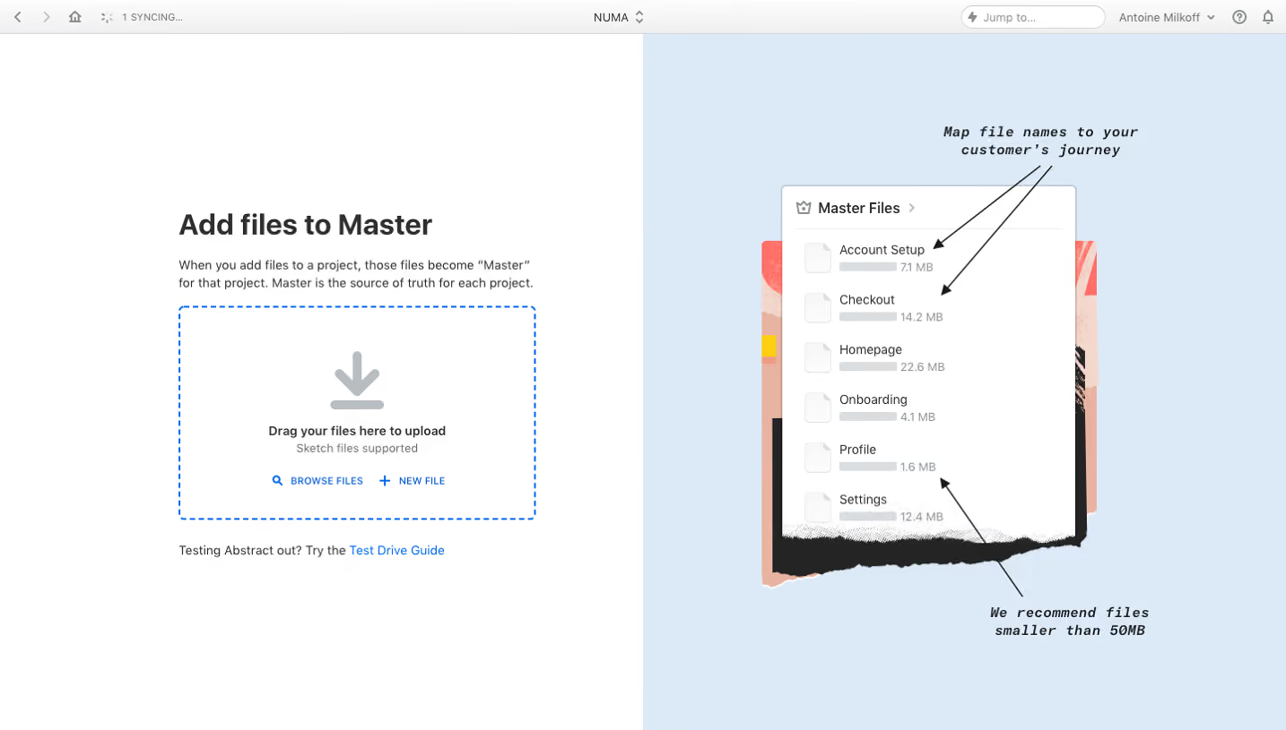
- **Guidance:** The right-side illustration explains naming and file-size recommendations. It is an instructional image rather than an interactive file browser.
- **Progress:** The bottom step count and Next Step action keep the user oriented. No uploaded-file result or error is visible.
### Typography
- **Heading:** Approximately 32 px bold sans-serif with compact line-height.
- **Body:** Explanatory text is around 14 px with approximately 20 px line-height.
- **Drop zone:** The main instruction is around 14 px semibold; supporting text is similar sized but muted. Browse/New File actions are small uppercase blue text.
- **Artwork and utilities:** Annotations use a bold italic monospaced or handwritten-style face around 16 px with visible tracking. Chrome and footer utility text are approximately 12–14 px. Actual font identities are unverified.
### Colors & surfaces
- **Measured foundations:** White #FFFFFF and pale blue #DEE9F6 define the two main halves.
- **Measured text:** Dark #242424 anchors content, with pale gray #DBDEE0 among rules and illustration details.
- **Measured accent:** Blue #1076E4 supplies upload actions, dashed boundary and the final button.
- **Artwork tones:** Warm peach #E0B6A4, coral, yellow and black appear in the layered collage. They are decorative image colors rather than form states.
### Components
- **Drop zone:** Approximately 389 × 234 px with a blue dashed border, roughly 6 px corners and centered contents. A large light-gray download arrow sits above the instruction.
- **Upload actions:** Browse Files and New File sit side by side with small leading search/plus icons and generous separation.
- **Guide link:** A short sentence ends in a bright blue text link beneath the drop zone.
- **File-list artwork:** A roughly 320 px wide white panel has a thin gray border, small corners, six file rows, pale document icons and gray size indicators. Torn lower edges and offset paper layers distinguish it from live UI.
- **Next action:** A compact approximately 96 × 33 px blue button uses uppercase white text and modest rounding.
- **Header chrome:** Compact icons, a pill-like jump field and account dropdown remain low contrast. No open menu or focused input is shown.
### Visual rhythm
- **Balance:** Equal white/blue halves give functional and educational content similar space.
- **Left alignment:** Heading, paragraph, drop zone and guide share one left edge and a bounded width.
- **Spacing:** The upload block has broad whitespace above and below; small repeated gaps connect its title, instruction and actions.
- **Footer anchoring:** The step bar spans both halves, visually separating navigation from the content area.
### Responsive
- **Evidence limit:** Only the desktop split view is visible.
- **Recommended stacking:** Keep the upload task first and place the explanatory artwork below, or replace it with concise text guidance on narrow screens.
- **Recommended upload:** Let the drop zone fill the available width while preserving the browse action for devices without drag-and-drop.
- **Recommended footer:** Keep progress and Next Step visible without covering content; allow the main area to scroll.
- **Recommended accessibility:** Provide text equivalents for essential naming and size guidance carried by the artwork.
### Adaptation guidance
- **Preserve:** Retain the clear drop zone, brief explanation, visual guidance and persistent step navigation.
- **Build:** Reuse upload-zone, guide-link and onboarding-footer components with explicit file selection, validation and progress states.
- **Separate artwork:** Treat the annotated file list as educational content, not a functioning list or an upload result.
- **Validate:** Confirm keyboard upload access, file constraints, error messaging, focus order and small-screen rendering.
Use this context to reproduce the reference's visual language: layout, typography, colors, spacing, borders, radii, and distinctive elements. The screenshot takes priority if descriptions conflict.
## Direction
{{preferences.fidelityInstructions}}
## Output
{{output.instructions}}
Deliver a polished, cohesive design with precise alignment, hierarchy, and spacing. Produce the requested visual artifact, not just a description. If unsupported, explain the limitation.


Category
Patterns
Tech Stack



Added on
February 4, 2023
Found in 1 flow

Similar screens






Upgrade to SaaSFrame Pro now to see similar examples.
Monthly
$18 /month
Billed $18 monthly
Browse all screens & flows
Filter and search screens & flows
Search text in screenshots
Access Figma files
Access mobile versions
Join now
Quarterly
$16 /month
Billed $48 quarterly
Browse all screens & flows
Filter and search screens & flows
Search text in screenshots
Access Figma files
Access mobile versions
Join now
Yearly
$15 /month
Billed $180 yearly
Browse all screens & flows
Filter and search screens & flows
Search text in screenshots
Access Figma files
Access mobile versions
Join now