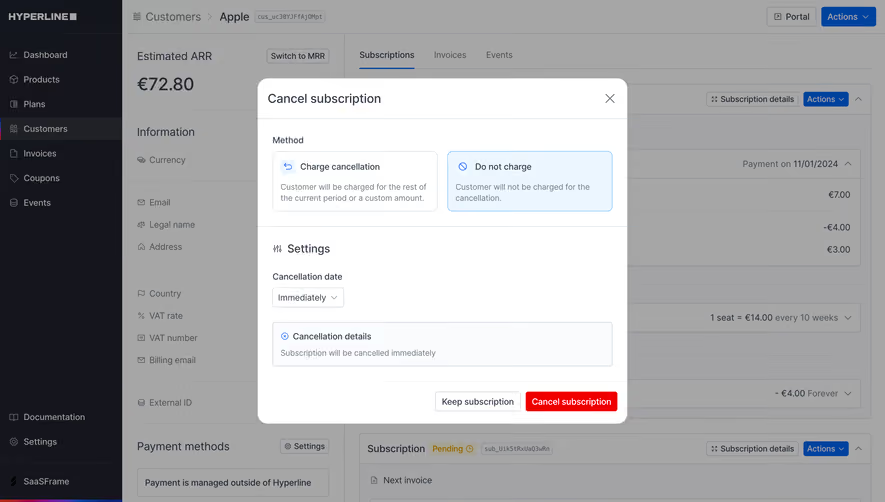
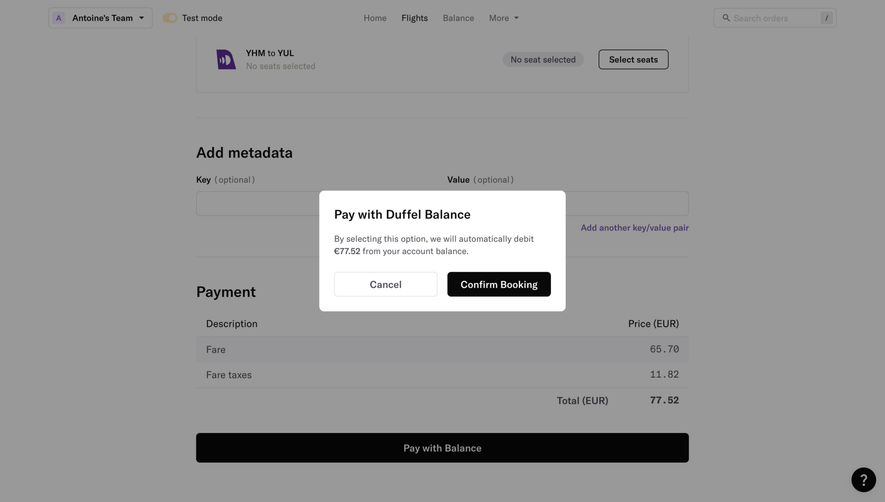
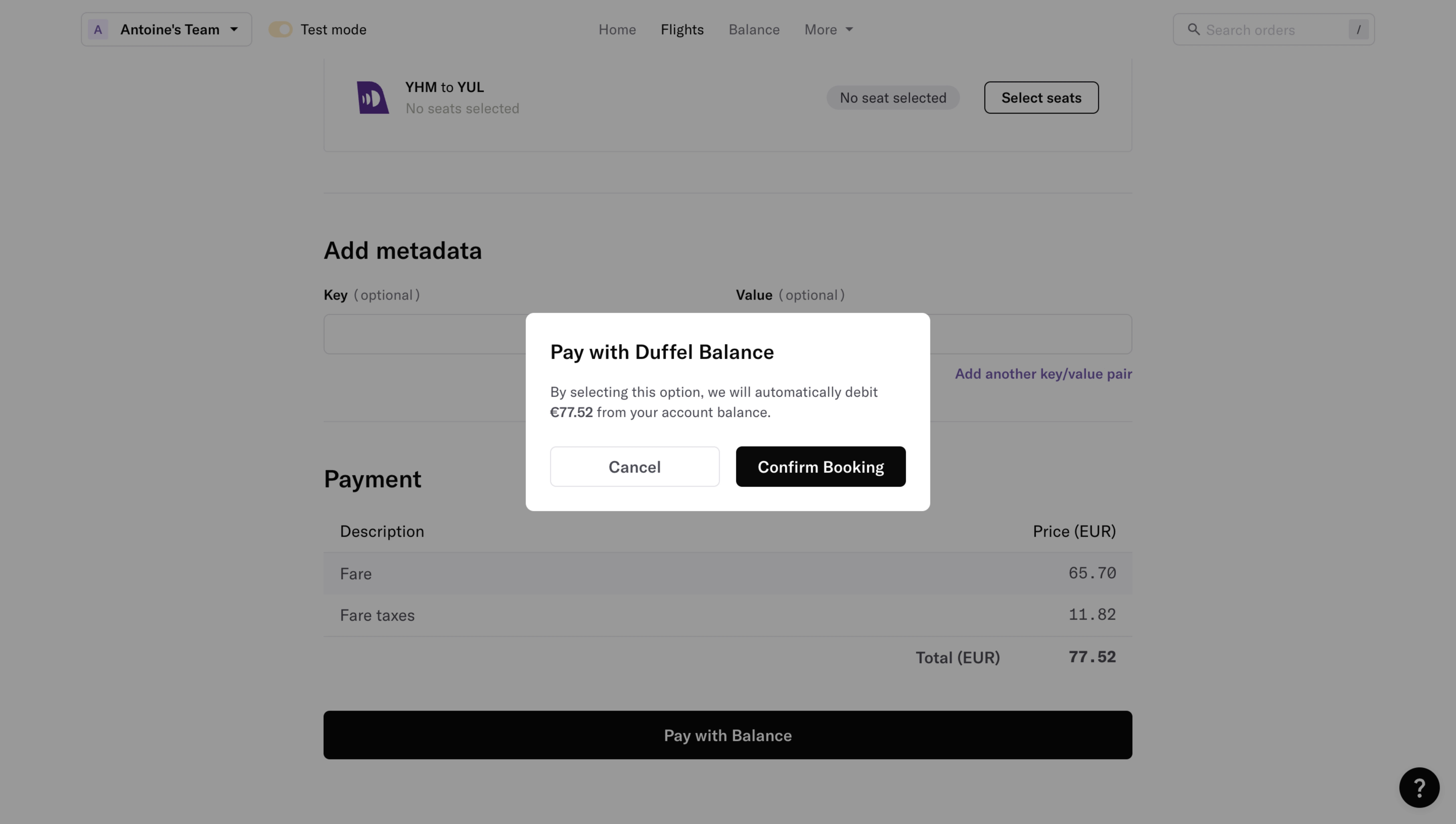
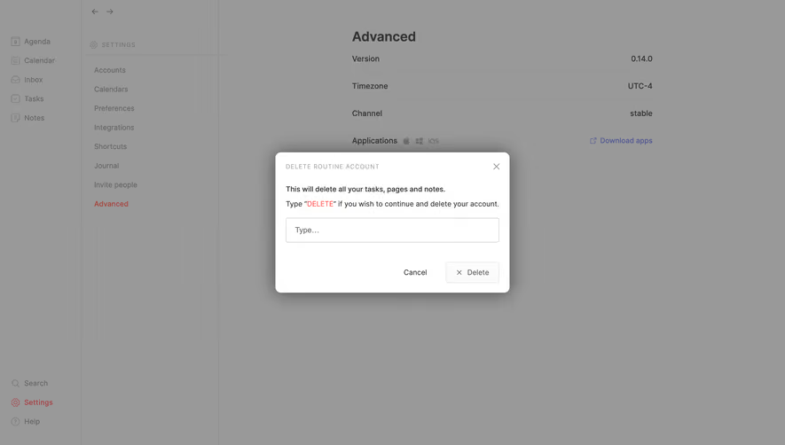
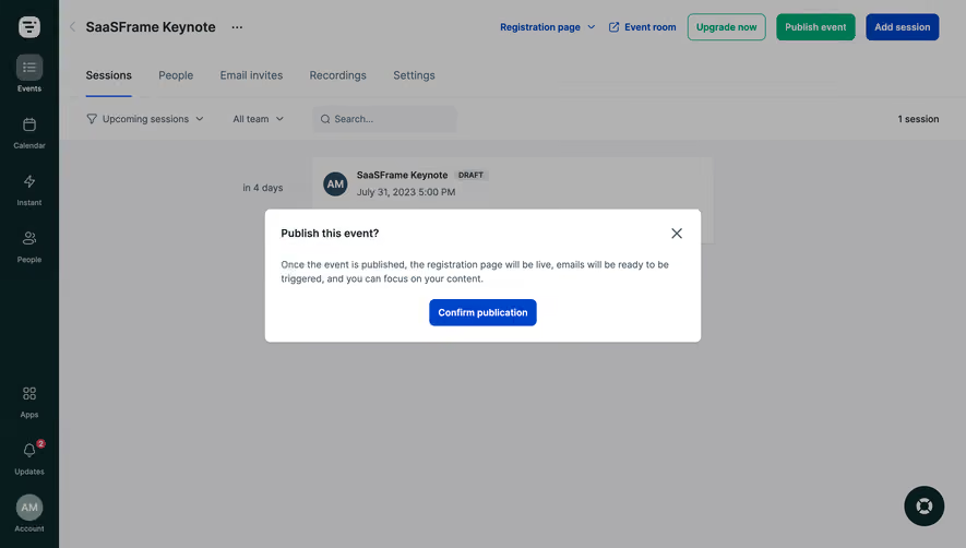
Prevent user errors with strategic SaaS Confirmation and Modal designs. These examples highlight 'Are you sure?' dialogues, double-verification steps, and destructive action warnings that balance security with a smooth user experience.
Browse 27 real SaaS Confirmation with modern UI patterns and conversion strategies.
We sell SaaSFrame licenses on Gumroad, a secured online selling platform for creators.
What about future updates and versions?
SaaSFrame gets updated all the time! Every new update and version will immediately be made available to all SaaSFrame users.
I didn't receive my licence key, what should I do?
The licence key required to create your SaaSFrame account is send by Gumroad once you made your purchase. If this email is blocked by your email client, send me an email at antoine[at]unmake[dot]io so I can resend the licence key.
Can you send me an invoice?
You can generate an invoice on Gumroad once you purchased SaaSFrame. You will find the link in the order confirmation email.
Can I get a refund?
If you're not satisfied, you can ask for a refund within 7 days. Just send me an email at antoine[at]unmake[dot]io
Confirmation Design Guide
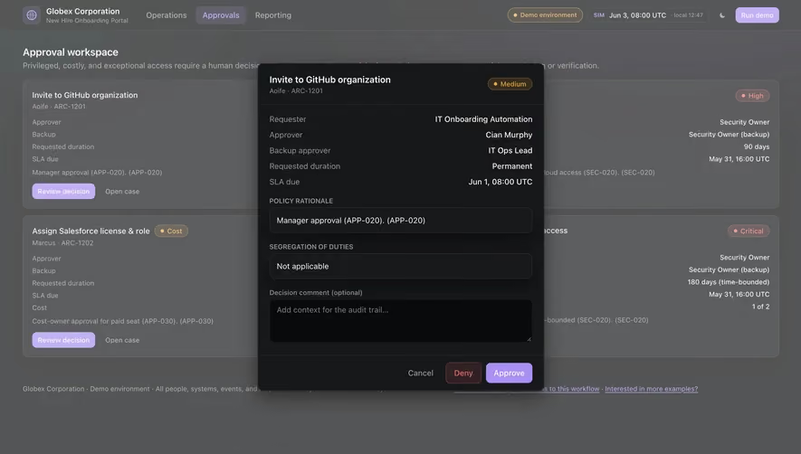
A SaaS confirmation screen gives a user a final opportunity to understand an action before committing. It may review a scheduled operation, summarize a resource-intensive task, or explain the next stage of connecting another service. Its purpose is to resolve meaningful uncertainty, not to add an automatic extra click to every interaction.
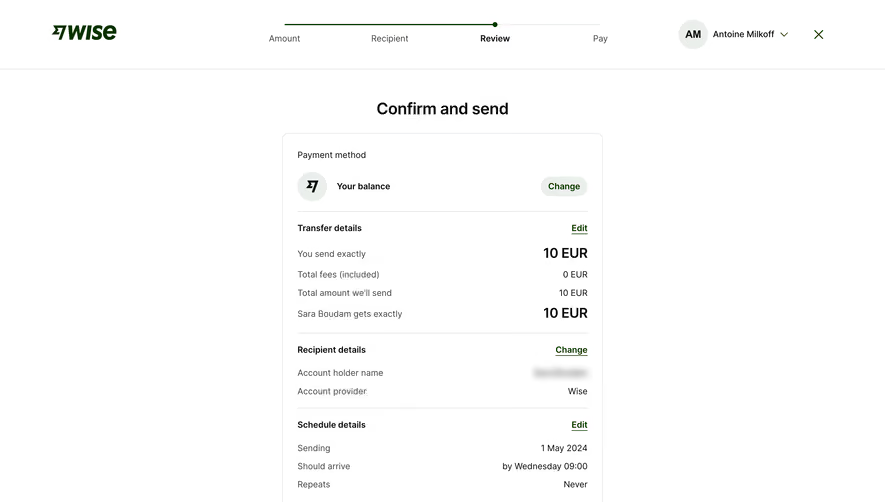
The SaaSFrame references show financial review, scheduled transfers, connector authorization, and search-mode comparisons. They are interface examples rather than advice about financial transactions or a verification of data-access promises. Use them to study how consequence, timing, and correction are communicated.
Distinguish confirmation from a success message
A pre-action confirmation explains what will happen if the user proceeds. A success state explains what the system has already confirmed. Mixing the two can make an uncommitted action look completed.
Use verb tense and action labels that match the stage. Reviewing a scheduled operation is different from reporting that it ran. Continuing to an external authorization page is different from establishing a working connection.
The success category addresses post-action feedback. Keep that responsibility separate from the review stage so users can identify whether they still have a decision to make.
Confirm only the uncertainty that matters
A confirmation is useful when an action has a consequence the user might otherwise misunderstand. It can establish the affected object, scope, cost, access, timing, or reversibility. If none of those are uncertain, an extra prompt may simply slow down familiar work.
Choose the review content from the consequence. A generic “Are you sure?” message asks for confidence without providing evidence. A useful prompt identifies what will change and gives users a way to correct it.
For routine reversible actions, an undo route may be more useful than a mandatory dialog. For consequential actions, the confirmation should not rely on a vague icon or a broad warning that users learn to ignore.
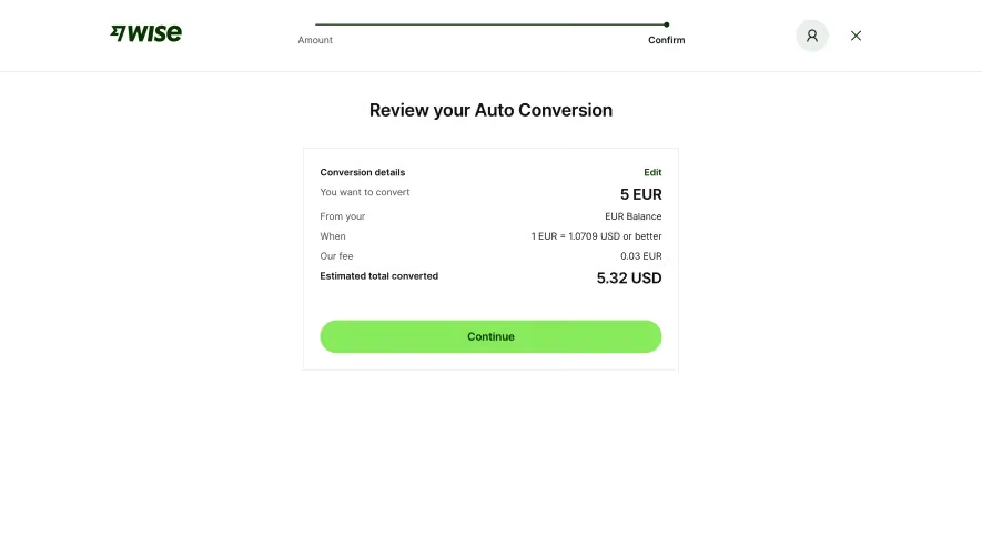
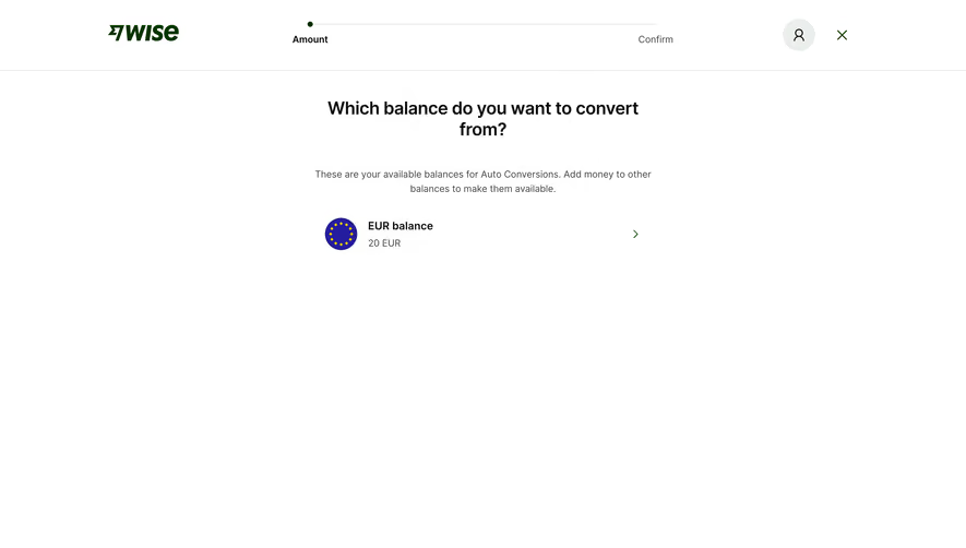
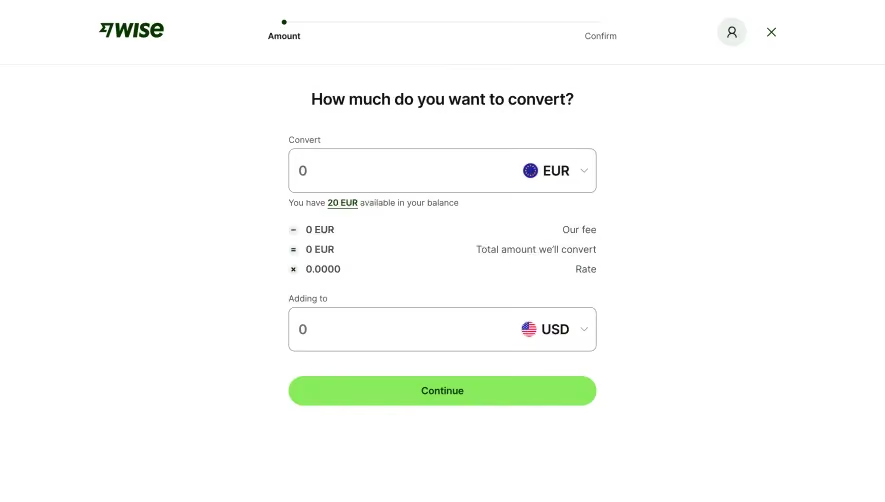
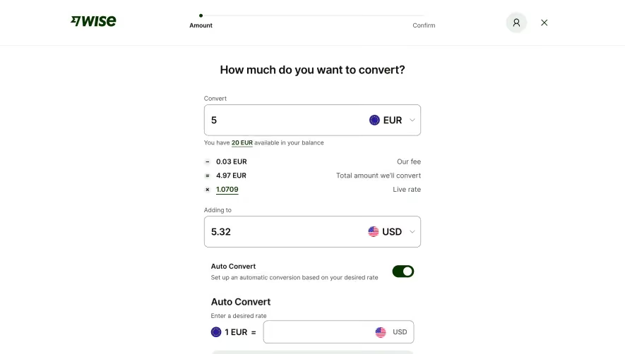
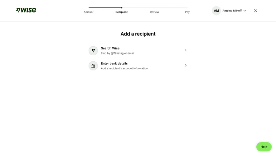
The Wise auto-conversion capture summarizes the amount to convert, source balance, exchange-rate condition, fee, and estimated converted total. An edit route appears within the review area before the continue action.
This illustrates how a confirmation can bring several prior choices into one inspectable statement. The condition and estimate have different meanings from the entered amount. Their labels should preserve that distinction.
When adapting the model, avoid presenting a conditional or estimated result as guaranteed. The review stage needs the terms relevant to the decision, using the actual product behavior. Captured values are examples of presentation, not current rates or recommendations.
Make correction part of the review
A user who notices a wrong value should be able to fix it without restarting the whole flow. Provide an edit route near the relevant summary or return to the appropriate step while preserving other valid inputs.
After a correction, update dependent information consistently. A changed amount can affect a fee or result estimate; a changed recipient can affect availability or timing. The confirmation must describe the new selection rather than retain stale text.
Keep temporary review state separate from the committed operation. Users should be able to inspect or edit without unintentionally applying the action. The final control needs a clear and stable consequence.
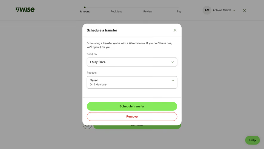
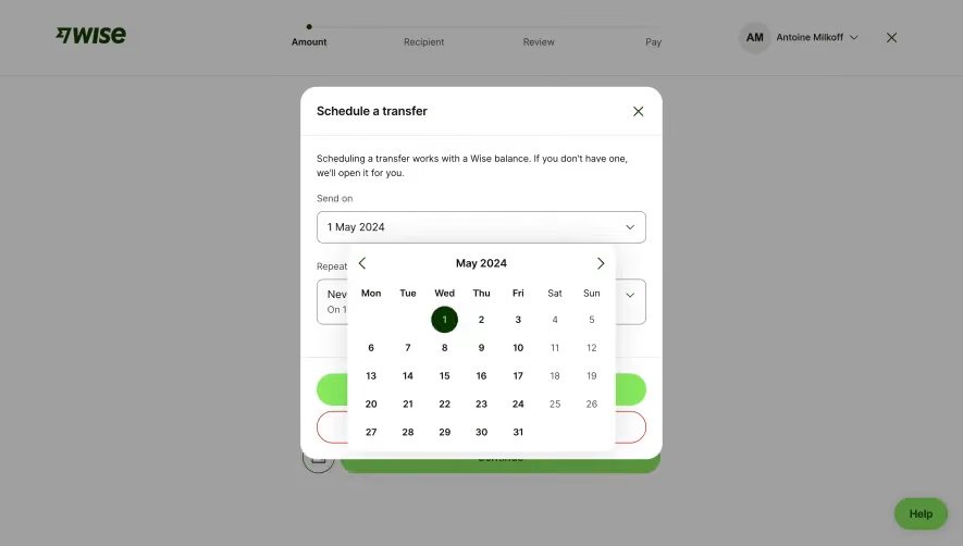
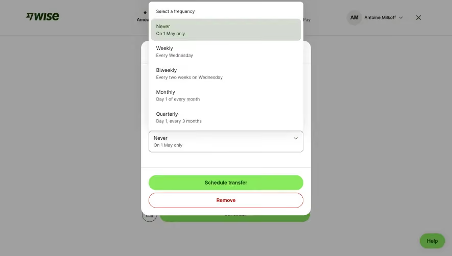
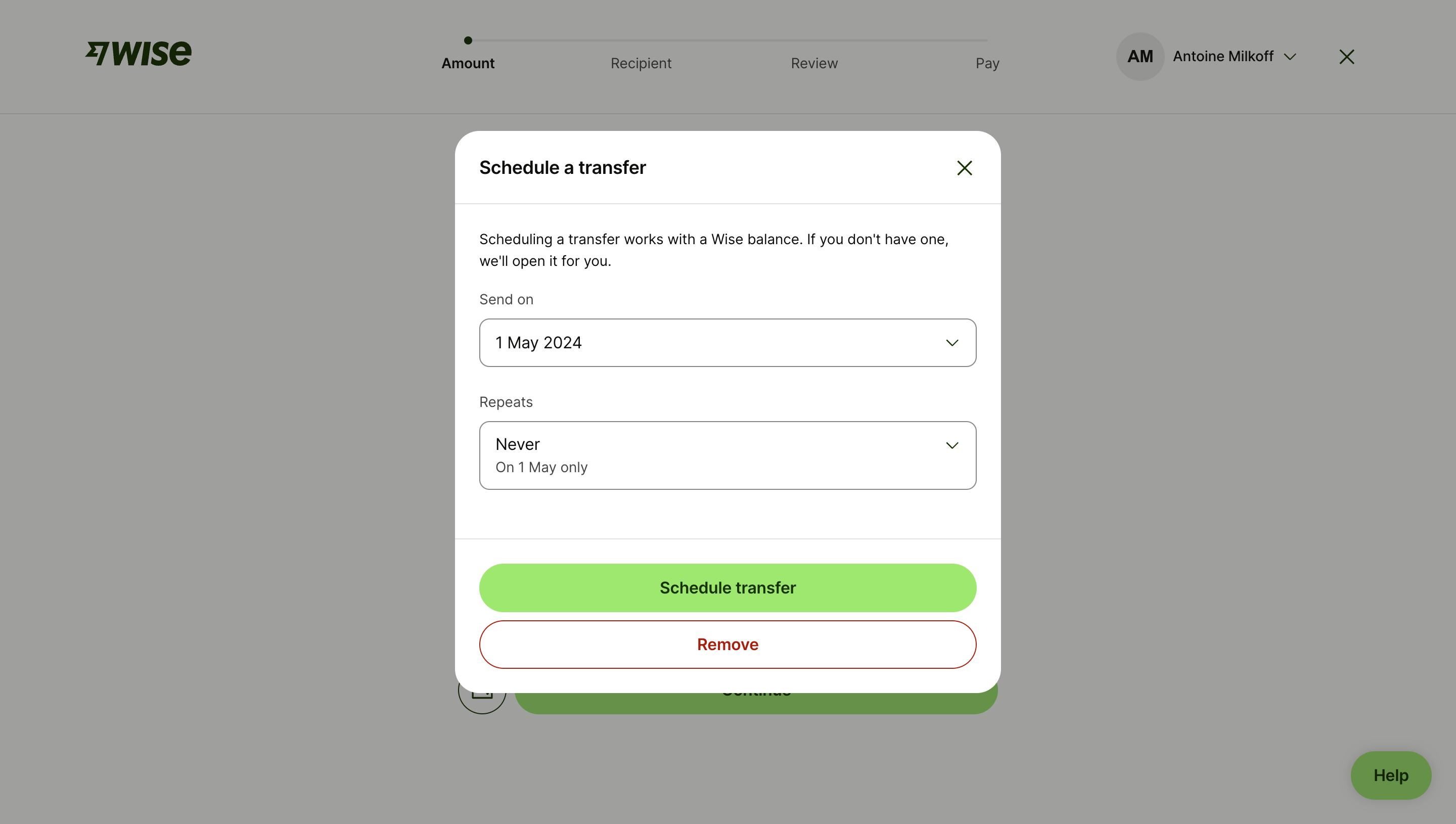
The Wise scheduling capture presents a send date and repetition choice within a transfer flow. Supporting text explains a balance-related dependency, while the main action explicitly schedules the transfer.
This shows why timing belongs in confirmation. An immediate action, a one-time future action, and a recurring schedule are different commitments. Users need to see which one they are creating.
Use dates and timezone context appropriate to the operation. For recurrence, explain the rule in a form users can check. A compact dropdown value should not conceal an ongoing schedule that continues beyond the date visible on screen.
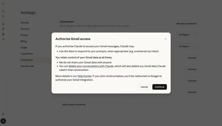
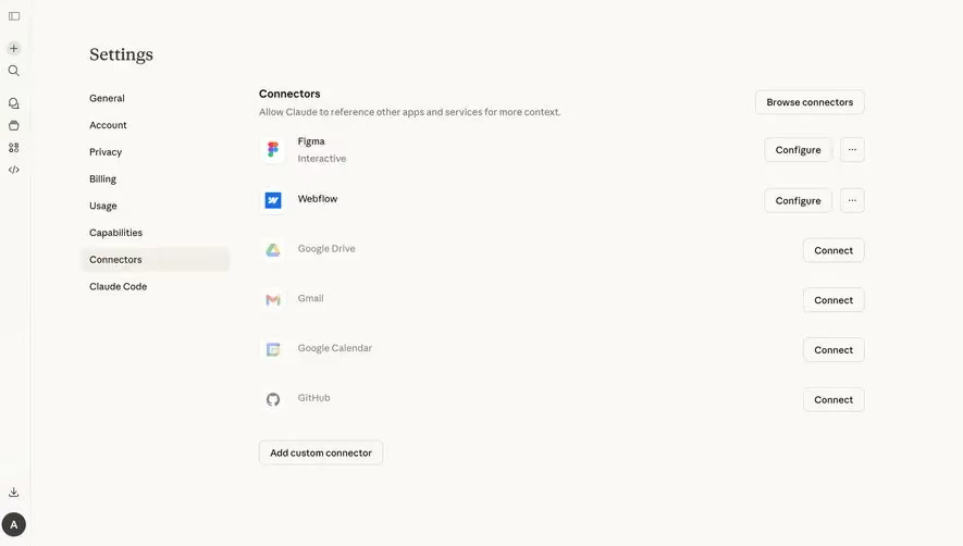
The Claude connector capture explains a Gmail-access step and says that continuing redirects to Google for authorization. It provides cancel and continue actions within the settings context.
The useful design distinction is between explaining a connection and completing authorization. The shown page is a handoff stage, not proof that access has already been granted. Its data-use statements are the product's own visible claims.
When adapting this structure, explain what happens next and keep the requested access understandable. After returning from the external service, display the confirmed connection state. A closed authorization window should not automatically be treated as success.
Review resource use before starting work
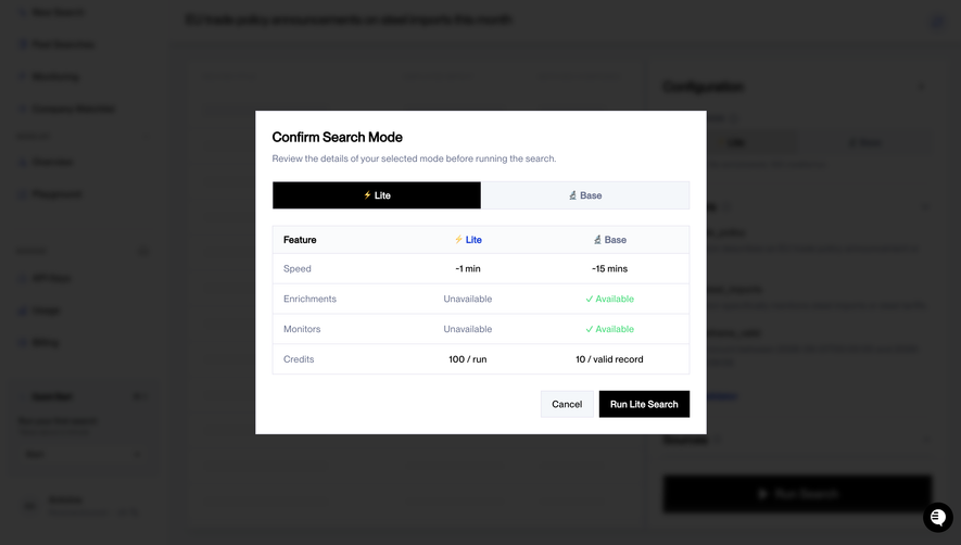
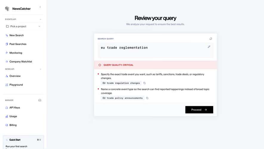
The NewsCatcher search-mode capture compares Lite and Base on speed, available capabilities, and credit treatment before a run action. It provides a concise decision surface near the point of execution.
This model is useful when choosing a mode changes both the result and the cost model. A flat per-run amount and a per-record amount cannot be compared solely by their numeric values. The interface should explain the unit and relevant uncertainty.
Keep the selected mode obvious and align the final action label with it. If a choice changes, update the summary and commitment control together. Do not let the confirmation show one mode while the system executes another.
Show scope for shared and bulk actions
A confirmation needs to identify whether the action affects one item, selected items, all matching records, or a whole workspace. A visible count can help, but the criteria also matter when the set is dynamic.
For shared settings, explain who is affected. A personal preference and an organization-wide policy can use similar controls while having very different consequences. The review should not hide scope behind a generic settings title.
When a bulk selection spans several pages, state that scope explicitly. Users should not assume that only visible rows are affected. Where the product can preview the target set, offer that inspection before commitment.
Use action labels that carry the decision
The final action should describe what it does. Schedule, run, authorize, remove, and purchase are more informative than a universal continue label at the commitment point. Continue can be appropriate when another review stage follows.
Use visual emphasis proportionate to the action and preserve a clear cancellation route. Destructive actions may need a different treatment from routine confirmations, but color alone should not convey their consequence.
Avoid button text that promises an outcome the system has not confirmed. A run action starts work; it does not guarantee completion. A request action may initiate an approval process rather than apply the requested change.
Handle pending and uncertain submission
After commitment, show that the action is processing and prevent accidental duplicate submission where necessary. Users need to know whether to wait, correct an input, or try again.
If the response is uncertain, check the confirmed system state before encouraging repetition. A timeout can occur after an operation was accepted. A generic retry prompt may create duplicate work or conflicting schedules.
Keep the review information available when failure occurs. Preserve valid inputs and identify the part that needs attention. The user should not have to reconstruct the original choice from memory.
Preserve accessible focus and reading order
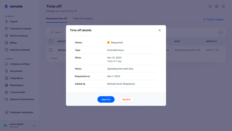
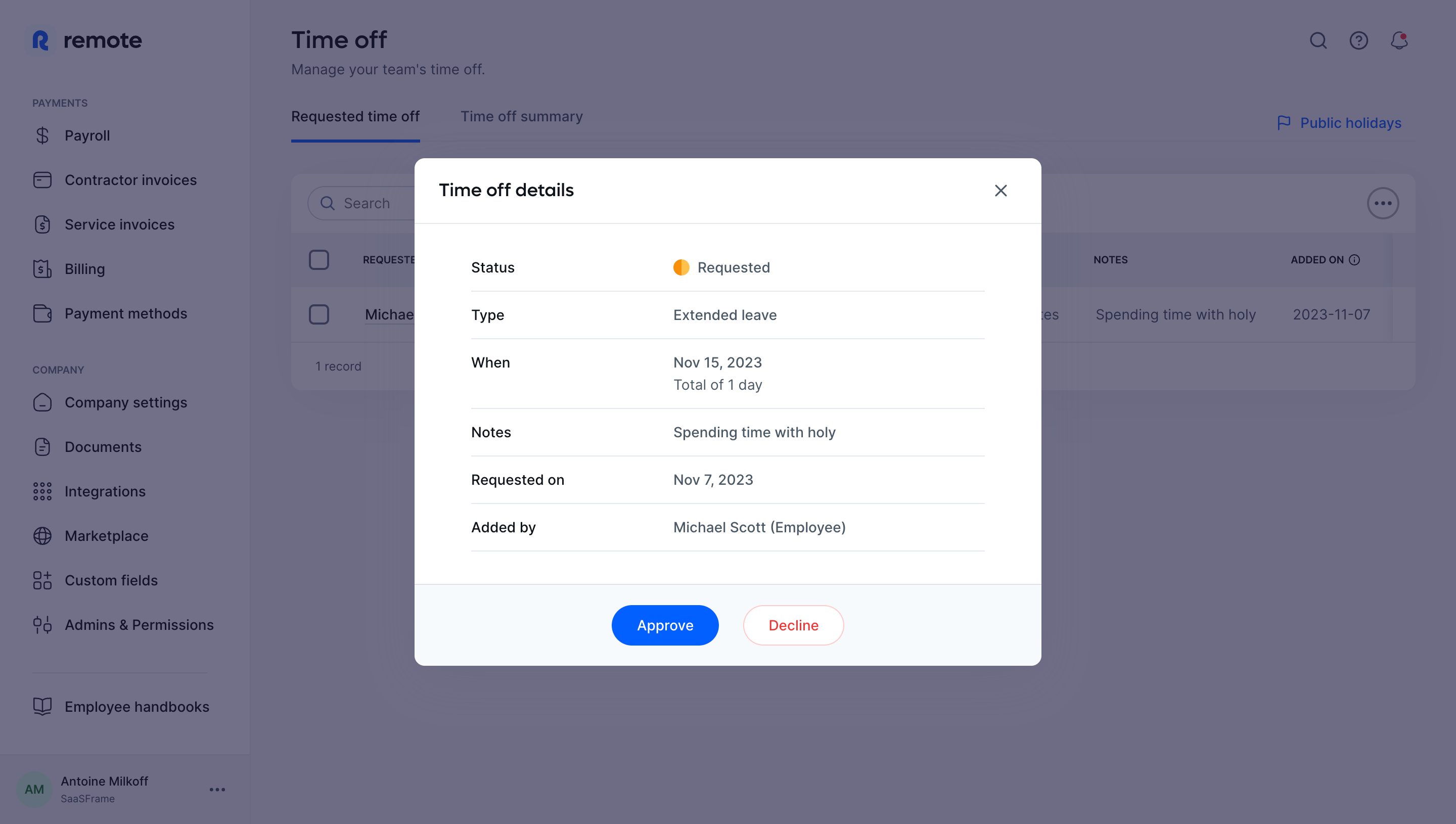
A modal confirmation should have a recognizable title, a usable keyboard path, and appropriate focus behavior. The summary must be readable before the action. Important information should not appear only in a tooltip.
On small screens, avoid burying the consequence between large decorative elements and the final button. Keep the essential scope and timing visible, while allowing fuller detail to be inspected.
After canceling or completing the action, return focus to a relevant place. A dialog disappearing without orientation can leave keyboard users unsure what happened or where to continue.
Test whether users can explain the consequence
Ask users what will happen, which object or account it affects, when it happens, and whether it can be changed afterward. A confirmation succeeds when those answers match the product's real behavior.
Test incorrect prior selections, long names, bulk actions, external-service cancellation, changed estimates, delayed operations, and failed submissions. Include people who revisit a familiar flow and may scan quickly.
Measure unnecessary interruptions as well as prevented errors. Repeating low-value confirmations can train people to click through the important ones. Keep each review stage justified by a concrete decision.
Frequently asked questions about SaaS confirmation screens
Should every action ask for confirmation?
No. Use confirmation when it resolves meaningful uncertainty or makes a consequence reviewable. Routine reversible actions may benefit more from clear feedback and undo.
What belongs in the confirmation summary?
Include the target, scope, timing, and other conditions that materially affect the decision. Provide a correction route for choices the user may need to change.
Is continuing to authorization the same as connecting an app?
No. It can be a handoff to another service. Show the actual confirmed connection state after that service returns a result.