Loading Indicator
51
Improve perceived performance with SaaS Loader patterns. Discover skeleton screens, progress bars, and spinners that keep users engaged while your app processes data.

A loading indicator tells users that an operation is still in progress. It bridges the gap between an action and a result, helping people decide whether to wait, continue another task, or intervene. Its purpose is to communicate real system state rather than simply fill empty space with motion.
Different waits need different treatment. Loading a dashboard, creating a room, uploading a file, and generating an AI answer have different scopes and opportunities for progress feedback. A spinner may be sufficient for one task and frustratingly vague for another. Choose the indicator after defining what the user is waiting for.
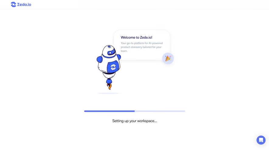
A label such as “Creating your room” gives the wait a meaning. “Loading” alone may leave users unsure whether the page is fetching data, saving a change, or starting a new process. The action name also helps people recognize when the interface moves to the result.
Use a status that the system can support. Do not cycle through invented phases merely to make waiting feel active. If the product knows that a file is being uploaded and then processed, those phases can be useful. If it only knows that the request is pending, use honest pending language.
Keep the explanation proportionate. A brief operation may need only a small local indicator. A longer job can benefit from the current stage, retained task context, and a route to return later. The display should answer the user’s uncertainty, not narrate every backend event.
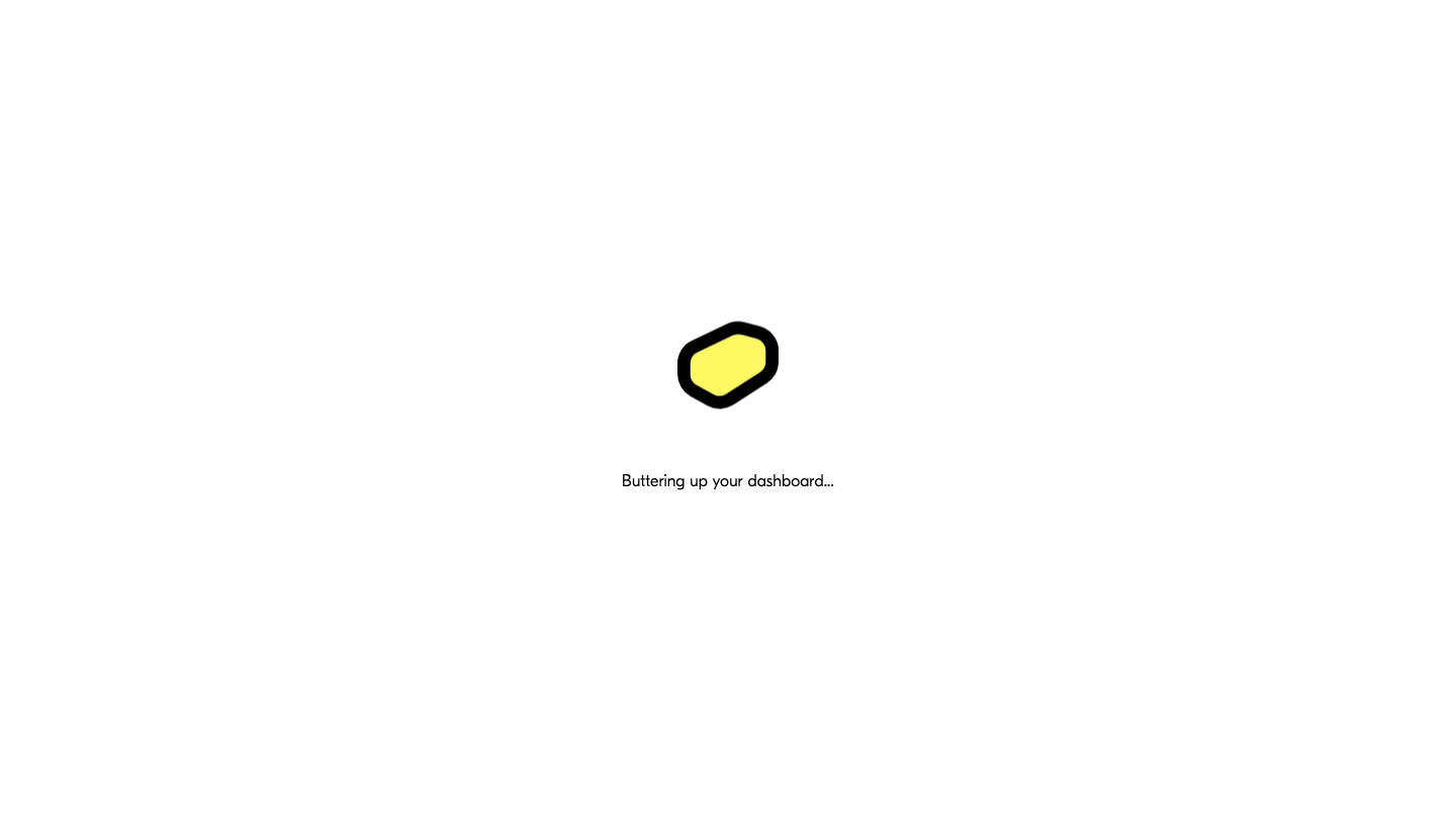
The first Butter capture shows a sparse screen with a centered mark and the phrase “Buttering up your dashboard.” The visible design gives the wait a destination: the dashboard. It keeps the screen simple rather than presenting incomplete controls as though they were ready.
The brand language can make the state recognizable, but it still needs to remain understandable. If the wait becomes prolonged, a playful phrase alone will not explain whether the application is progressing or stuck. The implementation needs a plan for delayed and failed loading.
A static screenshot cannot establish whether the mark is animated or how long this state lasts. Evaluate those behaviors in the product before describing the design as fast, smooth, or reassuring.
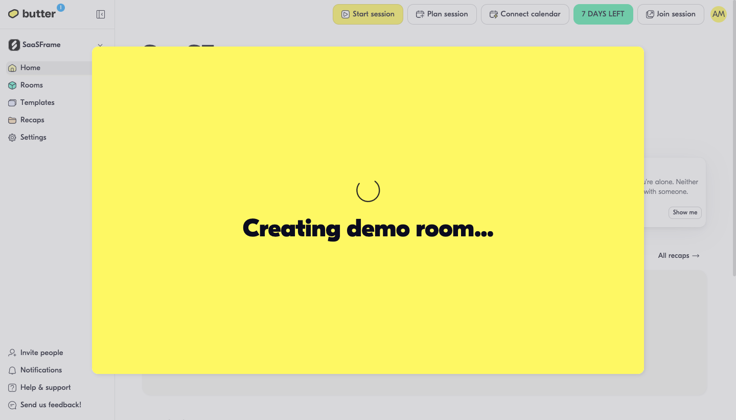
The second Butter capture shows a large yellow overlay with a spinner and “Creating demo room…” over the existing dashboard. This is an operation-level wait rather than initial page loading. The visible background preserves where the action began.
The overlay blocks much of the interface, suggesting that the user must wait for room creation before proceeding. That can be appropriate when the next action depends on the new room. If creation is a longer background job, blocking the whole dashboard may be unnecessary.
The contrast between the two captures is a useful design lesson: the same product can use different loading scope for different tasks. A global loading screen and a contextual operation state should not be interchangeable by default.
Use a full-page wait when the page cannot meaningfully render yet. Use a local indicator when only one panel or action is pending. A dashboard with one unavailable chart should not necessarily hide every working control.
During a save, a button-level pending state can communicate that the request is being processed. Preserve the form content and prevent conflicting submissions where appropriate. Do not disable unrelated navigation without a task-specific reason.
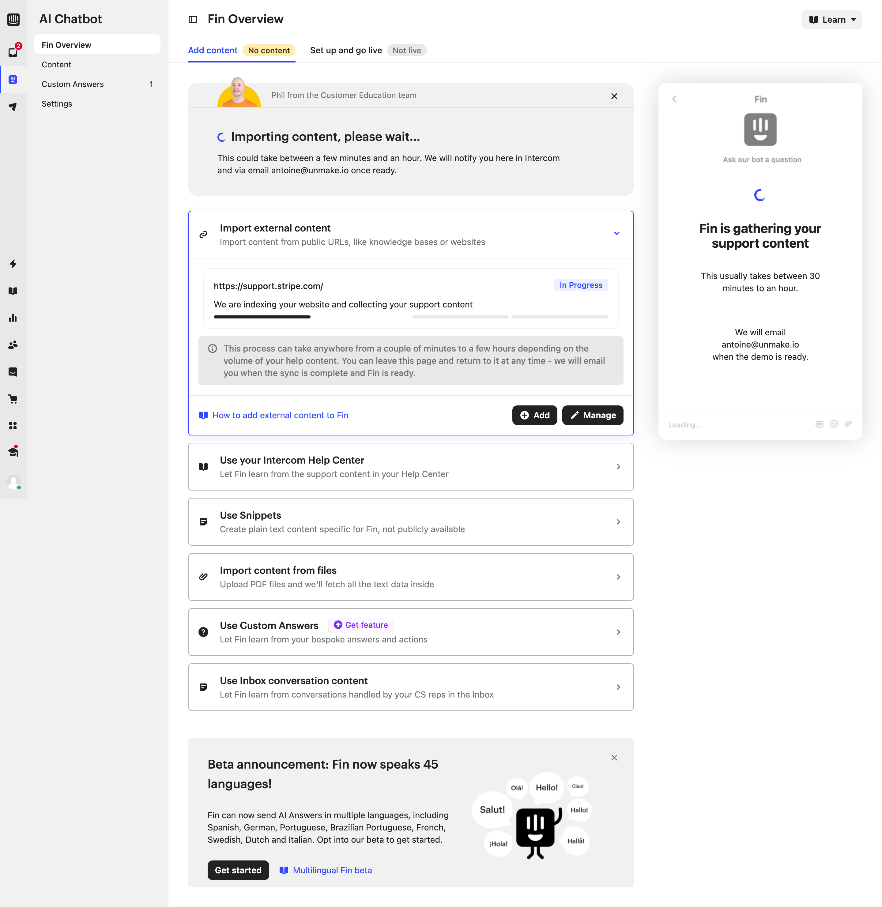
For long-running jobs, consider a background state that lets users continue work. The product must then make progress and completion discoverable, including a route back to the result. A background job that disappears from view is not more usable simply because it removes a modal.
If closing a loading panel does not cancel the operation, say so when the distinction matters. Users can otherwise assume that dismissing the overlay stopped the task and start a duplicate operation.
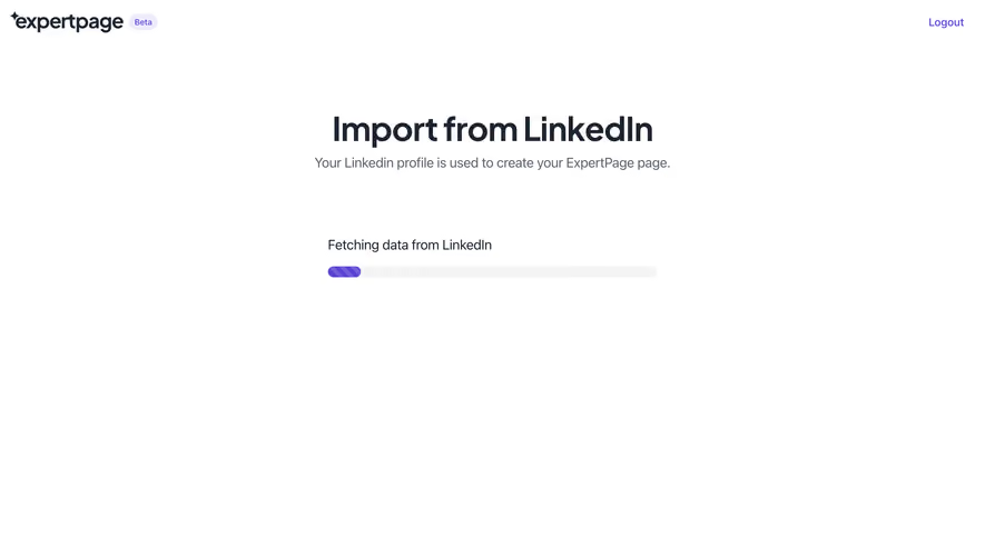
A determinate progress indicator represents a known portion of work completed. A percentage needs a meaningful denominator, such as bytes transferred or records processed. Do not invent a steadily increasing value merely because it looks more informative than a spinner.
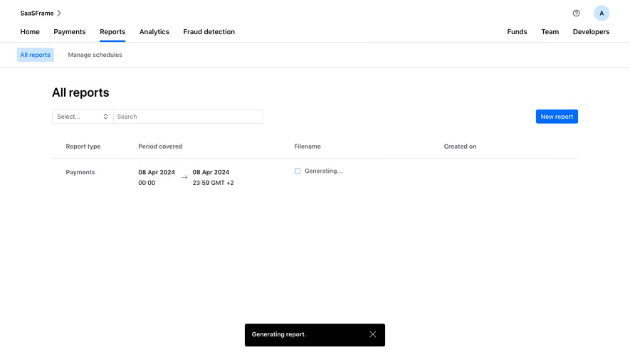
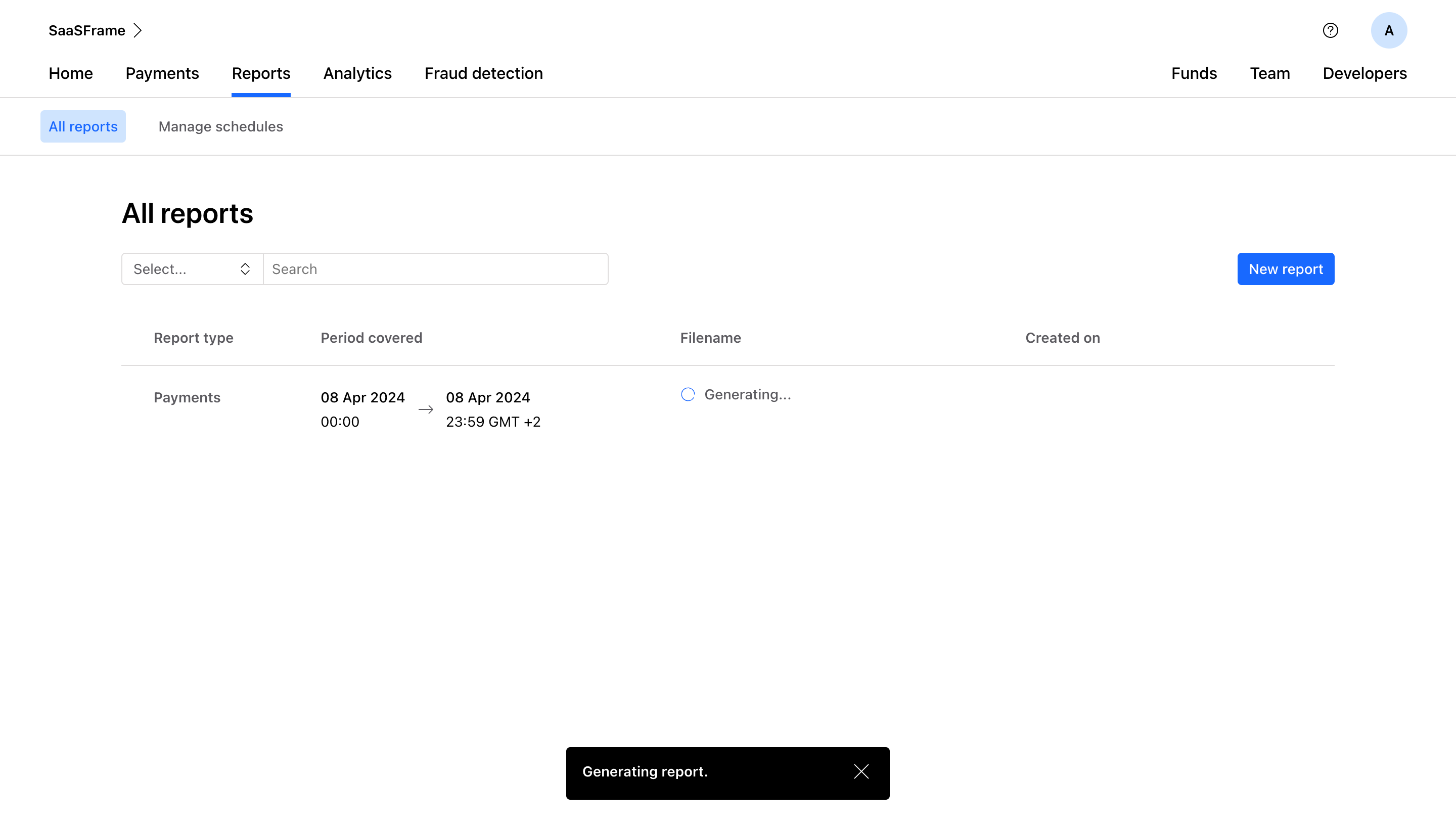
Some tasks have measurable and unmeasurable phases. Uploading may show transfer progress, while processing afterward may need an indeterminate state. Explain the transition rather than letting the bar appear stuck at 100% while the result is still unavailable.
If a total changes during processing, preserve an understandable representation. A job that discovers more records can appear to move backward. Stage labels or completed-item counts may communicate the situation more honestly than a single unstable percentage.
Time estimates also need a basis. Use ranges or qualified language where the system can support them, and update them when appropriate. A repeated “one minute remaining” message becomes misleading if the product cannot actually estimate completion.
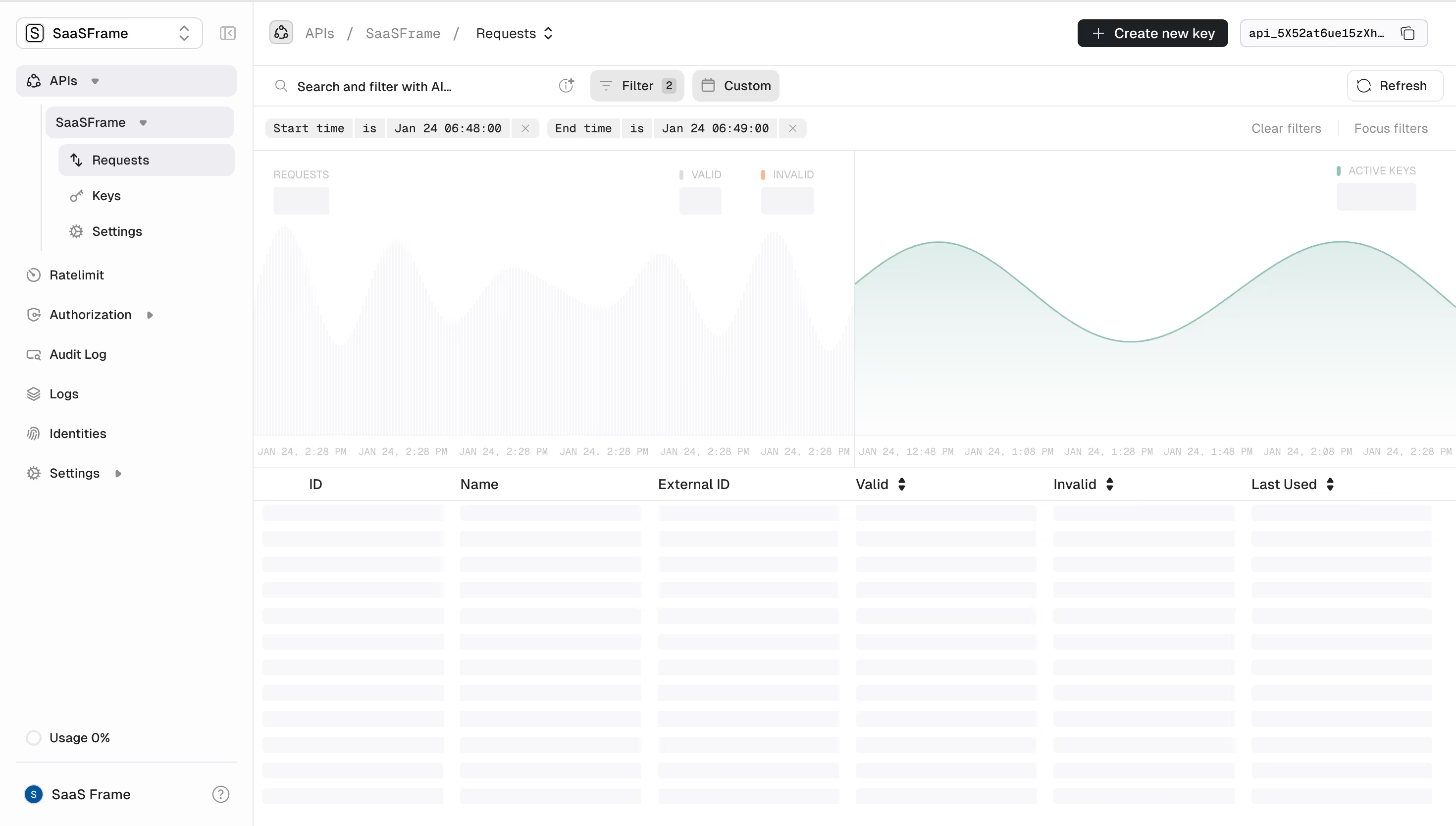
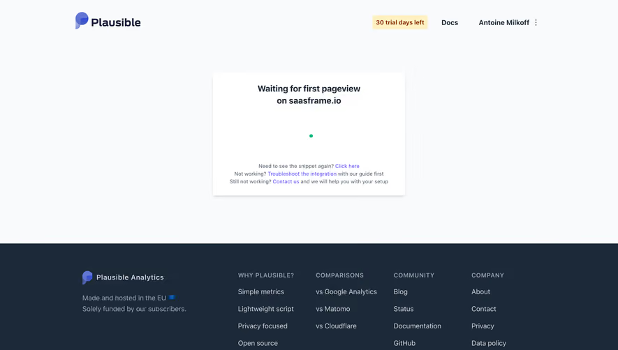
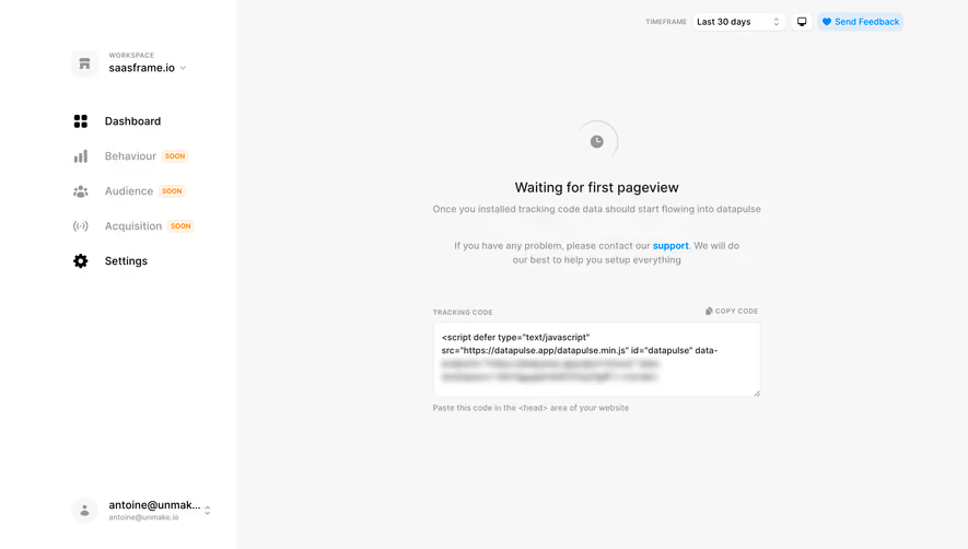
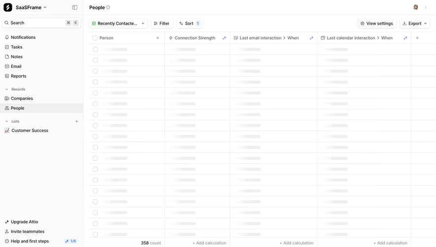
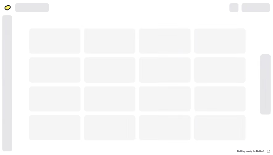
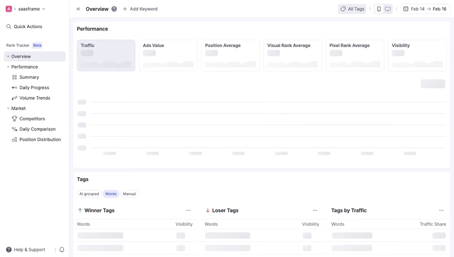
A spinner communicates pending work without describing the shape of the result. A skeleton suggests the layout that will be populated. Use a skeleton when the structure is predictable and preserving it helps orientation.
A skeleton should not imply that the data is almost ready when the operation may fail or take a long time. It needs the same delayed and error states as other loading treatments. Placeholder shapes are not evidence of progress.
Preserve useful existing data during refresh when it remains valid. Replacing a populated table with an empty skeleton on every filter change can disrupt comparison. If stale content stays visible, label the refreshing state and avoid presenting old data as the confirmed new result.
Loading, empty, and error are separate conditions. An empty collection should explain that no items exist or match the filter. A failed request should provide recovery. Neither should remain an indefinite skeleton.
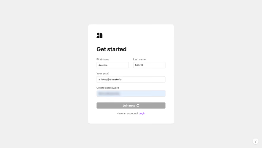
After a user starts an operation, make the pending state visible in the place they acted. A button that remains unchanged invites repeated clicks, especially if there is no immediate response elsewhere.
Disabling the initiating action can prevent duplicate submissions, but it needs a readable explanation. “Creating…” or “Saving…” gives the disabled state meaning. Preserve the original task label or context so the user knows what is underway.
For repeated actions that are legitimate, decide whether the interface queues them or requires the previous result. Do not silently ignore additional clicks and then leave users unsure whether their intent was received.
When the request finishes, restore the appropriate actions and show the confirmed result. A spinner that disappears without feedback may leave the user wondering whether the operation succeeded or simply stopped.
A prolonged pending state should offer more information when available. Explain the current stage, whether the user can leave the page, and where the result will appear. Do not keep repeating the same optimistic message when the system has detected a problem.
Provide cancellation only when the system can meaningfully cancel. If cancellation merely hides the progress panel, use different wording. For jobs that may complete after cancellation is requested, report that state accurately.
A retry after timeout should consider whether the original operation may still finish. Repeating a room creation, payment, or large job can have consequences. Give users a way to check current state before starting another operation when the outcome is uncertain.
Support information can be useful for a stuck process, but keep the primary explanation human-readable. A task identifier can help investigation without replacing the message about what the user should do.
When an operation fails, transition from pending to a clear failure state. Stop or update the indicator that represented the failed attempt. An error dialog beside a continuing “Joining…” message can leave users unsure which state is authoritative.
Preserve the task context and useful inputs. The recovery route should relate to the operation: reconnect, retry the failed item, correct a field, or contact support. A generic refresh action may erase work without fixing the problem.
For partial success, distinguish completed and pending items. A batch can continue while some records fail, but the interface should explain both conditions. Do not compress a mixed outcome into one cheerful completion label.
After a retry starts, make the new attempt identifiable where relevant. The user should understand whether the product restarted all work or resumed from a saved point.
Animation can make pending work noticeable, but the state must remain understandable without motion. Pair an animated mark with text or another readable status. Avoid intense or distracting effects that dominate the task.
Respect the product’s reduced-motion behavior and test the result. A static alternative should still convey pending state. Do not use motion as the only way to distinguish loading from an inactive icon.
Assistive technology users need to perceive meaningful status changes without repeated interruption. Announce the start or completion concisely where appropriate, and avoid announcing every spinner frame or minor progress increment.
If a blocking overlay appears, keep focus behavior predictable and prevent interaction with unavailable background controls. When the operation ends, return users to a useful location rather than leaving focus on an element that no longer exists.
A loading indicator ends when the relevant operation reaches a confirmed state. The next display should tell users whether their intended task succeeded. A downloaded file, created room, or saved record should become discoverable immediately.
Different completion states may require different actions. A generated draft can be ready for review rather than ready to publish. A successfully uploaded file may still await processing. Name the next state instead of using “Done” for every transition.
For background work, make notifications and history consistent with the visible status. A job should not be shown as completed in one place while remaining pending in another. Link completion feedback to the actual result.
Test quick completion, a noticeable delay, a long wait, failure, cancellation, and uncertain completion. Observe whether users click repeatedly, leave the page, or lose confidence because they cannot interpret the state.
Review real behavior on the supported devices and connections. The best loading treatment is not necessarily the one with the most elaborate animation; it is the one that makes the wait understandable and preserves progress.
Use a progress bar when the completed portion has a defined, meaningful relationship to the total work. Otherwise an honest pending state is preferable to an invented percentage.
No. Block only the controls or task that depend on the result. Longer jobs may work better in the background if their progress and completion remain discoverable.
No. A skeleton represents pending content. The interface still needs explicit empty, delayed, and error states, plus a recovery route when loading fails.
Compare SaaSFrame’s loading indicators with skeleton screens, progress indicators, and error states to design the complete waiting journey.