Design with AI
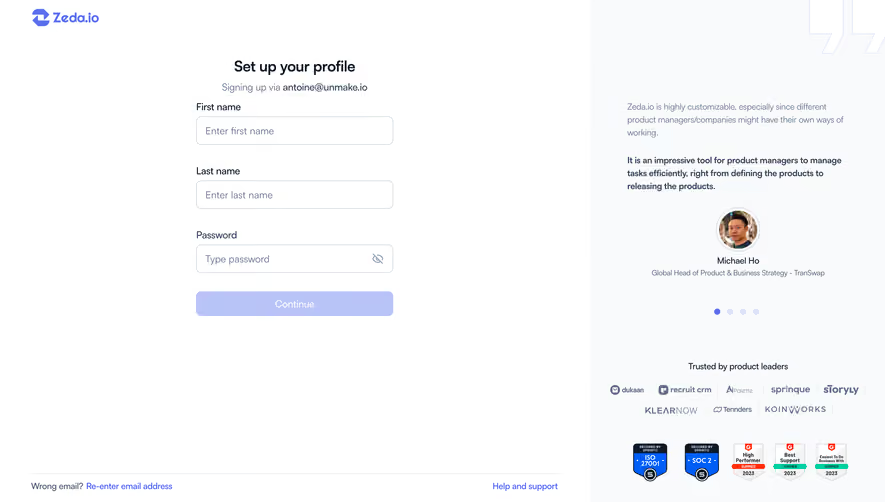
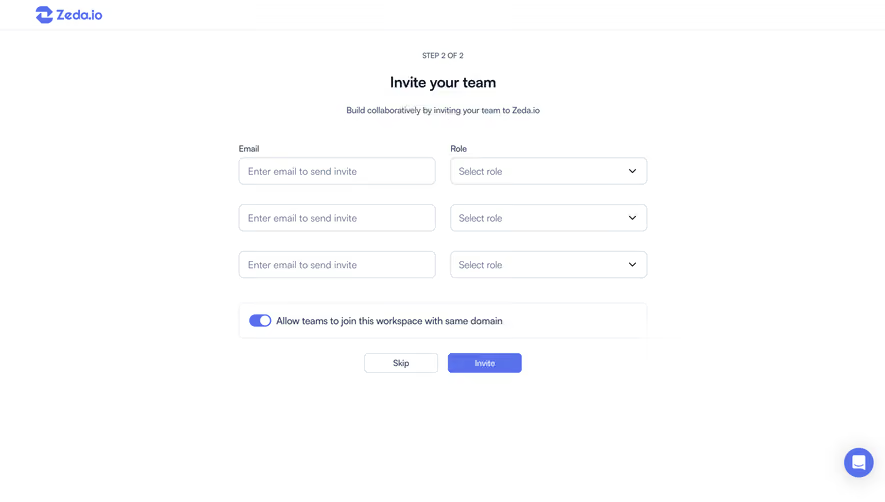
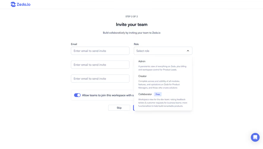
Generate a new design based on this screen using your own content.
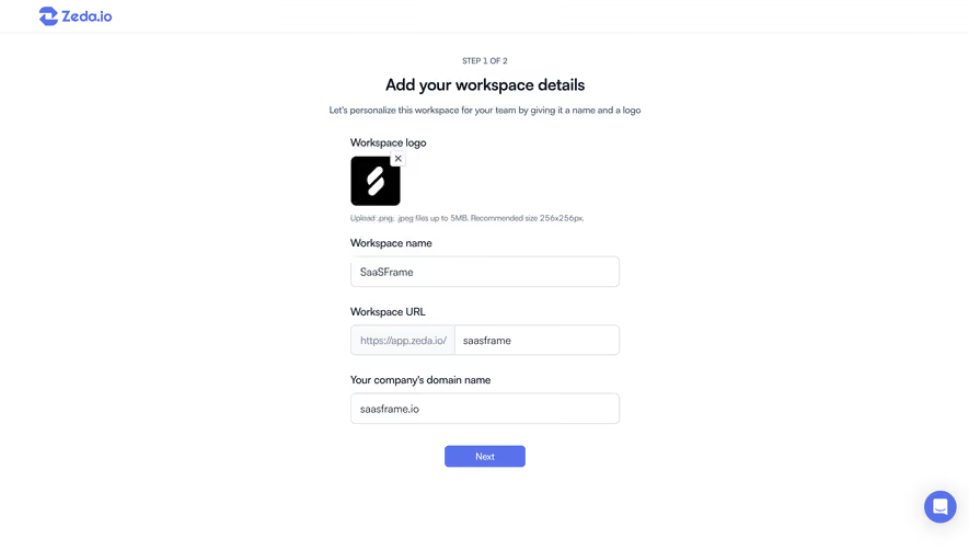
# Design from Reference: Zeda.io Account Setup
Create an original, high-fidelity visual design inspired by the reference. Prioritize composition, typography, colors, spacing, and component styling over technical implementation.
## Reference
- **Product:** Zeda.io
- **Category:** Account Setup
- **Screenshot:** https://cdn.prod.website-files.com/5e9dc792e1210c5325f7ebbc/6acadc4e5c79bb17f221afb9_6acadba85c79bb17f2216c9c_cms-b6d8e8abd145403b0f48b566.webp
Analyze the screenshot first. If inaccessible, request it rather than guessing.
## Content
{{content.instructions}}
{{content.data}}
Preserve essential messaging and factual accuracy. Adapt structure and copy length for visual balance; never invent product claims.
## Visual Design
### Overall aesthetic
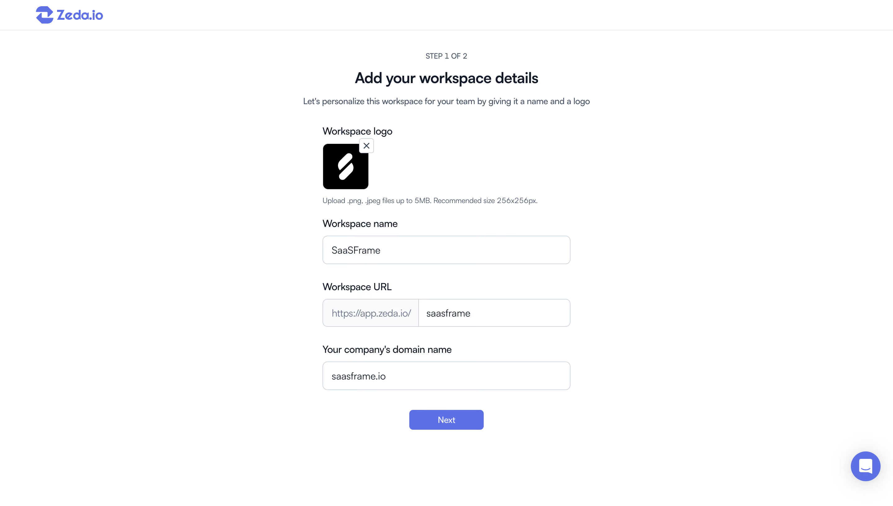
- **Character:** A sparse workspace-setup form on white with a small blue brand mark and one blue continuation action. External labels and generous spacing keep the step straightforward.
- **Image basis:** Source is 2880 × 1632, inspected at approximately 1400 × 793. Measurements below are inspection pixels; CSS scale and pixel ratio are unverified.
### Page composition
- **Header:** A thin roughly 47 px white brand bar spans the top.
- **Introduction:** Centered step count, heading and one-line explanation sit above the form.
- **Form:** A roughly 389 px column begins around x505, with logo, workspace name, segmented workspace URL and company-domain field.
- **Action:** A centered Next button sits below; a blue chat launcher occupies the lower-right corner.
### Information hierarchy
- **Progress:** Step 1 of 2 is small and muted above the stronger title.
- **Identity:** Workspace logo and its upload guidance precede three labeled fields.
- **URL:** A fixed prefix is visually separated from the editable suffix.
- **State:** A logo and field values are present. No validation, upload progress or subsequent step is shown.
### Typography
- **Title:** Approximately 24 px semibold sans-serif.
- **Body:** Around 14 px regular; upload helper around 12 px.
- **Labels/fields:** Approximately 15–16 px with labels slightly stronger.
- **Certainty:** Exact font identity and CSS metrics remain unverified.
### Colors & surfaces
- **Measured base:** White #FFFFFF dominates, with pale #F9FAFB in control segments.
- **Measured accent:** Blue #5972EC forms the primary action/brand family.
- **Measured text:** Black #000000 and dark #0F1829 provide primary emphasis.
- **Measured borders:** Gray #CFD5DE and pale #E8ECF0 define inputs and rules.
### Components
- **Logo tile:** Approximately 72 px square, black with a white mark and roughly 8 px corners. A small overlapping outlined close control sits upper right.
- **Fields:** Approximately 389 × 44 px, thin gray borders and around 8 px corners.
- **URL field:** A pale fixed-prefix segment meets a white editable segment within one rounded frame.
- **Next:** Approximately 117 × 32 px, blue filled with small corners.
- **Chat:** A roughly 48 px blue circular launcher with white icon and faint shadow.
### Visual rhythm
- **Alignment:** All form labels and controls share one left edge.
- **Spacing:** Approximately 27–30 px separates field groups; logo guidance is closer to its tile.
- **Whitespace:** Broad margins and empty lower space keep the step focused.
- **Hierarchy:** Small utility details remain quieter than title and action.
### Responsive
- **Evidence limit:** Only desktop is observed.
- **Recommended form:** Use fluid width capped near the observed measure.
- **Recommended URL:** Prevent long prefixes/suffixes from overflowing and keep their relationship clear.
- **Recommended controls:** Preserve accessible upload/remove actions and avoid chat overlap.
### Adaptation guidance
- **Preserve:** Keep the progress cue, explicit identity fields and single next action.
- **Build:** Reuse upload-tile, labeled-field and segmented-URL components.
- **State design:** Define upload failure, unavailable workspace URL and required-field errors.
- **Validate:** Confirm fonts, focus states and mobile field wrapping.
Use this context to reproduce the reference's visual language: layout, typography, colors, spacing, borders, radii, and distinctive elements. The screenshot takes priority if descriptions conflict.
## Direction
{{preferences.fidelityInstructions}}
## Output
{{output.instructions}}
Deliver a polished, cohesive design with precise alignment, hierarchy, and spacing. Produce the requested visual artifact, not just a description. If unsupported, explain the limitation.