
Thank you! Your submission has been received!
Oops! Something went wrong while submitting the form.
Get SaaSFrame Pro
Monthly
$18
Quarterly
$48
Yearly
$180
Upgrade to access this feature
Browse all screens & flows
Filter and search screens & flows
Access Figma files
Access mobile versions
Bookmark screens & flows
Join now


Workable Pricing Page

Workable
The world's leading talent acquisition software
Designed by
No items found.

Bookmark
Bookmark

Design with AI
Thank you! Your submission has been received!
Oops! Something went wrong while submitting the form.
# Design from Reference: Workable Pricing Page
Create an original, high-fidelity visual design inspired by the reference. Prioritize composition, typography, colors, spacing, and component styling over technical implementation.
## Reference
- **Product:** Workable
- **Category:** Pricing Page
- **Screenshot:** https://cdn.prod.website-files.com/5e9dc792e1210c5325f7ebbc/62eca44351782cc3de3f6256_1659675006557-62ec9ca43da29e6d78f53c24_screenshot-device-866d788a7ead1c3e3c0b40f6a4ba7dac-1659618047254.webp
Analyze the screenshot first. If inaccessible, request it rather than guessing.
## Content
{{content.instructions}}
{{content.data}}
Preserve essential messaging and factual accuracy. Adapt structure and copy length for visual balance; never invent product claims.
## Visual Design
### Overall aesthetic
- **Character:** A detailed hiring-software pricing page with teal actions, white raised cards and a muted purple background band. Small colorful geometric illustrations and curved section edges soften the dense comparison content.
- **Image basis:** The 1440 × 6020 source was inspected throughout at approximately 1400 px wide in five crops. Dimensions below are inspection pixels; CSS scale and font identity are unverified.
### Page composition
- **Header/intro:** Brand left and navigation/actions right precede a centered teal heading and two-line explanation.
- **Pricing:** Three tall plan columns occupy a broad central region over a purple curved background. A floating two-step configuration strip spans above the two right plans.
- **Premium tools:** Three equal rounded add-on cards appear on white beneath the pricing band.
- **Comparison:** A long table compares three plans across essential, advanced, compliance/security, service/support and premium-tool groups.
- **Proof/footer:** A purple curved region combines a large recommendation statistic and four review cards, then four footer link columns and brand area.
- **Cookie notice:** A white bottom banner overlays the lower footer with copy, policy link and Accept/Decline controls.
### Information hierarchy
- **Decision:** Company size and payment cadence are explicit setup controls before fixed plan pricing.
- **Plans:** Illustration, large name/price, billing notes and teal trial actions precede feature lists. The two right plans also offer demo links.
- **Detail:** Grouped table rows provide exhaustive comparison; colored dots map consistently to plan columns.
- **Proof:** A large percentage and white quotation cards support conversion near the bottom.
- **State:** Small-company size and upfront payment appear selected. No dropdown, checkout or trial dialog is open.
### Typography
- **Display:** Main/section headings are approximately 42–44 px bold sans-serif.
- **Plans:** Names around 44 px bold, prices around 34 px bold, billing notes around 11–13 px.
- **Reading/table:** Body around 15–18 px with 23–25 px line-height; table labels around 14 px.
- **Reviews:** Quotation artwork uses a contrasting serif around 28 px. Exact typeface identities and CSS metrics remain unverified.
### Colors & surfaces
- **Measured foundations:** White #FFFFFF dominates; purple #373656 and nearby #363555/#353454 anchor pricing/proof bands.
- **Accent:** Teal actions/headings, cyan controls, green and purple plan markers distinguish functional roles.
- **Artwork:** Small orange/yellow/teal geometric motifs decorate band edges.
- **Depth:** Plan/add-on cards use soft shadows; the comparison relies on fine gray rules and a teal outline around the two right columns.
### Components
- **Configuration strip:** Raised white panel with two labeled steps, a cyan dropdown and segmented upfront/monthly control.
- **Plan columns:** Approximately 384 px wide white surfaces, small outer corners and generous padding. Two right plans share a larger frame and pale lower support strip.
- **Trial buttons:** Roughly 186–201 × 52 px teal rectangles with modest corners and trailing chevrons.
- **Add-ons:** Three roughly 365 × 308 px rounded cards with centered heading, description, starting price and small learn-more link.
- **Table:** Approximately 1168 px wide, compact roughly 40 px rows, category icons/headings and aligned dot/text cells.
- **Reviews:** White rectangular quote panels include source branding and yellow stars; the statistic sits in a purple circle.
- **Cookie controls:** Compact teal filled and outlined actions. Hover/focus states are not shown.
### Visual rhythm
- **Alignment:** Broad centered card/table widths link sections; dense rows contrast with spacious introductions.
- **Spacing:** Large gaps isolate pricing, add-ons and comparison.
- **Color mapping:** Cyan, green and purple repeat between plan artwork, bullets and table dots.
- **Transitions:** Curved purple boundaries and small motifs distinguish proof/pricing from white information sections.
### Responsive
- **Evidence limit:** Only desktop is observed.
- **Recommended plans:** Stack configuration controls and plan cards, retaining billing notes near prices.
- **Recommended table:** Provide labeled horizontal scrolling or a plan-focused comparison on narrow screens.
- **Recommended notices:** Wrap cookie copy/actions without hiding footer content.
- **Recommended proof:** Stack statistic and reviews while preserving source/rating attribution.
### Adaptation guidance
- **Preserve:** Keep explicit size/payment configuration, consistent plan colors and grouped comparison.
- **Build:** Reuse plan-card, add-on-card, comparison-group and review-card components.
- **Content integrity:** Verify current prices, allowances and compliance claims before reuse.
- **Validate:** Confirm fonts, table accessibility, selected-control contrast and responsive billing layout.
Use this context to reproduce the reference's visual language: layout, typography, colors, spacing, borders, radii, and distinctive elements. The screenshot takes priority if descriptions conflict.
## Direction
{{preferences.fidelityInstructions}}
## Output
{{output.instructions}}
Deliver a polished, cohesive design with precise alignment, hierarchy, and spacing. Produce the requested visual artifact, not just a description. If unsupported, explain the limitation.


Category
Patterns
No items found.
Tech Stack

Added on
June 6, 2020
Similar screens



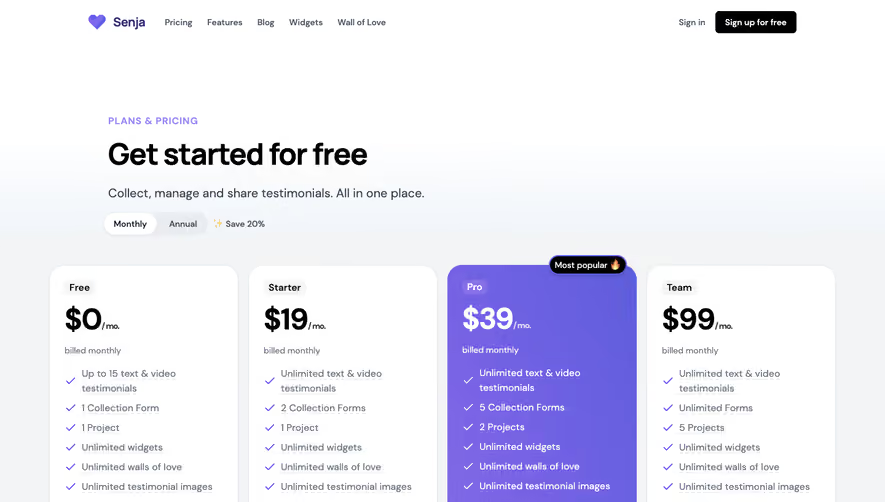

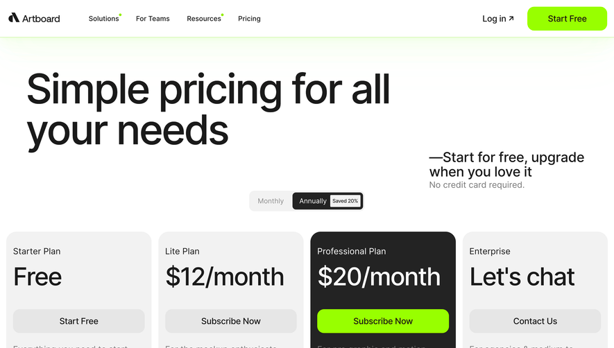

Upgrade to SaaSFrame Pro now to see similar examples.
Monthly
$18 /month
Billed $18 monthly
Browse all screens & flows
Filter and search screens & flows
Search text in screenshots
Access Figma files
Access mobile versions
Join now
Quarterly
$16 /month
Billed $48 quarterly
Browse all screens & flows
Filter and search screens & flows
Search text in screenshots
Access Figma files
Access mobile versions
Join now
Yearly
$15 /month
Billed $180 yearly
Browse all screens & flows
Filter and search screens & flows
Search text in screenshots
Access Figma files
Access mobile versions
Join now