Overall Style and Aesthetic
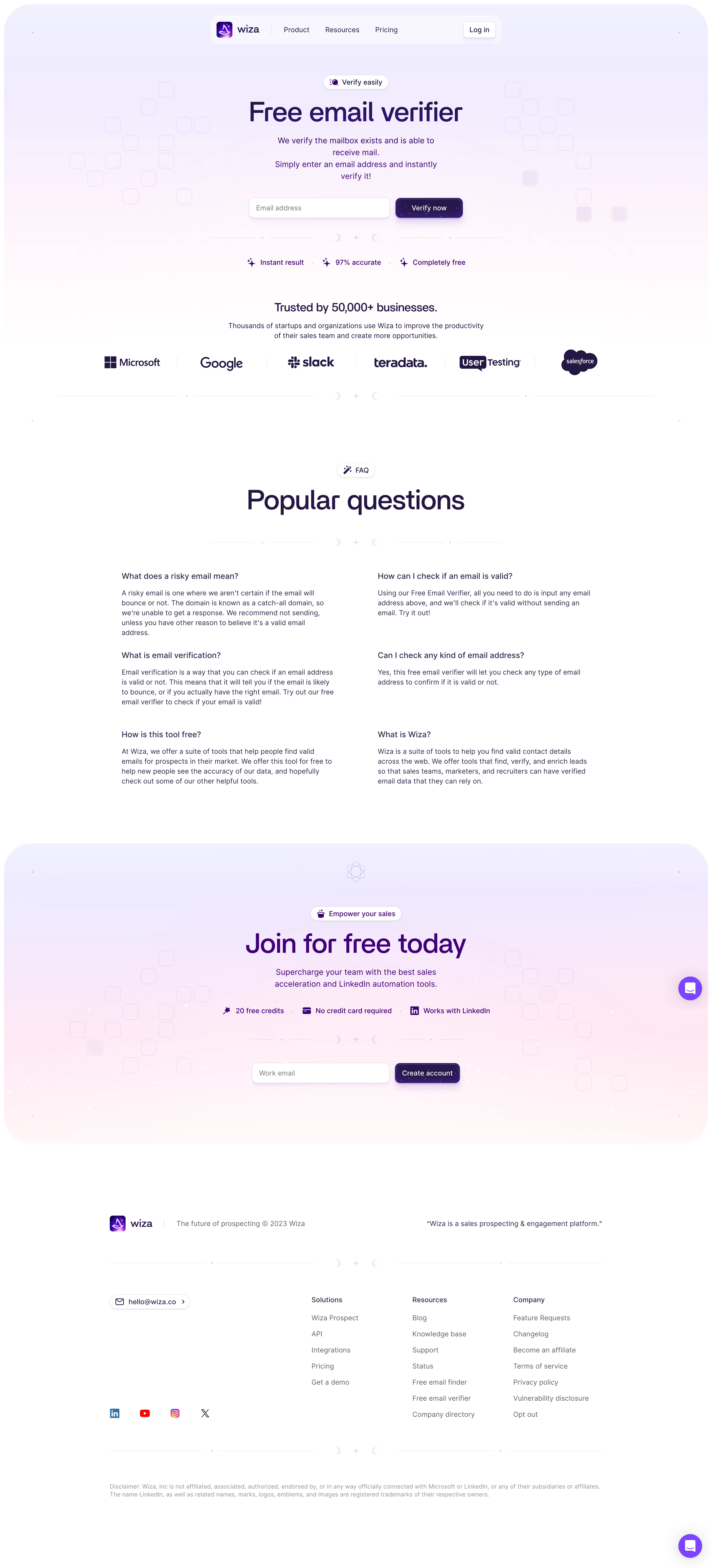
Wiza’s email verification page embodies a modern, minimalist flair, striking the right balance between professionalism and approachability. Clean lines, abundant white space, and subtle gradients create an inviting environment that feels uncluttered yet purposeful, making the value proposition clear at a glance. Layout and Structure
The layout follows a classic SaaS structure that guides users smoothly from awareness to action. An attention-grabbing hero section features a concise headline, supporting subtext, and a prominent email input form, instantly encouraging engagement. Farther down, features are presented with intuitive icons and bite-sized text, followed by a testimonial slider that leverages client logos for credibility. The sticky navigation and an anchored CTA keep conversion opportunities always within reach. Visual Elements
Illustrations and custom icons subtly animate as users scroll, adding dynamism without distraction. Soft background gradients, micro-interactions on buttons, and persuasive checkmarks in feature lists all serve to reinforce clarity and value. The visuals marry seamlessly with the content to tell a cohesive story without relying on stock images or video. Color Palette and Typography
A cool, fresh palette—dominated by blues and accented with bright greens—signals trust and security, ideal for a verification tool. Ample use of bold sans-serif headings and lighter body text establishes hierarchy and scannability. CTAs stand out in accent colors, ensuring they're easy to locate. User Experience Patterns
Navigation remains intuitive and sticky, with clear primary and secondary CTAs. Interactive forms offer instant feedback, minimizing friction. The page’s vertical flow guides visitors through benefits, proof, and action steps with minimal cognitive effort. Unique or Notable Design Choices
Subtle animation elevates essential messaging, while client logo carousels reinforce credibility. Notably, the single, prominent input field front-and-center removes barriers, inviting immediate action. The overall tone is trustworthy yet energetic, instilling both confidence and enthusiasm for the product.