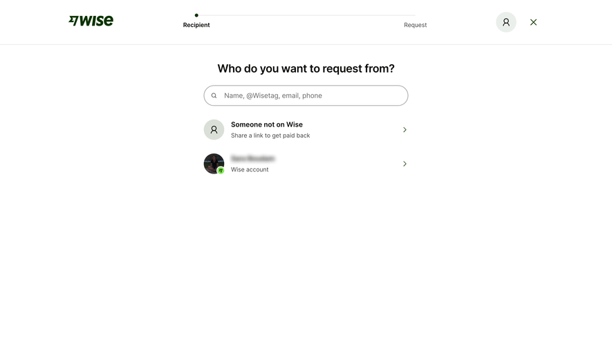
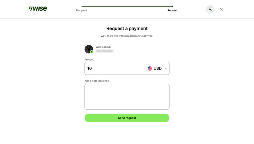
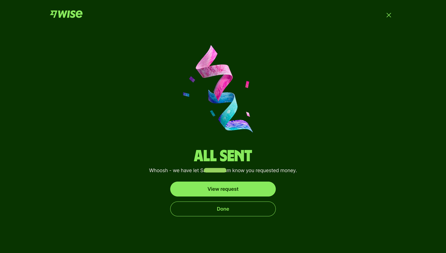
Generate a new design based on this screen using your own content.
Thank you! Your submission has been received!
Oops! Something went wrong while submitting the form.
# Design from Reference: Wise Payment Request Confirmation
Create an original, high-fidelity visual design inspired by the reference. Prioritize composition, typography, colors, spacing, and component styling over technical implementation.
## Reference
- **Product:** Wise
- **Category:** Details
- **Screenshot:** https://cdn.prod.website-files.com/5e9dc792e1210c5325f7ebbc/662fbf0496fe1afc7338138f_1T8NlLwh3Aa5MMuOhVz6_ymRywOtGt0cWRsNvt_ZPvo.webp
Analyze the screenshot first. If inaccessible, request it rather than guessing.
## Content
{{content.instructions}}
{{content.data}}
Preserve essential messaging and factual accuracy. Adapt structure and copy length for visual balance; never invent product claims.
## Visual Design
Use this context to reproduce the reference's visual language: layout, typography, colors, spacing, borders, radii, and distinctive elements. The screenshot takes priority if descriptions conflict.
## Direction
{{preferences.fidelityInstructions}}
## Output
{{output.instructions}}
Deliver a polished, cohesive design with precise alignment, hierarchy, and spacing. Produce the requested visual artifact, not just a description. If unsupported, explain the limitation.
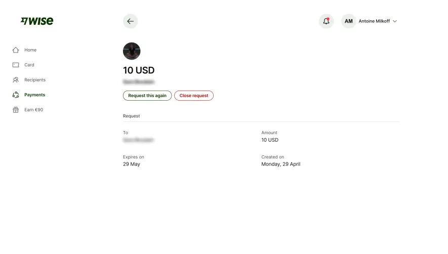
This is Wise's payment request detail page and it's a masterclass in restraint. The deep green brand color anchors the left sidebar nav while everything else breathes in white space. Your eye lands immediately on "10 USD" set in a large, bold serif-adjacent font. It's the hero moment and it needs zero decoration to get there.
Two Buttons, Zero Confusion
The action pair is smart. "Request this again" sits in a bordered green button, while "Close request" gets a red outline treatment. That color distinction between repeat and cancel actions is doing real UX work. No guessing which one is destructive.
Structure Without Fuss
Below the fold, a simple two-column grid lays out To, Amount, Expires on, and Created on. No cards, no shadows, no unnecessary dividers beyond one thin horizontal rule. The typography hierarchy relies entirely on font weight and size. Gray labels above dark values. It feels almost brutally minimal but every piece of information is instantly scannable. The top-right profile chip with initials "AM" for Antoine Milkoff is a small but thoughtful touch.