Design with AI
Generate a new design based on this screen using your own content.
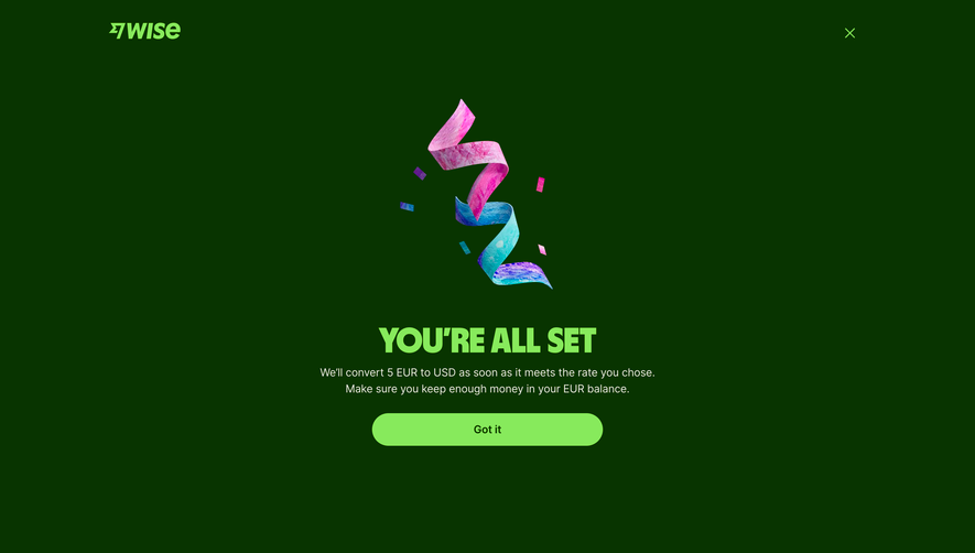
# Design from Reference: Wise Conversion Successful
Create an original, high-fidelity visual design inspired by the reference. Prioritize composition, typography, colors, spacing, and component styling over technical implementation.
## Reference
- **Product:** Wise
- **Category:** Success
- **Screenshot:** https://cdn.prod.website-files.com/5e9dc792e1210c5325f7ebbc/6aca27e5aca7079066e8e76a_6aca27026c0e5ae5caa3321f_cms-0d23b879ce7bbff24eefdd89.webp
Analyze the screenshot first. If inaccessible, request it rather than guessing.
## Content
{{content.instructions}}
{{content.data}}
Preserve essential messaging and factual accuracy. Adapt structure and copy length for visual balance; never invent product claims.
## Visual Design
### Overall aesthetic
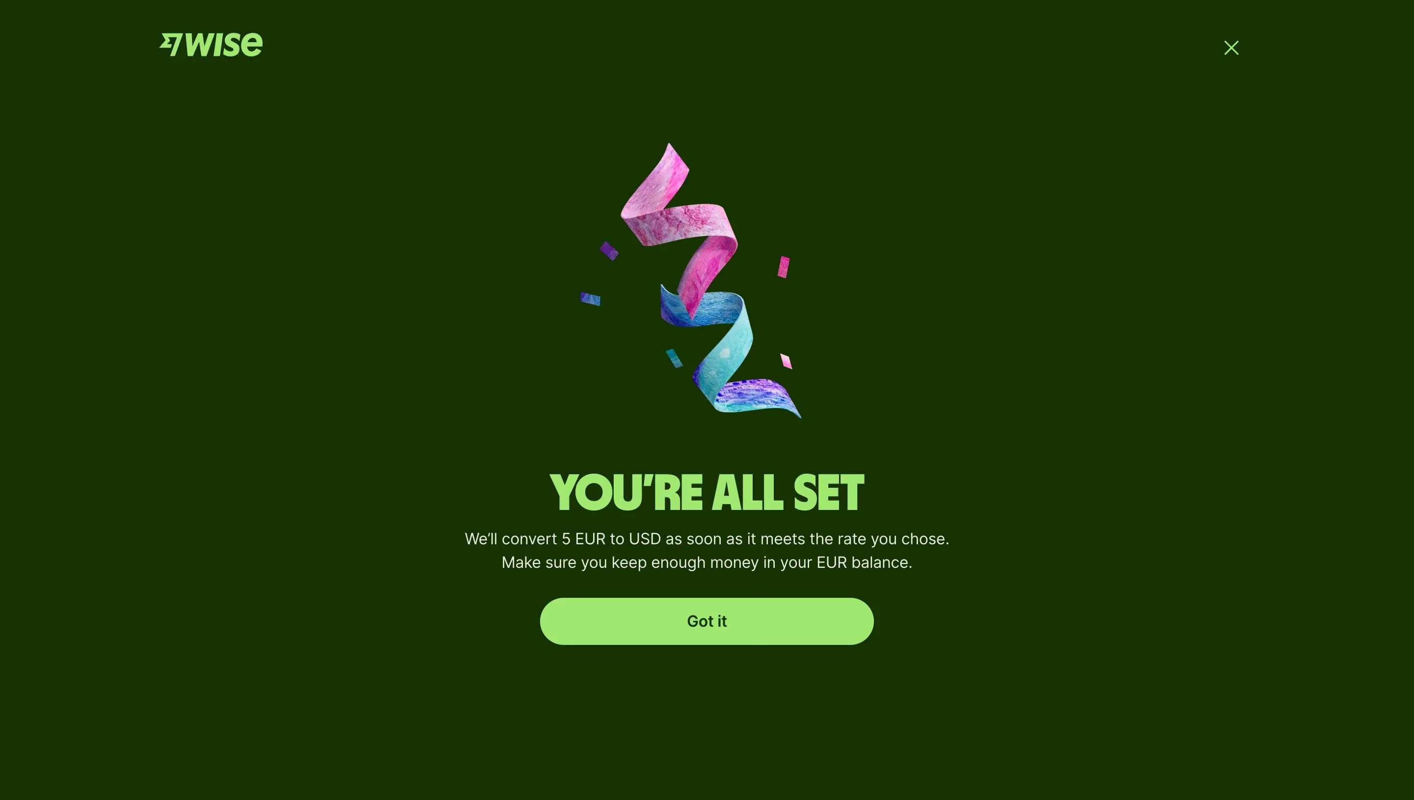
- **Character:** A full-screen confirmation uses a deep green field, bright lime typography/action and a colorful celebratory ribbon.
- **Capture scale:** The screenshot measures 2880 × 1630 pixels. Approximate CSS dimensions assume a 1440 × 815 viewport at 2× density; this is unverified.
- **Tone:** Strong brand color, a short confirmation and one acknowledgment action create a clear completion state.
### Page composition
- **Header:** A lime Wise logo sits upper left, with a small lime close X near the upper right.
- **Illustration:** A twisted pink/cyan/purple ribbon with small confetti pieces is centered in the upper-middle area.
- **Message:** A bold uppercase confirmation sits beneath the illustration.
- **Explanation:** Two centered lines describe the scheduled currency-conversion condition and balance reminder.
- **Action:** A broad lime Got it pill sits below the copy.
- **Surround:** The rest of the page remains uninterrupted deep green.
### Information hierarchy
- **Confirmation:** The large uppercase heading is the strongest text.
- **Condition:** Supporting copy clarifies that conversion will occur when the selected rate is met, rather than indicating an already executed conversion.
- **Acknowledgment:** Got it is the sole filled action.
- **Dismissal:** The small upper-right X provides a separate close route.
- **Celebration:** The ribbon supports the success tone without carrying essential information.
### Typography
- **Family:** Heavy condensed-like display forms serve the heading; a neutral sans-serif serves body and controls. Exact identities are unverified.
- **Heading:** Approximately 48px CSS extra-bold uppercase, tight line-height and tracking.
- **Body:** Approximately 16px with 24px line-height, regular weight.
- **Action:** Approximately 16px semibold, dark green.
- **Brand:** A compact custom italic wordmark uses the same bright lime as the heading.
### Colors & surfaces
- **Canvas:** Sampled #083400 supplies the deep green full-screen background.
- **Primary accent:** Sampled #87EA5C supplies the heading, logo, close mark and acknowledgment button.
- **Body text:** Sampled #E7EBE4 supplies the pale explanatory copy.
- **Illustration:** Saturated pink, cyan, blue and purple textures form the ribbon and confetti.
- **Surface simplicity:** No separate card, border or shadow divides the message from the background.
### Components
- **Ribbon asset:** A tall textured spiral occupies roughly 230 × 280px CSS, with small floating rectangular confetti.
- **Heading:** Heavy uppercase text sits directly on the green background.
- **Acknowledgment button:** Approximately 340 × 48px CSS with fully rounded ends, lime fill and centered dark label.
- **Close control:** A small unboxed X uses thin lime strokes.
- **Header alignment:** Logo and close mark sit within a centered wide content frame.
### Visual rhythm
- **Central axis:** Illustration, headline, explanation and button align centrally.
- **Spacing:** Roughly 48–56px separates the illustration from the heading; smaller 16–24px gaps connect heading, body and action.
- **Whitespace:** Broad green margins surround the compact central confirmation.
- **Color repetition:** Lime repeats only in brand, heading and controls, reinforcing the completion hierarchy.
### Responsive
- **Evidence limit:** Only one desktop confirmation state is observed; dismissal and mobile behavior are unverified.
- **Layout recommendation:** Use a fluid centered column with 20–24px side padding.
- **Illustration recommendation:** Reduce the ribbon size on short screens to keep the action visible.
- **Typography recommendation:** Scale the heading to fit without breaking into awkward fragments.
- **Action recommendation:** Maintain a generous touch target and accessible close control.
### Adaptation guidance
- **Status clarity:** Keep the distinction between a configured conversion condition and an executed conversion explicit.
- **Visual system:** Reuse deep green, lime and one celebratory asset for related confirmations.
- **Data handling:** Use representative amounts/currencies when demonstrating the design.
- **Accessibility:** Announce the confirmation appropriately, label Close and preserve strong contrast/focus.
- **Scope:** The screenshot establishes a confirmation interface only; no financial transaction was performed or independently verified.
Use this context to reproduce the reference's visual language: layout, typography, colors, spacing, borders, radii, and distinctive elements. The screenshot takes priority if descriptions conflict.
## Direction
{{preferences.fidelityInstructions}}
## Output
{{output.instructions}}
Deliver a polished, cohesive design with precise alignment, hierarchy, and spacing. Produce the requested visual artifact, not just a description. If unsupported, explain the limitation.