Generate a new design based on this screen using your own content.
Thank you! Your submission has been received!
Oops! Something went wrong while submitting the form.
# Design from Reference: Visitors Upgrading
Create an original, high-fidelity visual design inspired by the reference. Prioritize composition, typography, colors, spacing, and component styling over technical implementation.
## Reference
- **Product:** Visitors
- **Category:** Upgrading
- **Screenshot:** https://cdn.prod.website-files.com/5e9dc792e1210c5325f7ebbc/697b75bca3175b576c8a38cb_KTovqIvCRuJBEVTd7iS7xC-1KGTF6QCfatOlXCT684M.avif
Analyze the screenshot first. If inaccessible, request it rather than guessing.
## Content
{{content.instructions}}
{{content.data}}
Preserve essential messaging and factual accuracy. Adapt structure and copy length for visual balance; never invent product claims.
## Visual Design
Use this context to reproduce the reference's visual language: layout, typography, colors, spacing, borders, radii, and distinctive elements. The screenshot takes priority if descriptions conflict.
## Direction
{{preferences.fidelityInstructions}}
## Output
{{output.instructions}}
Deliver a polished, cohesive design with precise alignment, hierarchy, and spacing. Produce the requested visual artifact, not just a description. If unsupported, explain the limitation.
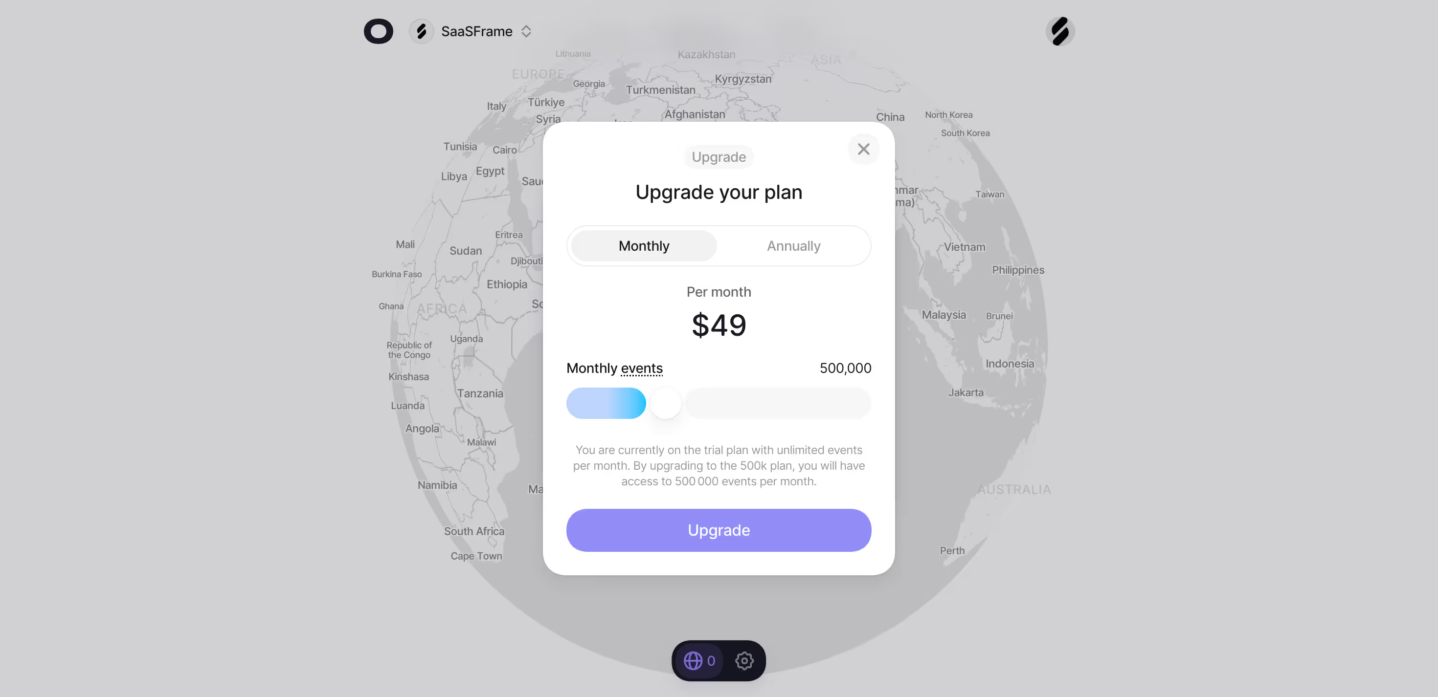
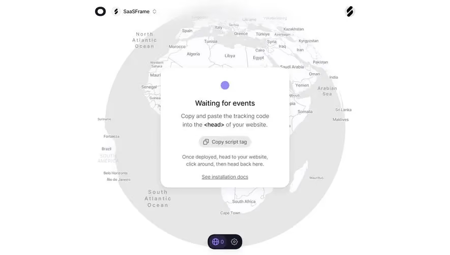
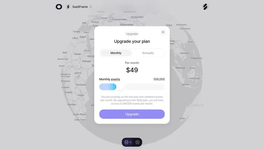
The first thing that hits you is that massive 3D globe sitting behind the modal. It's greyed out and muted but still commands presence. Gives the whole page a geo-aware, data-heavy vibe without saying a word. Smart move for an analytics or event-tracking product.
The modal does all the heavy lifting
Clean white card, centered, no distractions. The Monthly/Annually toggle is simple and familiar. Price is huge at $49, immediately scannable. Below that, a slider for monthly events with a soft blue-to-white gradient thumb that feels tactile. The copy underneath is honest and direct, telling you exactly what changes when you upgrade. No fluff.
Purple CTA pops hard
That purple "Upgrade" button at the bottom is the only saturated color in the entire modal. It pulls your eye straight down the page in a natural reading flow: title, price, options, action. Typography is tight and well-spaced, likely Inter or something similar. The whole thing feels confident and uncluttered. The X close button top-right keeps it low pressure.