Design with AI
Generate a new design based on this screen using your own content.
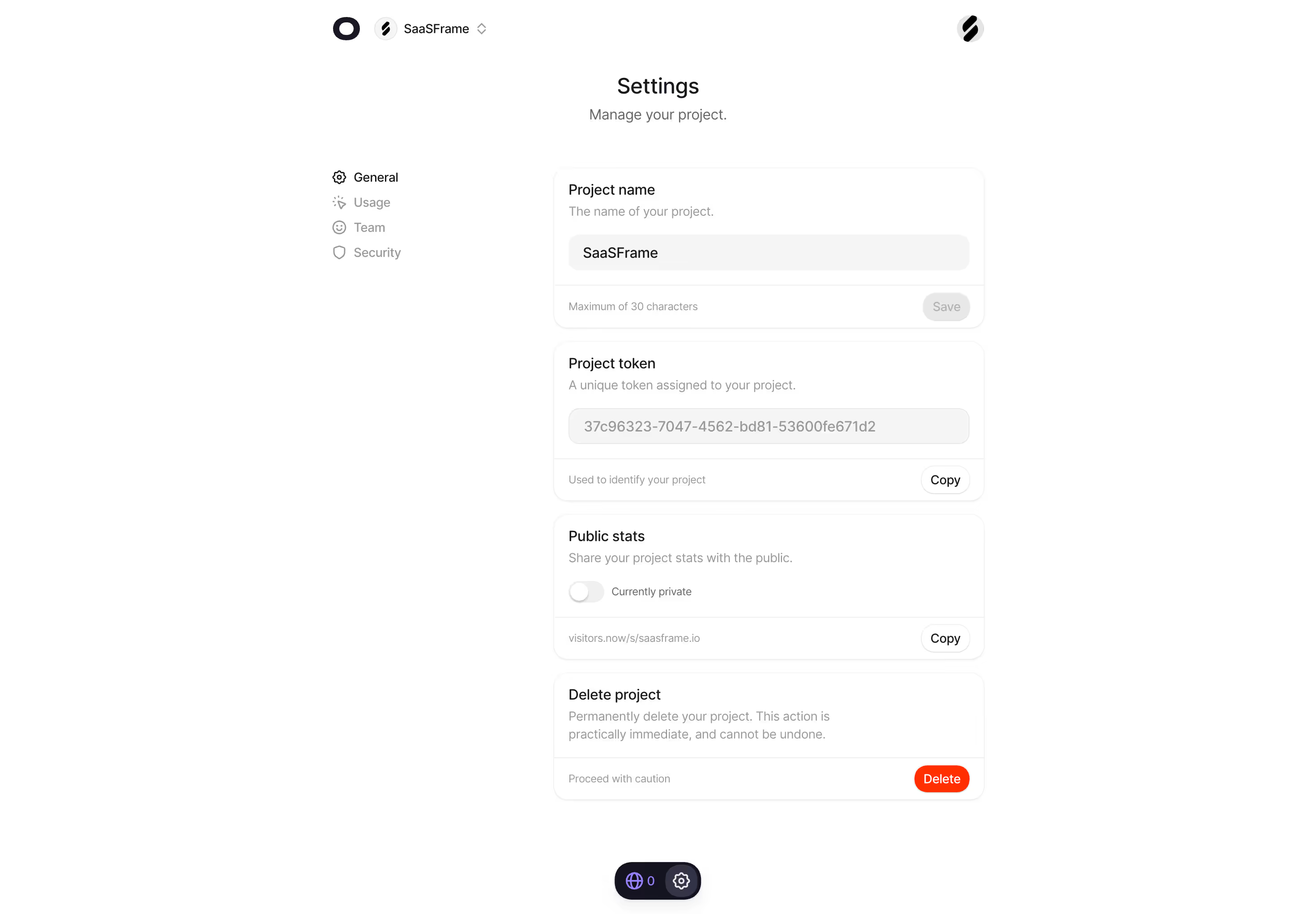
# Design from Reference: Visitors Project Settings
Create an original, high-fidelity visual design inspired by the reference. Prioritize composition, typography, colors, spacing, and component styling over technical implementation.
## Reference
- **Product:** Visitors
- **Category:** Settings
- **Screenshot:** https://cdn.prod.website-files.com/5e9dc792e1210c5325f7ebbc/697b75c9a3175b576c8a3df2_i4HVQEFQknLVaGlzkn2q1ENwHUOZCVRr3DkLS-51c3Q.avif
Analyze the screenshot first. If inaccessible, request it rather than guessing.
## Content
{{content.instructions}}
{{content.data}}
Preserve essential messaging and factual accuracy. Adapt structure and copy length for visual balance; never invent product claims.
## Visual Design
### Overall aesthetic
- **Style:** Minimal project settings with white surfaces, very pale borders, small rounded cards and a single vivid destructive action.
- **Scale:** Source 2940 × 2042px. Sizes below estimate a 1470px-wide CSS layout at 2× capture scale.
### Page composition
- **Top context:** A compact product mark and project switcher sit near the top left of the centered content region, with a project icon at the far right.
- **Page heading:** Settings and a short Manage your project subtitle are centered above the form.
- **Settings body:** A narrow left menu lists General, Usage, Team and Security. Four stacked cards occupy an approximately 482px-wide main column.
- **Bottom utility:** A small dark floating pill with a globe/count and settings icon sits near the bottom center.
### Information hierarchy
- **Card sequence:** Project name, Project token, Public stats and Delete project form a clear progression from basic details to irreversible action.
- **Current states:** Name is populated and Save is disabled. The token is read-only-looking with Copy. Public stats is off and labeled Currently private.
- **Destructive area:** The last card includes explicit permanent-deletion copy, a caution footer and a bright Delete pill.
### Typography
- **Family:** Rounded sans-serif; exact font identity is unverified.
- **Roles:** Estimated page title 24px medium, subtitle 16px, card headings 16px, descriptions 14px/20px and footer helper text 12px.
- **Emphasis:** Dark headings contrast with light gray supporting text; navigation highlights General with dark text.
### Colors & surfaces
- **Sampled palette:** ICC-aware sRGB samples include white #FFFFFF, field gray #F5F5F5, muted #999999, ink #181925 and pale #F0F0F0.
- **Accent:** Orange-red is reserved for Delete. A small lavender accent appears in the bottom utility pill.
- **Surface restraint:** Cards rely on thin pale outlines and faint lower shadows; fields use soft gray fills without strong borders.
### Components
- **Cards:** Approximately 482px wide, with 16px corners, compact 16px padding and separate footer bands divided by fine rules.
- **Fields:** Full-width rounded gray input surfaces around 40px high. The name is editable-looking; token text is muted.
- **Footer actions:** Small rounded Copy pills align right; the disabled Save uses a gray filled pill. Destructive Delete is a saturated rounded pill.
- **Public toggle:** Small off-state switch with white thumb on pale-gray track, accompanied by Currently private text and a separate public URL row.
### Visual rhythm
- **Stacking:** About 14px gaps separate the four cards, each repeating title, description/control and footer structure.
- **Balance:** The narrow form and menu sit within very broad white margins, keeping the page calm despite multiple settings.
### Responsive
- **Recommended adaptation:** Only desktop is observed. Move the menu above the cards, make card width fluid and allow long token/URL strings to wrap or scroll.
- **Actions:** Keep destructive action distinct and ensure the floating utility does not overlap the final card.
### Adaptation guidance
- **Preserve:** Keep settings grouped into independent cards with contextual helpers and right-aligned actions.
- **Adapt:** Use real project data and privacy state. Never reuse the visible token as sample credentials; preserve the explicit warning around deletion.
Use this context to reproduce the reference's visual language: layout, typography, colors, spacing, borders, radii, and distinctive elements. The screenshot takes priority if descriptions conflict.
## Direction
{{preferences.fidelityInstructions}}
## Output
{{output.instructions}}
Deliver a polished, cohesive design with precise alignment, hierarchy, and spacing. Produce the requested visual artifact, not just a description. If unsupported, explain the limitation.