Generate a new design based on this screen using your own content.
Thank you! Your submission has been received!
Oops! Something went wrong while submitting the form.
# Design from Reference: Visitors Profile Picture
Create an original, high-fidelity visual design inspired by the reference. Prioritize composition, typography, colors, spacing, and component styling over technical implementation.
## Reference
- **Product:** Visitors
- **Category:** Account Setup
- **Screenshot:** https://cdn.prod.website-files.com/5e9dc792e1210c5325f7ebbc/697b75b18fbd503ac69253eb_3O5qsKqwCIThnINyqwFfNRdcb3ysNcJUVoA8CfQlSaQ.avif
Analyze the screenshot first. If inaccessible, request it rather than guessing.
## Content
{{content.instructions}}
{{content.data}}
Preserve essential messaging and factual accuracy. Adapt structure and copy length for visual balance; never invent product claims.
## Visual Design
Use this context to reproduce the reference's visual language: layout, typography, colors, spacing, borders, radii, and distinctive elements. The screenshot takes priority if descriptions conflict.
## Direction
{{preferences.fidelityInstructions}}
## Output
{{output.instructions}}
Deliver a polished, cohesive design with precise alignment, hierarchy, and spacing. Produce the requested visual artifact, not just a description. If unsupported, explain the limitation.
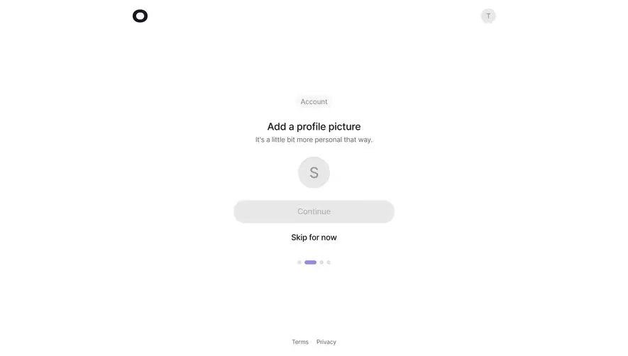
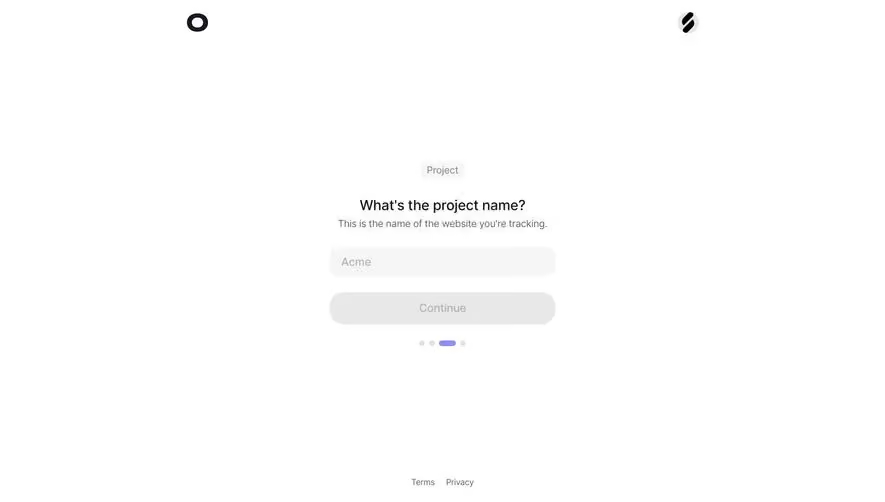
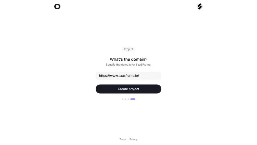
This is one of those screens that does almost nothing and nails it. The "Add a profile picture" step from what looks like Linear's onboarding flow is stripped down to the absolute essentials. A single avatar circle with the letter "S," a greyed-out Continue button, and a bold "Skip for now" link. That's it. No sidebar, no progress bar cluttering the header. Just a quiet little dot indicator at the bottom showing you're on step two of four.
Typography and Spacing Do the Heavy Lifting
The hierarchy is dead simple. "Add a profile picture" in bold, a soft grey subtitle underneath. The font feels like Inter or something similarly clean. There's generous whitespace everywhere, which makes the whole thing feel breathable and low-pressure. The "Account" chip sitting above the heading is a subtle contextual label that orients you without being loud.
What Makes It Stand Out
The disabled Continue button is a smart touch. It tells users they need to act first without any error states or tooltips. Restraint is the whole vibe here.