Generate a new design based on this screen using your own content.
Thank you! Your submission has been received!
Oops! Something went wrong while submitting the form.
# Design from Reference: VideoAsk Landing Page
Create an original, high-fidelity visual design inspired by the reference. Prioritize composition, typography, colors, spacing, and component styling over technical implementation.
## Reference
- **Product:** VideoAsk
- **Category:** Landing Page
- **Screenshot:** https://cdn.prod.website-files.com/5e9dc792e1210c5325f7ebbc/6acbd2164f59d5c9438bb6c6_6acbcfff212b9e1b1439dd4f_cms-8eb2172f77046067ee2469e9.webp
Analyze the screenshot first. If inaccessible, request it rather than guessing.
## Content
{{content.instructions}}
{{content.data}}
Preserve essential messaging and factual accuracy. Adapt structure and copy length for visual balance; never invent product claims.
## Visual Design
Use this context to reproduce the reference's visual language: layout, typography, colors, spacing, borders, radii, and distinctive elements. The screenshot takes priority if descriptions conflict.
## Direction
{{preferences.fidelityInstructions}}
## Output
{{output.instructions}}
Deliver a polished, cohesive design with precise alignment, hierarchy, and spacing. Produce the requested visual artifact, not just a description. If unsupported, explain the limitation.
Face-First Design That Actually Practices What It Preaches
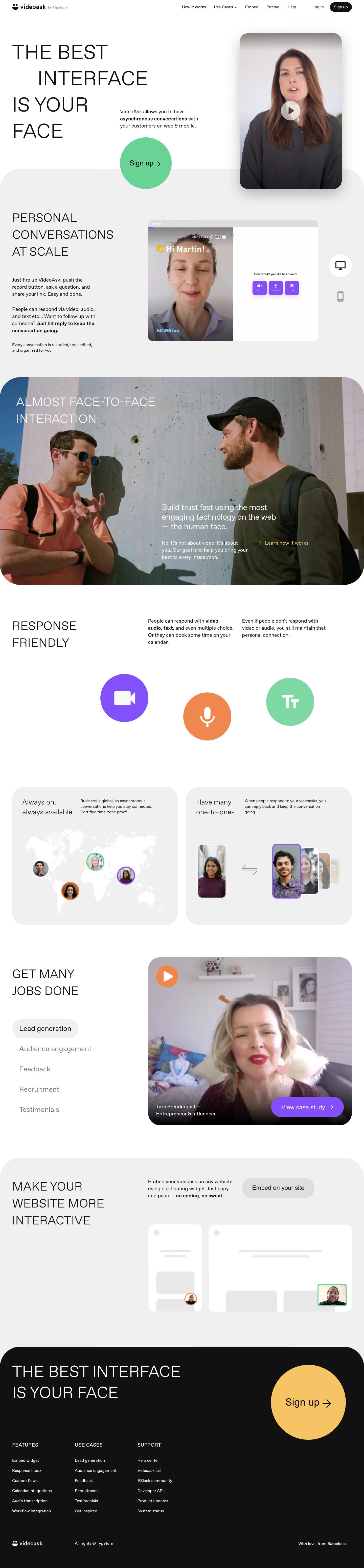
The hero hits hard. "THE BEST INTERFACE IS YOUR FACE" in massive black uppercase type against white, paired with a real human photo with a play button overlay. It sells the product concept in two seconds flat. The lone green "Sign up" pill button pops against all that whitespace.
Smart Visual Hierarchy Through Contrast
The layout alternates between stark white sections and a full-bleed dark photo block ("ALMOST FACE-TO-FACE INTERACTION") that breaks up the scroll and adds depth. Each section works like its own landing page. The response-friendly area uses three oversized icons for video, audio, and text that feel playful without being childish. Typography stays consistent with that bold condensed sans-serif for headlines, keeping things punchy.
The Little Things That Land
The world map illustration with avatar pins is a clever way to show async communication. The "GET MANY JOBS DONE" section uses a tabbed list pattern on the left with a video testimonial card on the right. Real faces everywhere reinforce the core product promise. Footer repeats the hero headline, closing the loop perfectly.