Overall Style and Aesthetic
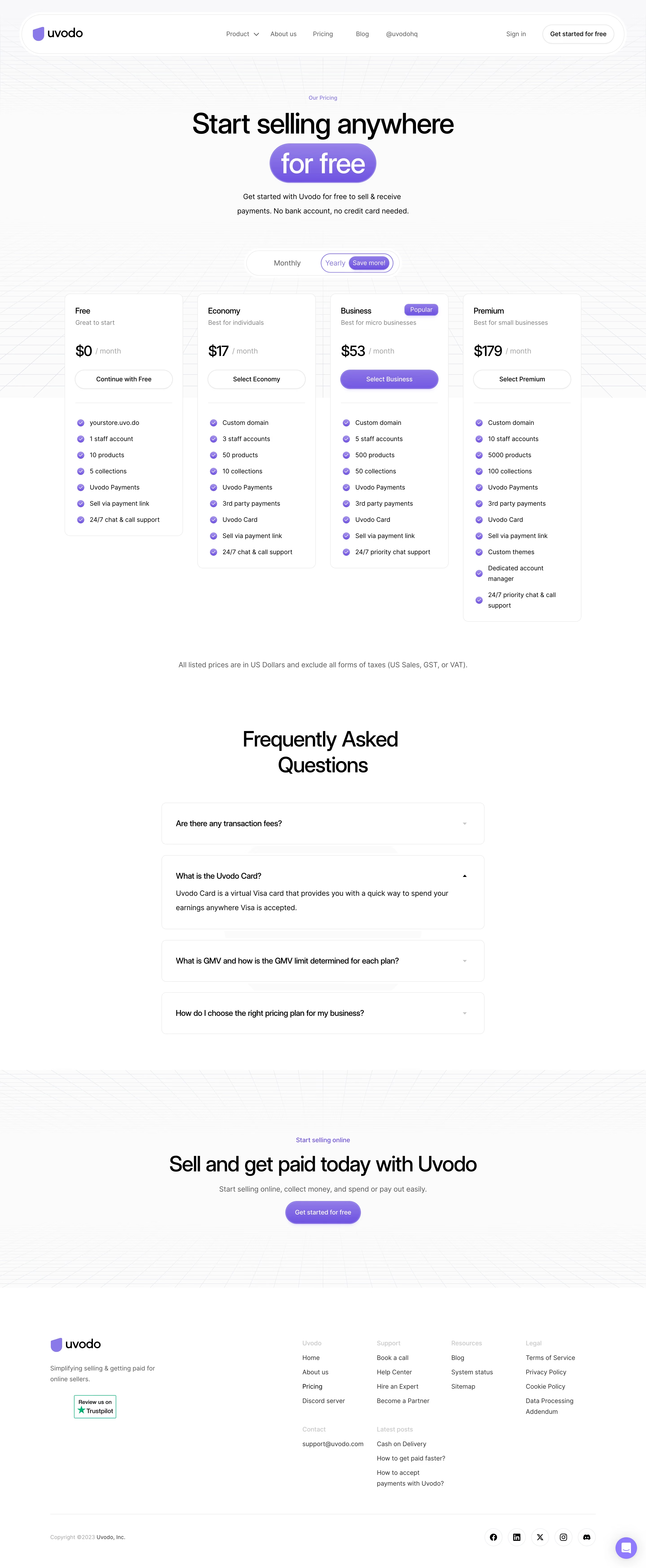
Uvodo’s pricing page embraces a modern minimalist aesthetic, balancing generous white space with precise alignment and understated accents. The design is sharply professional yet accessible, communicating confidence without overwhelming the user. It feels trustworthy and forward-thinking, accented by playful microinteractions that soften the SaaS seriousness. Layout and Structure
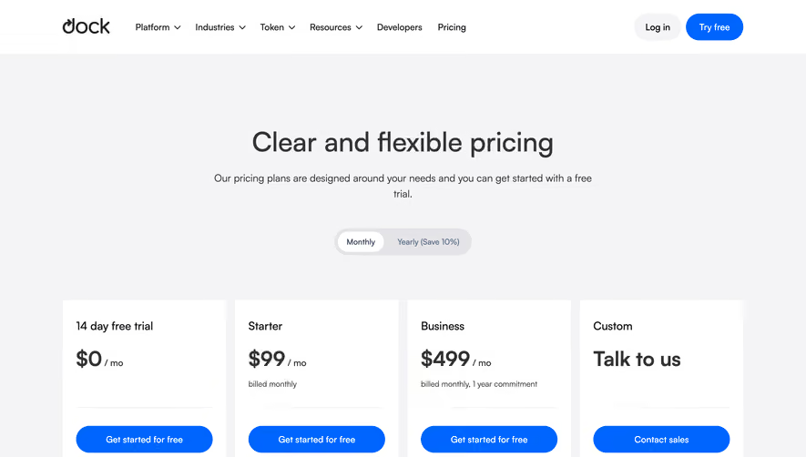
The page structure is intuitive, opening with a crisp hero section featuring a bold headline and succinct subtext, immediately orienting users. A transparent toggle allows easy comparison between billing options. Below, pricing tiers are elegantly displayed in horizontally aligned cards, each spotlighting a headline price, summary, key features, and clear CTAs. The hierarchically organized content flows seamlessly—first pricing plans, then a comparative features table, FAQs, and a streamlined footer with essential links and contact info. Visual Elements
Illustrative icons and subtle UI animations enrich the visuals without distraction. Accent graphics—smooth gradients and minimal icons—guide the eye and add brand character. No heavy photography or video, letting crisp illustrations and semi-flat visuals do the talking. Feature cards use checkmarks and highlights for quick visual scanning. Color Palette and Typography
The palette fuses soft blues, vibrant teals, and neutral grays, creating a calming yet energizing environment. Calls to action stand out in saturated blues and greens. Typography is clean and legible: bold sans-serif headlines contrast with lighter body text, establishing a clear visual hierarchy and aiding scannability. User Experience Patterns
Navigation is sticky and unobtrusive; pricing toggles are instant and satisfying. Primary CTAs (“Get Started”) are prominent and repeated. Microinteractions (e.g., hover states, card highlights) reward exploration. FAQ accordions reduce scroll fatigue, and all forms are frictionless, prioritizing conversion. Unique and Notable Design Choices
Standout details include the interactive billing toggle, subtle plan badges (“Recommended”), and a consistent card structure that enhances quick comparison. The approachable tone in copy and the visual economy reinforce Uvodo’s credibility while making SaaS pricing feel inviting rather than intimidating.