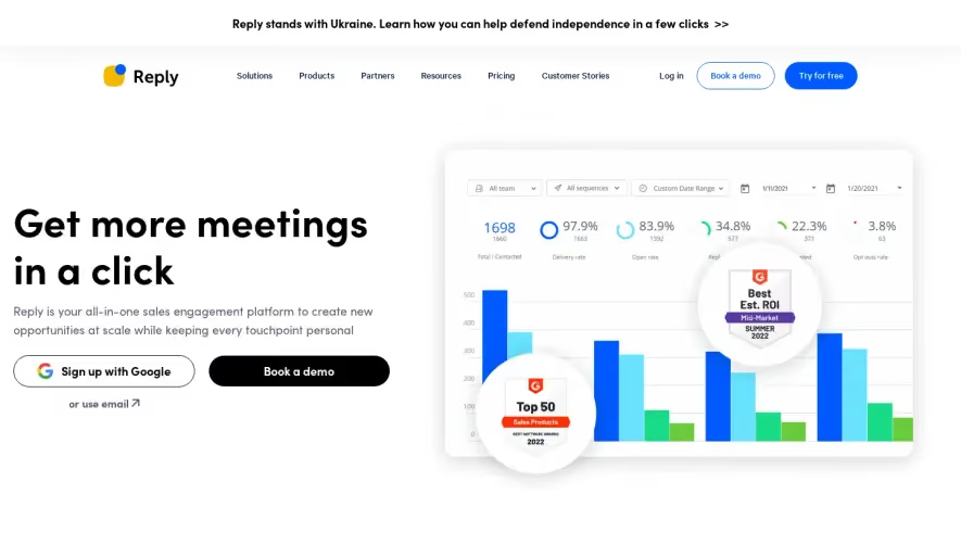
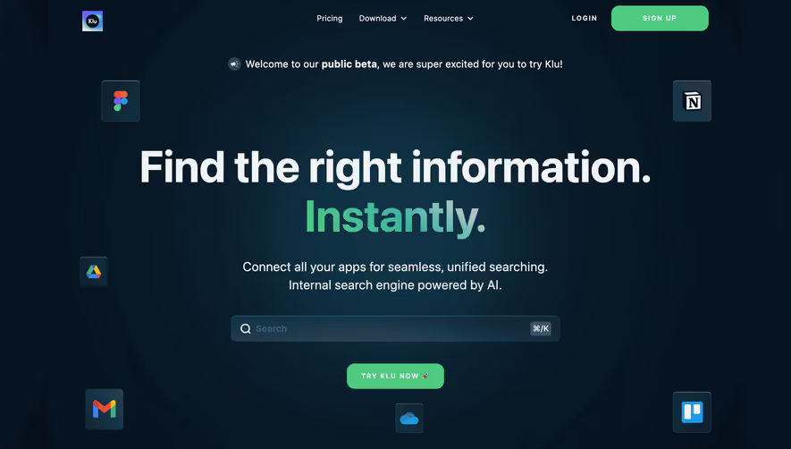
Generate a new design based on this screen using your own content.
Thank you! Your submission has been received!
Oops! Something went wrong while submitting the form.
# Design from Reference: Uvodo Landing Page
Create an original, high-fidelity visual design inspired by the reference. Prioritize composition, typography, colors, spacing, and component styling over technical implementation.
## Reference
- **Product:** Uvodo
- **Category:** Landing Page
- **Screenshot:** https://cdn.prod.website-files.com/5e9dc792e1210c5325f7ebbc/6acad66bd63d2caea65c6323_6acad5f8bf4db4ed6805636a_cms-83fc1be9bda75544ed22b71f.webp
Analyze the screenshot first. If inaccessible, request it rather than guessing.
## Content
{{content.instructions}}
{{content.data}}
Preserve essential messaging and factual accuracy. Adapt structure and copy length for visual balance; never invent product claims.
## Visual Design
Use this context to reproduce the reference's visual language: layout, typography, colors, spacing, borders, radii, and distinctive elements. The screenshot takes priority if descriptions conflict.
## Direction
{{preferences.fidelityInstructions}}
## Output
{{output.instructions}}
Deliver a polished, cohesive design with precise alignment, hierarchy, and spacing. Produce the requested visual artifact, not just a description. If unsupported, explain the limitation.
Uvodo’s homepage exemplifies a modern, minimalist aesthetic, leveraging substantial white space and clean lines to create a clutter-free and approachable look. The visual style feels thoroughly contemporary—professional yet welcoming—appealing to emerging entrepreneurs and established brands alike. The tone strikes a balance between trustworthiness and energetic innovation, achieved through both design and microcopy.
Layout and Structure
The structure follows an intuitive SaaS landing page flow: a striking hero section with bold messaging and a bright call-to-action draws attention instantly. Scrolling reveals concise feature highlights in grid-based layouts, seamlessly interleaved with customer testimonials and informative explainer panels. Eye-catching pricing cards stand out clearly, and a robust footer anchors the page with secondary links and essential information.
Visual Elements
Illustrations feature friendly, organic shapes—abstract, but warm and humanizing. Animated micro-interactions add subtle delight (like button hover effects or smooth content transitions). Custom icons punctuate key feature sections for visual skimmability, while the selective use of mockup imagery contextualizes the platform’s benefits.
Color Palette and Typography
The palette is crisp and fresh, dominated by deep blues, vivid accents (teals, yellows), and gentle backgrounds. Headings leverage a geometric sans-serif font, exuding clarity and modernity, contrasted with lighter body text that maximizes readability. The hierarchy is unmistakable: strong headlines, supportive subheads, and scannable text blocks guide the eye effortlessly.
User Experience Patterns & Unique Choices
Sticky navigation ensures persistent access to CTAs, while prominent buttons and well-paced content encourage engagement. The pricing toggle is interactive, and trust signals—such as customer logos—build credibility. Notably, animated SVG graphics elevate the brand’s energetic feel without distracting, and the entire experience is optimized for speed and clarity across devices.