Design with AI
Generate a new design based on this screen using your own content.
# Design from Reference: Uvodo Brand Settings
Create an original, high-fidelity visual design inspired by the reference. Prioritize composition, typography, colors, spacing, and component styling over technical implementation.
## Reference
- **Product:** Uvodo
- **Category:** Settings
- **Screenshot:** https://cdn.prod.website-files.com/5e9dc792e1210c5325f7ebbc/6acad66ad63d2caea65c62d9_6acad5f7d5603a17eba6aed1_cms-ebbf4b26c87ad6d9b0c711b0.webp
Analyze the screenshot first. If inaccessible, request it rather than guessing.
## Content
{{content.instructions}}
{{content.data}}
Preserve essential messaging and factual accuracy. Adapt structure and copy length for visual balance; never invent product claims.
## Visual Design
### Overall aesthetic
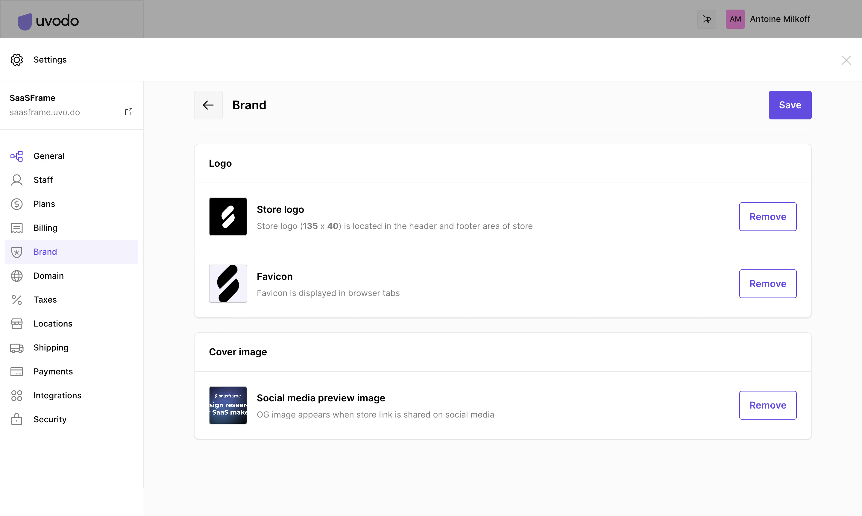
- **Character:** A neutral store-brand settings sheet with a left navigation rail, large outlined content groups and purple save/remove actions.
- **Evidence scale:** Original 2880 × 1724 pixels. CSS estimates assume an unverified 2× capture scale; measured colors include the dimmed application strip above the sheet.
### Page composition
- **Underlying shell:** A dimmed brand/account bar remains visible along the top.
- **Settings header:** White horizontal strip contains a gear icon and Settings left, close cross right.
- **Sidebar:** Approximately 240 px wide, with store identity/domain and twelve icon-led settings links.
- **Main:** A broad content region begins around x324, with back control, Brand heading and right-aligned Save button.
- **Groups:** A Logo panel contains store logo and favicon rows; a Cover image panel contains a social-preview-image row.
### Information hierarchy
- **Current location:** Brand is highlighted with a pale-purple row in the sidebar and repeated as the main heading.
- **Group labels:** Bold Logo and Cover image headers separate asset types.
- **Asset rows:** Thumbnail, bold name and muted explanation align left; outlined Remove action aligns right.
- **Primary action:** Solid purple Save is isolated at the main header's right edge.
- **State:** Uploaded assets are visible; no upload dialog, removal confirmation or saved feedback is shown.
### Typography
- **Main heading:** Unverified sans-serif, approximately 20 px semibold with 26 px line height.
- **Group/asset labels:** Around 16 px semibold.
- **Descriptions/navigation:** Approximately 14 px regular, 20 px line height; dimensions within the logo helper line are bold.
- **Actions:** Around 16 px medium white/purple labels.
- **Identity:** Store name bold with smaller muted domain below.
### Colors & surfaces
- **Base:** White #FFFFFF panels and sidebar; near-white #FBFBFB main background.
- **Overlay strip:** Measured #A8A8A8 and #A6A6A6 gray belongs to the dimmed underlying header.
- **Selection:** Pale lavender #F3F2FE.
- **Accent:** Purple #664BE8 supplies the save/action family.
- **Structure:** Light #EAEAEA borders and black #000000 labels create neutral contrast.
### Components
- **Navigation:** Compact icon-led rows with approximately 40 px pitch; Brand uses a broad rounded selection rectangle.
- **Back control:** Approximately 48 px square pale button with fine border and left arrow.
- **Save:** Approximately 72 × 48 px solid purple rounded rectangle.
- **Asset panels:** Approximately 1032 px wide, 8 px radius, thin gray border and faint lower shadow.
- **Rows:** Roughly 112 px tall with 24 px padding; 64 px square thumbnails have fine borders and small radii.
- **Remove controls:** Approximately 96 × 48 px outlined purple buttons with 4 px radii.
- **Close control:** Small unboxed cross at the sheet's upper-right edge.
### Visual rhythm
- **Panel spacing:** Approximately 24 px separates the two asset groups.
- **Alignment:** Thumbnails, text blocks and Remove actions repeat on consistent vertical axes.
- **Header rhythm:** Back/heading/Save share a baseline, above a fine separator and roughly 24 px gap to the first panel.
- **Whitespace:** Large remaining blank area keeps this small settings task uncluttered.
### Responsive
- **Observed limit:** Desktop settings sheet only; mobile behavior is unverified.
- **Recommendation:** Collapse the navigation rail and let asset rows wrap actions beneath descriptions.
- **Controls:** Keep Save visible and retain clear labels alongside thumbnails on narrow screens.
### Adaptation guidance
- **Retain:** Group uploaded brand assets by purpose and provide a consistent thumbnail/name/helper/action row.
- **Implement:** Use neutral surfaces, fine borders and one purple action system.
- **Verify:** Confirm fonts, actual scale and save/remove behavior separately; no store asset was changed.
Use this context to reproduce the reference's visual language: layout, typography, colors, spacing, borders, radii, and distinctive elements. The screenshot takes priority if descriptions conflict.
## Direction
{{preferences.fidelityInstructions}}
## Output
{{output.instructions}}
Deliver a polished, cohesive design with precise alignment, hierarchy, and spacing. Produce the requested visual artifact, not just a description. If unsupported, explain the limitation.