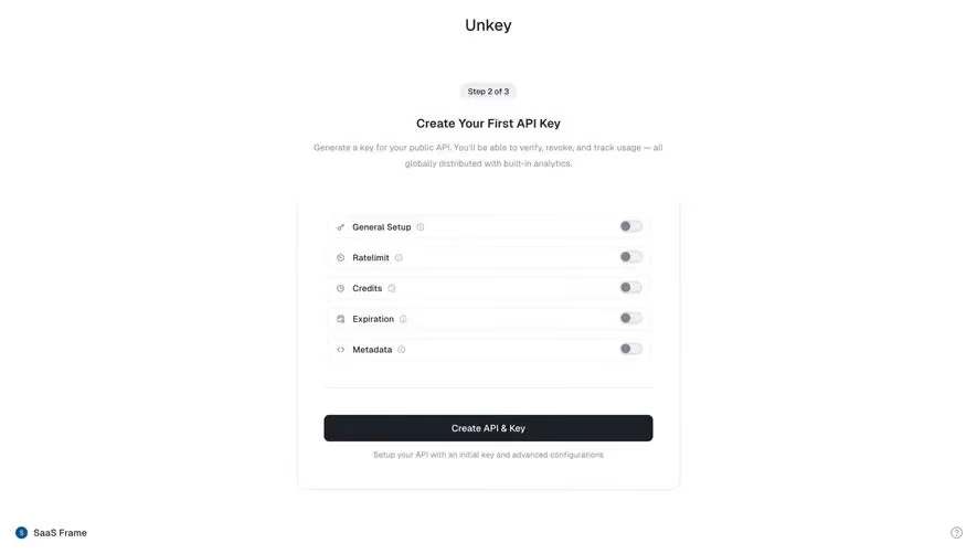
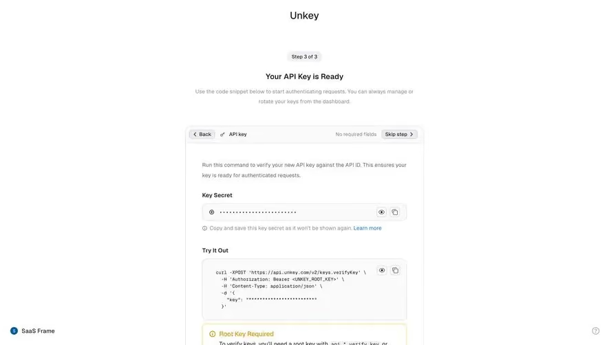
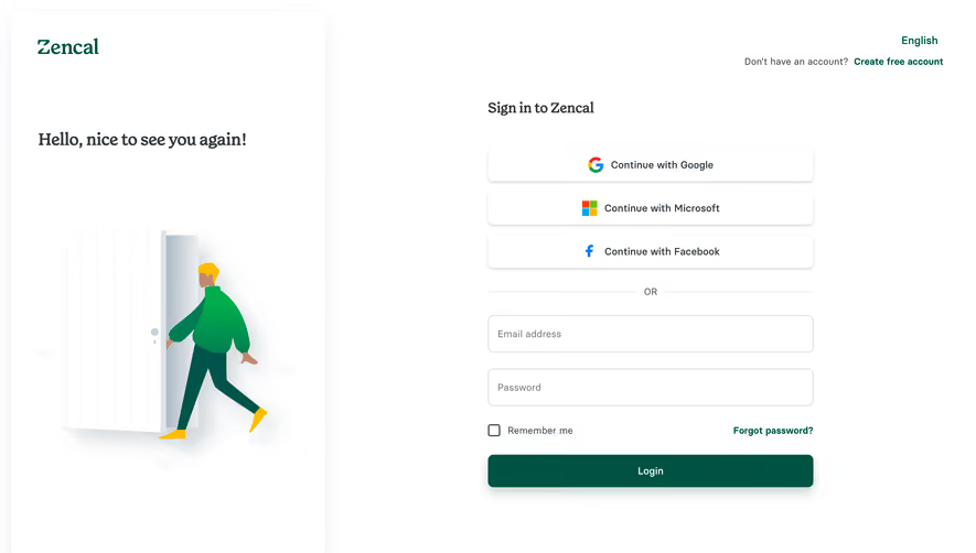
Generate a new design based on this screen using your own content.
Thank you! Your submission has been received!
Oops! Something went wrong while submitting the form.
# Design from Reference: Unkey Signup
Create an original, high-fidelity visual design inspired by the reference. Prioritize composition, typography, colors, spacing, and component styling over technical implementation.
## Reference
- **Product:** Unkey
- **Category:** Signup
- **Screenshot:** https://cdn.prod.website-files.com/5e9dc792e1210c5325f7ebbc/697b75d89e5055491cc83800_MXVonr59fjXQtPPgdCsQpqGPcWl9-_-XXz2vRCneGqw.avif
Analyze the screenshot first. If inaccessible, request it rather than guessing.
## Content
{{content.instructions}}
{{content.data}}
Preserve essential messaging and factual accuracy. Adapt structure and copy length for visual balance; never invent product claims.
## Visual Design
Use this context to reproduce the reference's visual language: layout, typography, colors, spacing, borders, radii, and distinctive elements. The screenshot takes priority if descriptions conflict.
## Direction
{{preferences.fidelityInstructions}}
## Output
{{output.instructions}}
Deliver a polished, cohesive design with precise alignment, hierarchy, and spacing. Produce the requested visual artifact, not just a description. If unsupported, explain the limitation.
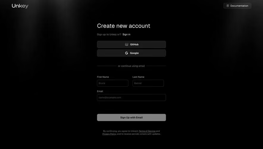
The first thing that hits you is that moody, dark gradient at the top. It's not just flat black. There's a subtle radial glow that gives the header area depth without being distracting. Unkey's sign-up page feels like it respects your time.
Clear Hierarchy, Zero Confusion
The layout is dead simple. "Create new account" in a large, bold white serif-style heading anchors everything. Then you get two OAuth buttons for GitHub and Google, a divider, and the email form fields below. The visual flow is top to bottom with no detours. The "or continue using email" separator does its job quietly. Name fields sit side by side, email gets its own row. Smart use of space.
What Makes It Stand Out
The input fields have that muted placeholder text against dark backgrounds, keeping contrast low but still readable. The "Sign Up with Email" button is intentionally understated, not screaming for attention. Legal links at the bottom are dimmed gray, present but not pushy. Everything feels considered and restrained. No unnecessary decoration anywhere.