
Thank you! Your submission has been received!
Oops! Something went wrong while submitting the form.
Get SaaSFrame Pro
Monthly
$18
Quarterly
$48
Yearly
$180
Upgrade to access this feature
Browse all screens & flows
Filter and search screens & flows
Access Figma files
Access mobile versions
Bookmark screens & flows
Join now
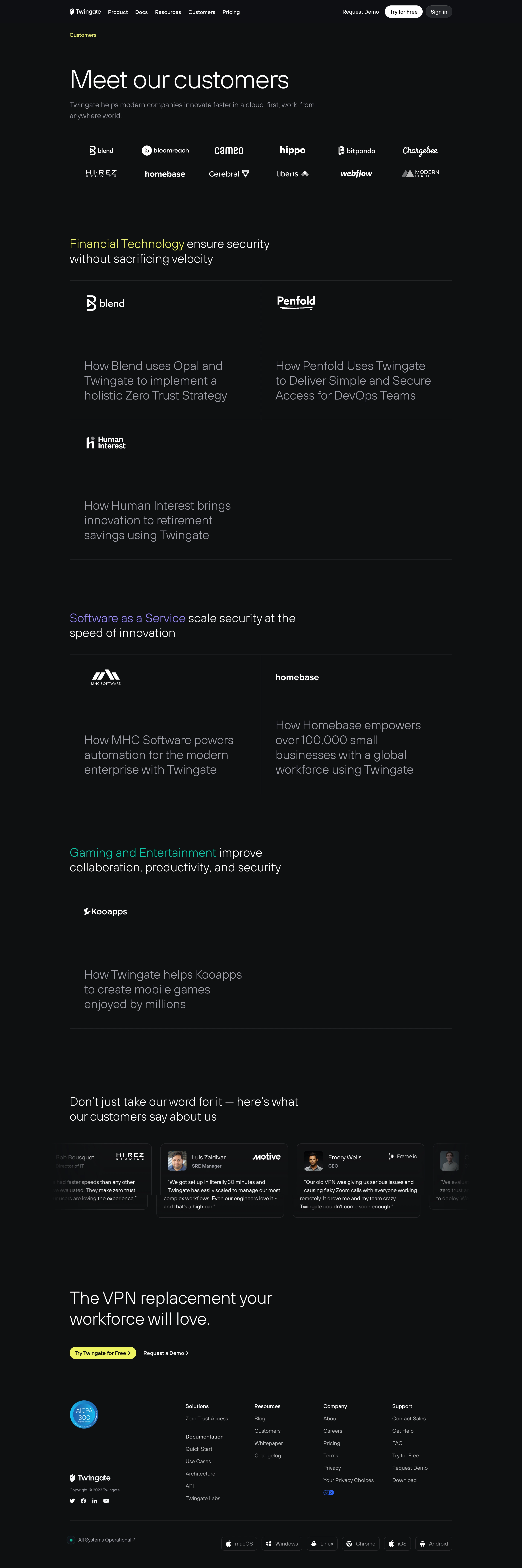

Twingate Customers Page

Twingate
It's time to ditch your VPN
Designed by
No items found.

Bookmark
Bookmark

Design with AI
Thank you! Your submission has been received!
Oops! Something went wrong while submitting the form.
# Design from Reference: Twingate Customers Page
Create an original, high-fidelity visual design inspired by the reference. Prioritize composition, typography, colors, spacing, and component styling over technical implementation.
## Reference
- **Product:** Twingate
- **Category:** Customers Page
- **Screenshot:** https://cdn.prod.website-files.com/5e9dc792e1210c5325f7ebbc/6acb6ae8bf2e69a0c03b6bd0_6acb6a0cc8e486b211791e4b_cms-cf1e1f04b71632467132993a.webp
Analyze the screenshot first. If inaccessible, request it rather than guessing.
## Content
{{content.instructions}}
{{content.data}}
Preserve essential messaging and factual accuracy. Adapt structure and copy length for visual balance; never invent product claims.
## Visual Design
### Overall aesthetic
- **Style:** Dark customer-proof page with large light-weight typography, monochrome logos and almost invisible card borders.
- **Accent system:** Lime, lavender and teal distinguish industry headings; bright lime returns for the closing conversion button.
- **Restraint:** Broad empty areas and typography-led customer stories replace photographic hero content.
### Page composition
- **Canvas:** Source 2880 × 8646 pixels, inspected through all four crops at 1400px width. Measurements use inspection pixels; an approximate 2× CSS capture is plausible but unverified.
- **Wrapper:** Roughly 1026px wide, centered near x187–1213. Compact navigation sits above a divider.
- **Hero:** Small lime page label, large left-aligned heading and two-line muted subtitle precede a two-row, six-column customer-logo arrangement.
- **Industry sections:** Financial technology uses two half-width story cells plus one full-width cell; software uses two half-width cells; gaming uses one full-width cell.
- **Testimonials:** A horizontal card strip follows a two-line heading, with partial outer cards and fading edges.
- **Closing/footer:** A large CTA statement, lime pill and text demo link precede a footer with certification badge, brand/social group, four navigation columns and a bottom platform-download/status row.
### Information hierarchy
- **Hero:** Meet our customers is the largest statement; the logo collection provides an immediate proof layer.
- **Industries:** Each two-line section heading starts with a colored industry phrase and continues in white.
- **Stories:** White customer logos anchor the upper-left of each cell; large muted-gray story titles sit lower down.
- **Testimonials:** Avatar/name/role and company mark form a compact header above quote text.
- **Conversion:** The final two-line headline and bright pill stand apart from the quieter footer links.
### Typography
- **Hero:** Approximately 68px light sans serif, around 80px line height with tight tracking.
- **Industry/story headings:** Approximately 32px light, around 40px line height; long story titles span several lines.
- **Closing heading:** Around 46px light with approximately 56px line height.
- **Body:** Hero subtitle approximately 20px/29px; navigation, testimonial text and footer around 14px, with quotes around 22px line height.
- **Font identity:** Neutral rounded sans-serif appearance; exact family is unverified.
### Colors & surfaces
- **Measured canvas:** #0E0F11 is overwhelmingly dominant; nearby #0E0F13, #0F1012, #101113, #0F1013 and #111214 occur in subtle dark variations.
- **Measured foreground:** #FFFFFF white logos/headings and #A1A1AB muted story/body tones.
- **Accents:** Industry phrases appear yellow-lime, lavender and teal; a blue certification badge adds a localized secondary color. Exact accent hex values are not claimed without semantic sampling.
- **Surface hierarchy:** Story cells remain on the page’s dark plane, bounded by faint charcoal lines rather than contrasting fills or shadows.
### Components
- **Navigation actions:** White Try for Free pill and charcoal Sign in pill are roughly 34px high; request-demo is a plain text action.
- **Logo matrix:** Twelve marks in two rows, with balanced visual sizes and generous horizontal separation.
- **Story cells:** Half-width cells approximately 513 × 374px, around 39px padding, sharp corners and thin borders. Full-width cells retain the same broad height.
- **Testimonial cards:** Roughly 342 × 200px, 12px radius, thin border and around 20px padding; small portraits are approximately 50px square with rounded corners.
- **Closing action:** Lime pill roughly 179 × 34px with dark text and right chevron.
- **Footer utilities:** Small outlined platform buttons, green-dot system-status label and social icons. Slider motion, card hover and navigation outcomes are unverified.
### Visual rhythm
- **Hero spacing:** Large gap follows navigation; logos sit roughly 60px below subtitle.
- **Industry spacing:** Roughly 140–160px separates the logo block and successive industry groups.
- **Card composition:** Logos stay near the top while titles sit toward the bottom, producing deliberate empty space within each cell.
- **Proof-to-action:** Broad dark gaps separate stories, testimonial strip, closing CTA and footer.
- **Footer cadence:** Links use approximately 33px row pitch; a bottom hairline separates status/download utilities.
### Responsive
- **Observed scope:** A desktop long page only; carousel behavior and narrow layouts are unverified.
- **Recommended layout:** Reduce heading sizes, use 20–24px side gutters and stack story cells at mobile widths.
- **Recommended logos:** Reflow the six-column logo matrix into fewer columns while preserving minimum legibility.
- **Recommended testimonials:** Provide accessible horizontal navigation or stack cards; keep fade effects from hiding essential quote text.
- **Recommended footer:** Stack link groups and wrap platform controls with adequate touch spacing.
### Adaptation guidance
- **Preserve:** Dark canvas, industry accent phrases, monochrome logo treatment and spacious typography-led story cells.
- **Content fidelity:** Use supplied customer marks, story links and authorized testimonials; avoid inventing metrics or endorsements.
- **Implementation:** Build industry sections from reusable grids, allowing single stories to span both columns.
- **Accessibility:** Maintain contrast for muted titles and subtle boundaries, and provide clear focus states and meaningful customer-link names.
Use this context to reproduce the reference's visual language: layout, typography, colors, spacing, borders, radii, and distinctive elements. The screenshot takes priority if descriptions conflict.
## Direction
{{preferences.fidelityInstructions}}
## Output
{{output.instructions}}
Deliver a polished, cohesive design with precise alignment, hierarchy, and spacing. Produce the requested visual artifact, not just a description. If unsupported, explain the limitation.


Category
Patterns
No items found.


Added on
April 7, 2023
Similar screens
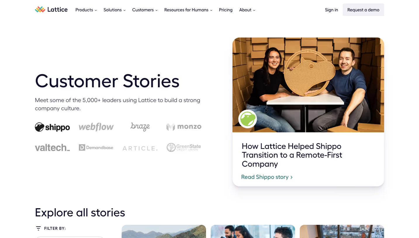


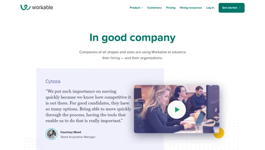

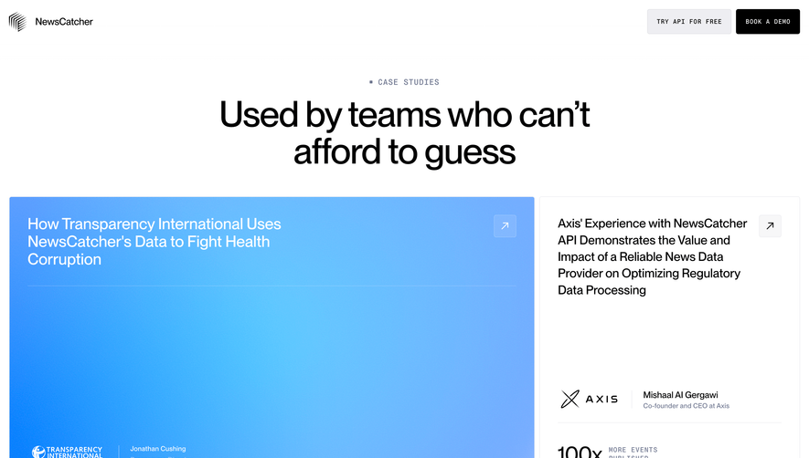

Upgrade to SaaSFrame Pro now to see similar examples.
Monthly
$18 /month
Billed $18 monthly
Browse all screens & flows
Filter and search screens & flows
Search text in screenshots
Access Figma files
Access mobile versions
Join now
Quarterly
$16 /month
Billed $48 quarterly
Browse all screens & flows
Filter and search screens & flows
Search text in screenshots
Access Figma files
Access mobile versions
Join now
Yearly
$15 /month
Billed $180 yearly
Browse all screens & flows
Filter and search screens & flows
Search text in screenshots
Access Figma files
Access mobile versions
Join now