Design with AI
Generate a new design based on this screen using your own content.
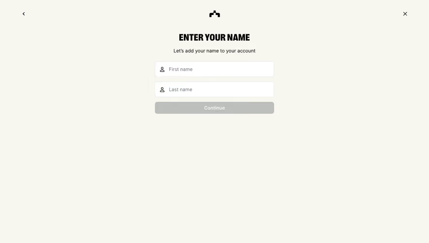
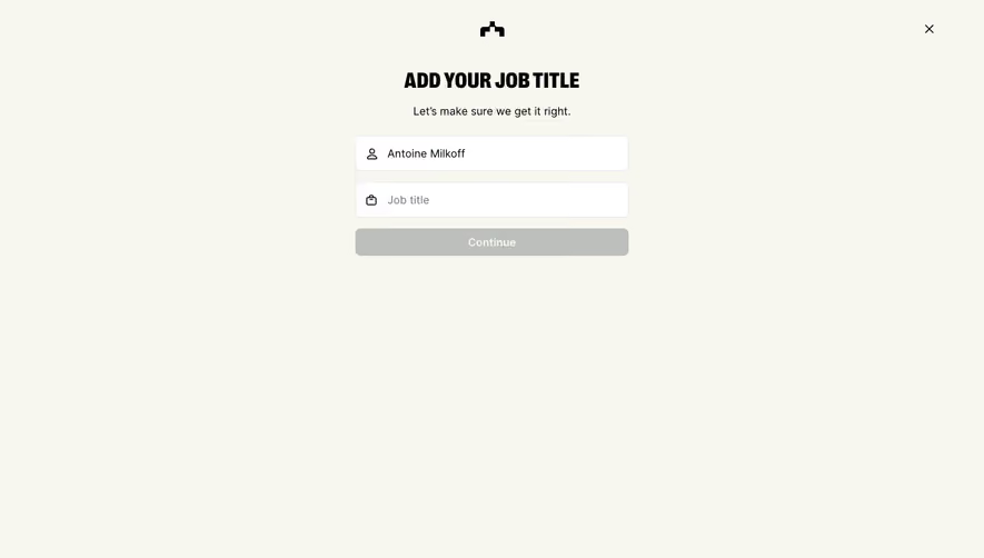
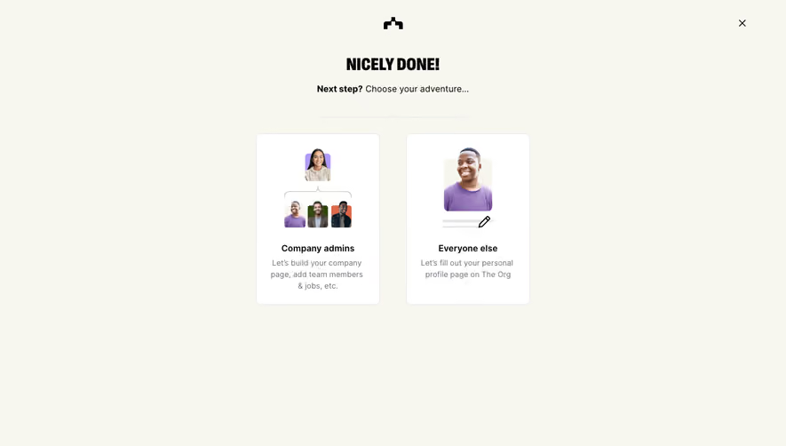
# Design from Reference: The Org Signup
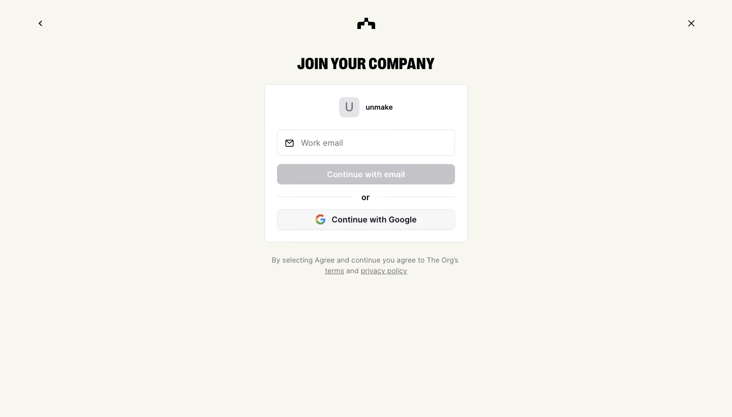
Create an original, high-fidelity visual design inspired by the reference. Prioritize composition, typography, colors, spacing, and component styling over technical implementation.
## Reference
- **Product:** The Org
- **Category:** Signup
- **Screenshot:** https://cdn.prod.website-files.com/5e9dc792e1210c5325f7ebbc/6acbbc726325e7e23e4c968d_6acbbbbe5c8937341a55409b_cms-8d1fbed06b0585665d01c5a4.webp
Analyze the screenshot first. If inaccessible, request it rather than guessing.
## Content
{{content.instructions}}
{{content.data}}
Preserve essential messaging and factual accuracy. Adapt structure and copy length for visual balance; never invent product claims.
## Visual Design
### Overall aesthetic
- **Character:** Restrained company-join screen on a warm off-white canvas with condensed uppercase display text.
### Page composition
- **Canvas:** 1440 × 821 screenshot px.
- **Structure:** Back and close controls in upper corners, small centered brand symbol, JOIN YOUR COMPANY title, compact white account card and legal copy below.
### Information hierarchy
- **Priority:** Company identity precedes work-email entry. Gray Continue with email is subdued in the empty state; Google provides an alternate route below an OR divider.
### Typography
- **Family:** Heavy condensed sans display heading paired with neutral sans interface text; exact fonts unverified.
- **Scale:** Estimated screenshot title 28 px, card text/buttons 16 px and legal 14 px.
### Colors & surfaces
- **Sampled palette:** Warm canvas #F7F7EF, white #FFFFFF, inactive button #C4C4C8, provider surface #F7F7F7, borders #E4E4E7 and black #000000.
### Components
- **Card:** Thin outlined white rectangle, approximately 400 px wide, 8 px corners and 24 px padding.
- **Controls:** Leading envelope icon inside email field, full-width muted action, centered divider and outlined Google button; small company initial tile at top.
### Visual rhythm
- **Spacing:** Approximately 16–20 screenshot px control gaps; wide outer whitespace and compact legal block beneath card.
### Responsive
- **Observed:** Desktop only.
- **Adaptation:** Fit card inside 20 px gutters, retain legal links and make back/close hit targets accessible.
### Adaptation guidance
- **Preserve:** Quiet company identity, strong condensed heading and clear authentication alternatives.
- **Replace:** Use actual company/domain and supported providers; do not infer disabled-state behavior beyond the capture.
Use this context to reproduce the reference's visual language: layout, typography, colors, spacing, borders, radii, and distinctive elements. The screenshot takes priority if descriptions conflict.
## Direction
{{preferences.fidelityInstructions}}
## Output
{{output.instructions}}
Deliver a polished, cohesive design with precise alignment, hierarchy, and spacing. Produce the requested visual artifact, not just a description. If unsupported, explain the limitation.