Design with AI
Generate a new design based on this screen using your own content.
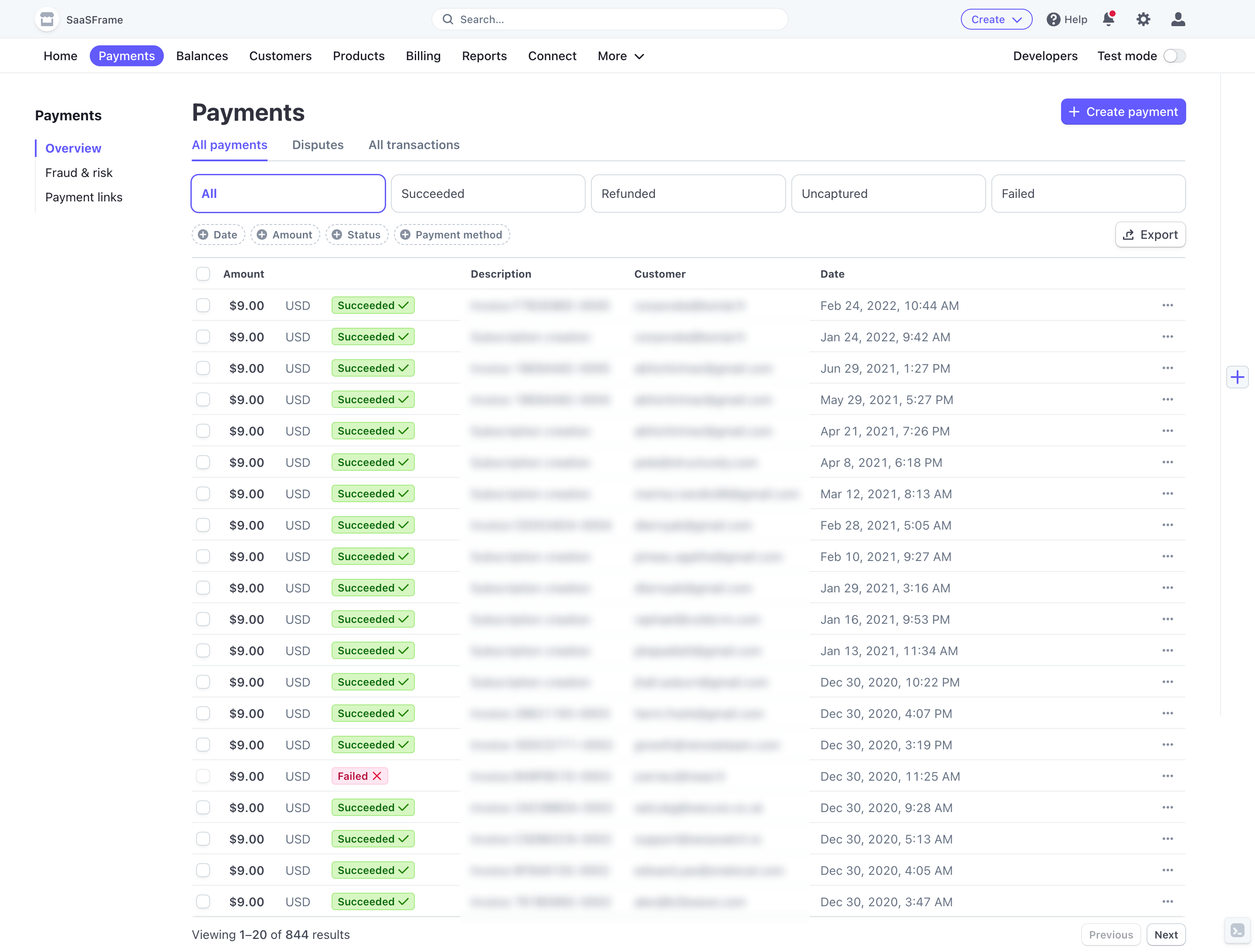
# Design from Reference: Stripe Payments Dashboard
Create an original, high-fidelity visual design inspired by the reference. Prioritize composition, typography, colors, spacing, and component styling over technical implementation.
## Reference
- **Product:** Stripe
- **Category:** Table
- **Screenshot:** https://cdn.prod.website-files.com/5e9dc792e1210c5325f7ebbc/6acadcc38c9a73ab05f13471_6acadc2c5f2661b1665852af_cms-a020056c8afc59ccd1a96aad.webp
Analyze the screenshot first. If inaccessible, request it rather than guessing.
## Content
{{content.instructions}}
{{content.data}}
Preserve essential messaging and factual accuracy. Adapt structure and copy length for visual balance; never invent product claims.
## Visual Design
### Overall aesthetic
- **Character:** Dense payments administration view with white surfaces, violet navigation and compact colored transaction statuses.
### Page composition
- **Capture:** 2880 × 2184 screenshot pixels; estimated 2× CSS scale.
- **Structure:** Two top navigation tiers, Payments sidebar, main heading/action, tabs, five status filters, small filter chips and long transaction table with pagination.
### Information hierarchy
- **Priority:** Amount/status pairs anchor each row; descriptions, customers and dates follow. Create payment and Export are clearly separated actions.
### Typography
- **Family:** Sans serif; exact family unverified.
- **Estimated CSS sizes:** Page heading 28px, navigation/body 14px, table labels 12px and status badges 12px.
### Colors & surfaces
- **Measured palette:** White #FFFFFF, utility background #F4F8FA, rules #EAEEF1, near-white #FEFEFE/#FDFEFE and success mint #CFF8BD.
- **Accents:** Violet selected navigation/actions and pink-red failure badge.
### Components
- **Elements:** Global search, status tabs, dashed-outline filter chips, selection checkboxes, green success badges, red failure badge, row overflow and result-count pagination.
- **Estimated geometry:** Rows approximately 36px high, 32px actions, 8px filter radii and thin table rules.
### Visual rhythm
- **Spacing:** Multiple compact control rows precede a tightly repeated table. Consistent column alignment supports scanning many transactions.
### Responsive
- **Suggested adaptation:** Collapse secondary navigation, wrap filters and allow horizontal table scrolling. Mobile layout is not shown.
### Adaptation guidance
- **Transfer:** Retain amount/status prominence and strong filter grouping. Use masked customer information and accurate financial states.
Use this context to reproduce the reference's visual language: layout, typography, colors, spacing, borders, radii, and distinctive elements. The screenshot takes priority if descriptions conflict.
## Direction
{{preferences.fidelityInstructions}}
## Output
{{output.instructions}}
Deliver a polished, cohesive design with precise alignment, hierarchy, and spacing. Produce the requested visual artifact, not just a description. If unsupported, explain the limitation.