
Thank you! Your submission has been received!
Oops! Something went wrong while submitting the form.
Get SaaSFrame Pro
Monthly
$18
Quarterly
$48
Yearly
$180
Upgrade to access this feature
Browse all screens & flows
Filter and search screens & flows
Access Figma files
Access mobile versions
Bookmark screens & flows
Join now
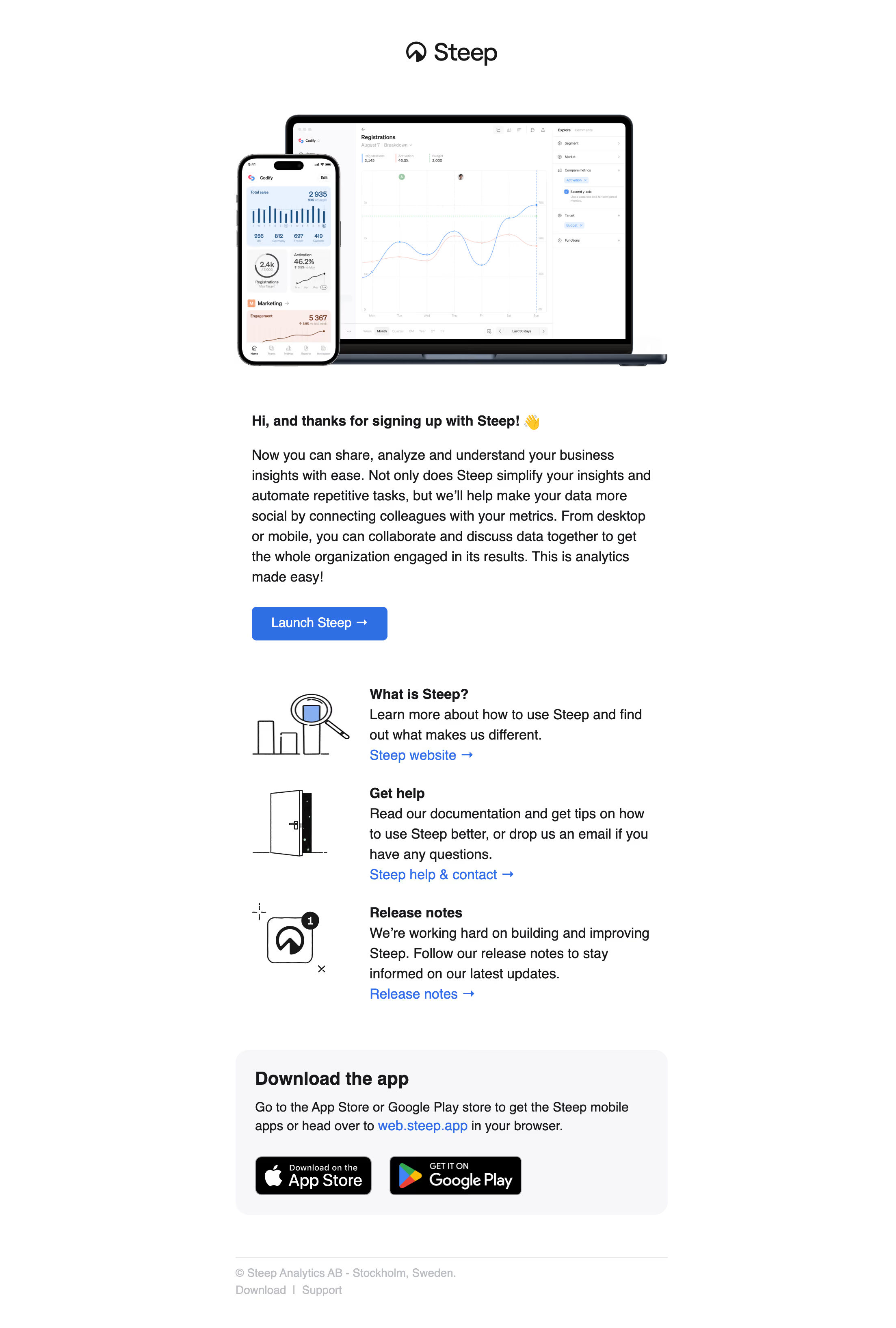
Steep Welcome Email

Steep
Modern analytics platform
Designed by
No items found.

Bookmark
Bookmark

Design with AI
Thank you! Your submission has been received!
Oops! Something went wrong while submitting the form.
# Design from Reference: Steep Welcome Email
Create an original, high-fidelity visual design inspired by the reference. Prioritize composition, typography, colors, spacing, and component styling over technical implementation.
## Reference
- **Product:** Steep
- **Category:** Welcome Email
- **Screenshot:** https://cdn.prod.website-files.com/5e9dc792e1210c5325f7ebbc/6acad56f86f1bee9c3650767_6acad49cfef6904ce00896c9_cms-37d0a3259fcf04f15bbf96f7.webp
Analyze the screenshot first. If inaccessible, request it rather than guessing.
## Content
{{content.instructions}}
{{content.data}}
Preserve essential messaging and factual accuracy. Adapt structure and copy length for visual balance; never invent product claims.
## Visual Design
### Overall aesthetic
- **Character:** Clean welcome email with a large device-product hero, plain black copy, blue links and illustrated resource rows.
- **Evidence and scale:** Screenshot measures 2206 × 3270 image pixels. The capture scale is unverified; relative layout and captured-image measurements are more reliable than inferred email CSS dimensions.
### Page composition
- **Brand/hero:** Centered logo appears above a laptop-and-phone product composition showing analytical charts.
- **Welcome copy:** A narrow left-aligned text column beneath the hero contains a bold greeting, long introductory paragraph and blue launch button.
- **Resources:** Three vertically stacked rows pair small black line illustrations at left with bold resource headings, explanatory copy and blue arrow links at right.
- **Download/footer:** A rounded pale-gray panel presents mobile/browser guidance and two store badges. A thin divider precedes muted company and utility text.
### Information hierarchy
- **Product image:** The large devices establish the product context before the welcome message.
- **Main action:** The filled Launch Steep button is visually stronger than the subsequent text links.
- **Resource levels:** Bold headings distinguish product explanation, help and release notes, while concise paragraphs explain each route.
- **Secondary conversion:** App-download badges are grouped inside their own pale panel, separate from the initial launch action.
### Typography
- **Body:** Neutral sans-serif, approximately 32–36px in original captured pixels, with leading around 50px; these are raster measurements, not asserted CSS values.
- **Emphasis:** Greeting/resource headings are bold at similar scale; the download heading is larger near 44px captured size.
- **Links/actions:** Blue resource links retain body scale; launch label is medium weight. Footer text is smaller and pale gray.
- **Family:** Exact sans-serif family and computed weights remain unverified.
### Colors & surfaces
- **Measured foundation:** White #FFFFFF dominates; #F7F7F8 forms the download panel and related pale surfaces.
- **Measured text:** Near-black #17191C and black #000000 appear in copy/brand.
- **Measured action:** Blue #0071EC supports the main launch action and prominent links.
- **Preview colors:** Pale blue #E6F1FF and darker #004E84 belong largely to product charts; device frames supply black/dark metallic edges.
### Components
- **Device hero:** Large laptop with line-chart workspace overlaps a phone showing metric cards and bars. The phone sits in front at left; neither preview is an observed live interface.
- **Launch button:** Approximately 335 × 83 original pixels, saturated blue, white label/right arrow and radius around 12px.
- **Resource rows:** Black hand-drawn chart/magnifier, doorway and notification/app motifs sit in a narrow illustration column; text aligns to a consistent right-hand edge.
- **Download panel:** Approximately 1065px wide in the original raster, pale fill, radius near 32px and about 48px padding. Black store badges sit in a horizontal row.
- **Footer:** Thin pale divider and two compact lines of muted company/location and utility links, left aligned with the main content.
### Visual rhythm
- **Centered frame:** Hero and resource/download content share a narrow central email region with broad white outer margins.
- **Text rhythm:** Long welcome paragraph uses comfortable leading; substantial breaks separate launch, resources and download panel.
- **Resource consistency:** Illustration width, heading baseline and blue-link placement repeat across all three resource rows.
- **Surface contrast:** The pale download box is the only large container treatment, making it a clear final content block.
### Responsive
- **Observed limit:** One tall email rendering is visible; mobile wrapping and email-client behavior are unobserved.
- **Recommended sizing:** Use a fluid max-width email container, scale the device hero proportionally and retain comfortable mobile side padding.
- **Recommended resources:** Stack icons above text if columns become cramped; allow store badges to wrap without distortion.
- **Recommended text:** Set actual CSS type from readability testing rather than copying the high-resolution raster measurements.
### Adaptation guidance
- **Preserve the journey:** Welcome, launch, learning/support resources and optional downloads form a clear first-use email sequence.
- **Use restraint:** Retain white ground, one blue action color and a small number of simple illustrations.
- **Implementation:** Use email-safe markup, selectable text, descriptive alternatives and accessible links. App availability and product capabilities shown in the message require separate verification.
Use this context to reproduce the reference's visual language: layout, typography, colors, spacing, borders, radii, and distinctive elements. The screenshot takes priority if descriptions conflict.
## Direction
{{preferences.fidelityInstructions}}
## Output
{{output.instructions}}
Deliver a polished, cohesive design with precise alignment, hierarchy, and spacing. Produce the requested visual artifact, not just a description. If unsupported, explain the limitation.


Category
Patterns
No items found.
Tech Stack
No items found.
Added on
January 4, 2024
Similar screens
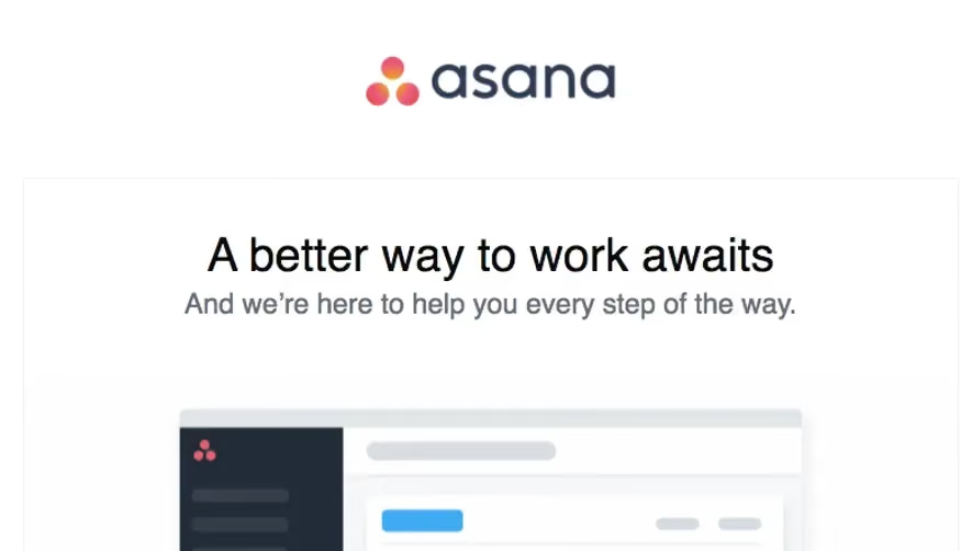


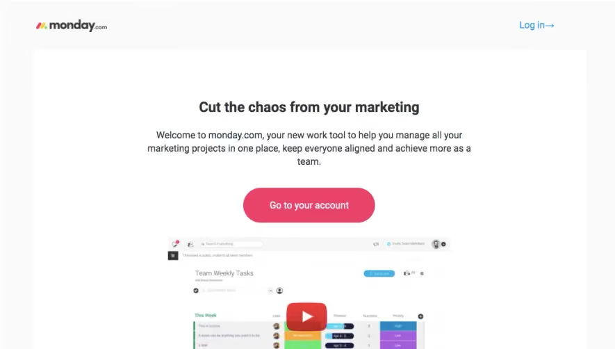

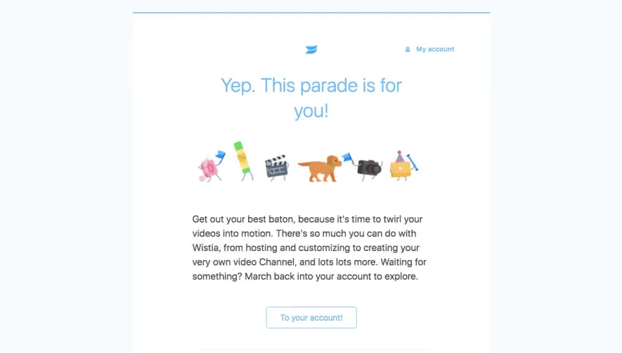

Upgrade to SaaSFrame Pro now to see similar examples.
Monthly
$18 /month
Billed $18 monthly
Browse all screens & flows
Filter and search screens & flows
Search text in screenshots
Access Figma files
Access mobile versions
Join now
Quarterly
$16 /month
Billed $48 quarterly
Browse all screens & flows
Filter and search screens & flows
Search text in screenshots
Access Figma files
Access mobile versions
Join now
Yearly
$15 /month
Billed $180 yearly
Browse all screens & flows
Filter and search screens & flows
Search text in screenshots
Access Figma files
Access mobile versions
Join now