Design with AI
Generate a new design based on this screen using your own content.
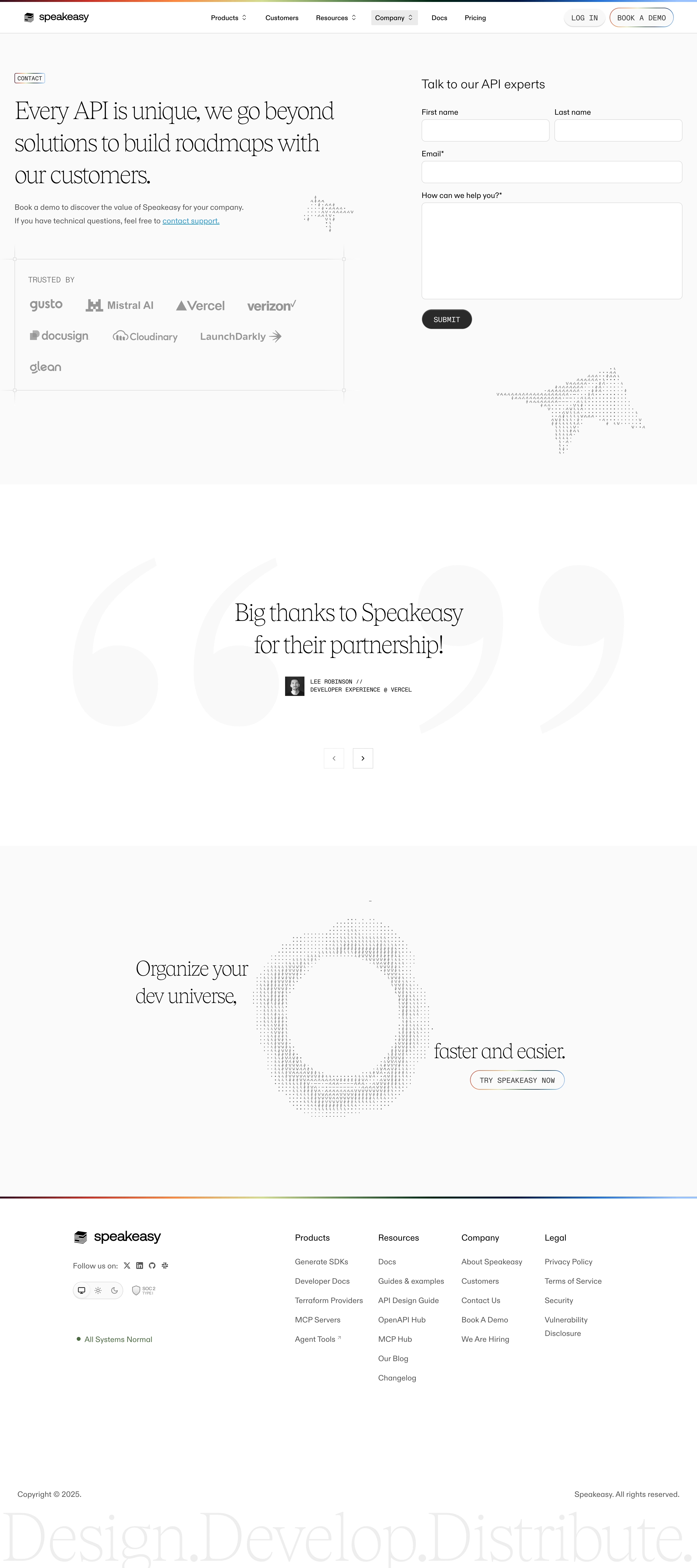
# Design from Reference: Speakeasy Contact Page
Create an original, high-fidelity visual design inspired by the reference. Prioritize composition, typography, colors, spacing, and component styling over technical implementation.
## Reference
- **Product:** Speakeasy
- **Category:** Contact Page
- **Screenshot:** https://cdn.prod.website-files.com/5e9dc792e1210c5325f7ebbc/6acad40fc910b3adf9e48d82_6acad1acb2165b6c7fffdf7f_cms-e3bd388bd077ed166b824ec8.webp
Analyze the screenshot first. If inaccessible, request it rather than guessing.
## Content
{{content.instructions}}
{{content.data}}
Preserve essential messaging and factual accuracy. Adapt structure and copy length for visual balance; never invent product claims.
## Visual Design
### Overall aesthetic
- **Style:** An editorial contact page combining delicate large serif headlines, neutral sans serif forms, monospaced labels, and ASCII-like decorative forms.
- **Character:** Refined and technical, using near-white surfaces, sparse rainbow rules, and generous whitespace.
### Page composition
- **Capture and scale:** 2880 × 6480 screenshot pixels, consistent with estimated 2× capture. Following sizes are estimated CSS pixels under that assumption.
- **Contact region:** A slim navigation header precedes a two-column layout: large statement, short support copy, and framed customer-logo group left; labeled contact form right.
- **Proof:** A large white testimonial region centers a serif quote over oversized pale quotation marks, with portrait/attribution and previous/next controls.
- **Closing:** A pale CTA region places serif text around a large ASCII-style circular motif. A thin rainbow rule introduces the footer with brand/social/theme/status left and four link groups right. Oversized pale serif wording spans the bottom.
### Information hierarchy
- **Primary task:** The form heading and four inputs provide the conversion path, while the left statement explains the relationship.
- **Evidence:** Muted customer logos and one testimonial remain secondary to the contact request.
- **Brand expression:** Serif display and sparse ASCII motifs distinguish the page without competing with form labels.
### Typography
- **Family:** High-contrast editorial serif display, neutral sans serif body, and monospace utility labels; exact families unverified.
- **Display:** Contact statement around 48–52 px CSS with generous 1.25 line-height; testimonial approximately 48 px.
- **Form/body:** Form heading about 24 px, labels/body around 16 px, compact uppercase buttons/attribution around 12–14 px monospace.
- **Footer:** Small sans serif link groups contrast with the enormous low-contrast serif bottom phrase.
### Colors & surfaces
- **Foundation:** Sampled sRGB #FFFFFF and #FAFAFA alternate across broad regions; #F9F9F9 supports faint details.
- **Ink and rules:** Sampled #000000 anchors headings; #545454 and #808080 support secondary copy. #DBDBDB and #EDEDED define fields/rules.
- **Accent:** Very thin multicolor lines edge header/footer and selected pill outlines. Blue highlights the support link; other artwork is neutral.
### Components
- **Form:** First/last name share a row, email spans full width, and a large textarea follows. White fields have thin gray borders and 7–8 px radii; Submit is a compact charcoal pill.
- **Logo proof:** A lightly ruled rectangle contains muted logos, with small square corner intersections suggesting a technical frame.
- **Testimonial:** Huge pale quotation marks sit behind centered serif copy. Small square arrow controls sit below.
- **ASCII motifs:** Sparse repeated characters form star-like shapes near the form and a large circular shape in the closing CTA.
- **Footer:** Unboxed link groups, a small segmented theme control, compliance badge, green status dot, and social icons remain compact beneath broad whitespace.
### Visual rhythm
- **Spacing:** Use around 80–100 px main-section padding and large 150 px-plus breathing regions around testimonial and closing art.
- **Form rhythm:** Keep labels close to fields and use approximately 20 px group gaps. Align both name inputs precisely.
- **Balance:** Maintain wide separation between the editorial left column and functional right form.
### Responsive
- **Observed state:** Desktop only; alternate testimonial slides are unseen.
- **Recommended reflow:** Stack introduction/form, place name fields vertically, simplify ASCII decoration, and collapse footer columns.
- **Legibility:** Scale serif statements to roughly 32–38 px CSS and keep labels readable.
### Adaptation guidance
- **Preserve:** Retain serif/sans/monospace contrast, restrained form, muted proof, ASCII artwork, and fine rainbow accents.
- **Adapt:** Use real contact requirements, customer permissions, testimonial, and status/compliance information.
- **Avoid:** Do not invent alternate quotes or support commitments from the reference.
Use this context to reproduce the reference's visual language: layout, typography, colors, spacing, borders, radii, and distinctive elements. The screenshot takes priority if descriptions conflict.
## Direction
{{preferences.fidelityInstructions}}
## Output
{{output.instructions}}
Deliver a polished, cohesive design with precise alignment, hierarchy, and spacing. Produce the requested visual artifact, not just a description. If unsupported, explain the limitation.