Design with AI
Generate a new design based on this screen using your own content.
# Design from Reference: Sellx Verification
Create an original, high-fidelity visual design inspired by the reference. Prioritize composition, typography, colors, spacing, and component styling over technical implementation.
## Reference
- **Product:** Sellx
- **Category:** Verification
- **Screenshot:** https://cdn.prod.website-files.com/5e9dc792e1210c5325f7ebbc/6acadab9d5603a17eba7e697_6acada4705865e2eb66b3e64_cms-0af41b65995418632b0a29b4.webp
Analyze the screenshot first. If inaccessible, request it rather than guessing.
## Content
{{content.instructions}}
{{content.data}}
Preserve essential messaging and factual accuracy. Adapt structure and copy length for visual balance; never invent product claims.
## Visual Design
### Overall aesthetic
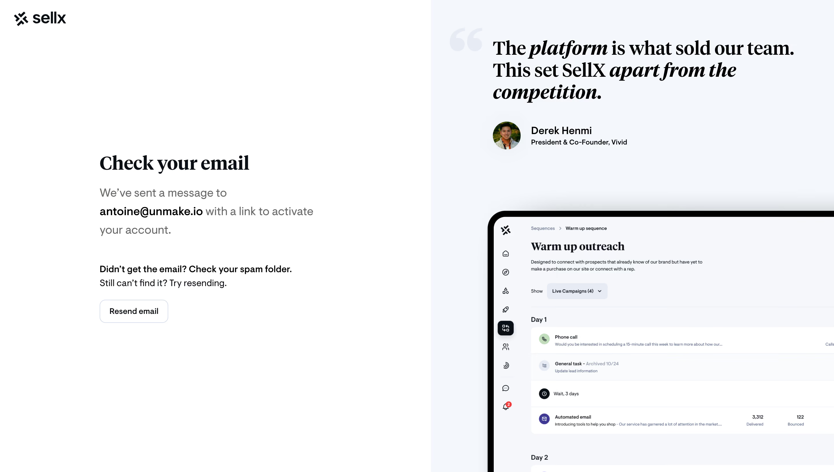
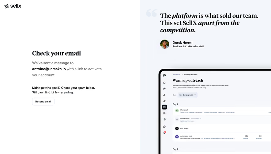
- **Style:** A split verification screen pairs a minimal white message area with a pale-blue testimonial and product-preview region.
- **Character:** Bold serif typography provides editorial emphasis, while neutral sans-serif copy keeps the authentication task clear.
### Page composition
- **Capture:** The original measures 2880 × 1630 pixels. Estimated CSS dimensions below assume an unverified 2× capture.
- **Split:** The left half is white; the right half uses a pale cool surface.
- **Brand:** A small dark wordmark sits at the top left.
- **Message:** A roughly 390-pixel-wide text group sits left of center vertically, containing heading, activation explanation, troubleshooting copy and resend control.
- **Proof region:** A large serif quotation and small portrait attribution sit at the top right. A framed application screenshot enters from below and is cropped at the right/bottom edges.
### Information hierarchy
- **Task heading:** Check your email is the strongest left-side text.
- **Activation explanation:** A bold email address is embedded in muted explanatory copy.
- **Troubleshooting:** A short bold prompt precedes regular resend guidance and an outlined button.
- **Social proof:** Large quotation text, selective italics and a small author group form a separate hierarchy.
- **Product preview:** The visible sequence interface supports the proof area without competing with the activation message.
### Typography
- **Families:** Bold editorial serif headings/quotation contrast with neutral sans-serif body/UI text; identities are unverified.
- **Task title:** Approximately 34 pixels, bold serif.
- **Body:** About 20 pixels with 32-pixel leading; the address is heavier.
- **Troubleshooting:** Around 16 pixels with 24-pixel leading.
- **Quotation:** Approximately 36 pixels, bold serif with italic phrases and tight leading.
- **Attribution:** Name around 18 pixels bold; role around 12 pixels.
### Colors & surfaces
- **Measured base:** White #FFFFFF defines the message region.
- **Proof surface:** Pale #F3F7FB and #F6F7FB appear in the right region and embedded preview.
- **Ink:** Black #000000 supplies major quotation text; other headings use a dark blue-black tone.
- **Details:** Very pale quotation marks and fine blue-gray button outlines remain understated.
- **Depth:** A broad soft shadow surrounds the heavy dark frame of the product preview.
### Components
- **Resend button:** Approximately 118 × 40 pixels, white fill, thin cool outline and roughly 10-pixel radius.
- **Quote mark:** An oversized pale opening quotation symbol sits behind/beside the large testimonial.
- **Author group:** A roughly 48-pixel circular portrait aligns beside two text lines.
- **Product frame:** Thick dark rounded outer border encloses a pale sequence interface with sidebar, heading and stacked task rows.
- **Message grouping:** No enclosing card or input is visible in the left region.
### Visual rhythm
- **Whitespace:** Large blank areas surround the short verification message.
- **Alignment:** Left-side text shares one inset; quotation and author align within the right region.
- **Contrast:** Dense framed product imagery below balances the open upper message area.
### Responsive
- **Evidence:** Only desktop is observed; resend feedback and mobile behavior are unverified.
- **Recommended priority:** Place verification copy first and move testimonial/product imagery below on narrow screens.
- **Text handling:** Allow the address to wrap safely without horizontal overflow.
- **Accessibility:** Provide visible focus and clear feedback when resend is activated.
### Adaptation guidance
- **Preserve:** Keep the serif/sans-serif contrast, pale proof panel and focused verification message.
- **Content:** Use the actual recipient address rather than copying the screenshot's personal data.
- **Artwork:** Preserve the intentional crop of the product frame without inventing unseen interface details.
- **Behavior:** Activation, resend and account state are not demonstrated beyond this captured confirmation screen.
Use this context to reproduce the reference's visual language: layout, typography, colors, spacing, borders, radii, and distinctive elements. The screenshot takes priority if descriptions conflict.
## Direction
{{preferences.fidelityInstructions}}
## Output
{{output.instructions}}
Deliver a polished, cohesive design with precise alignment, hierarchy, and spacing. Produce the requested visual artifact, not just a description. If unsupported, explain the limitation.