
Thank you! Your submission has been received!
Oops! Something went wrong while submitting the form.
Get SaaSFrame Pro
Monthly
$18
Quarterly
$48
Yearly
$180
Upgrade to access this feature
Browse all screens & flows
Filter and search screens & flows
Access Figma files
Access mobile versions
Bookmark screens & flows
Join now
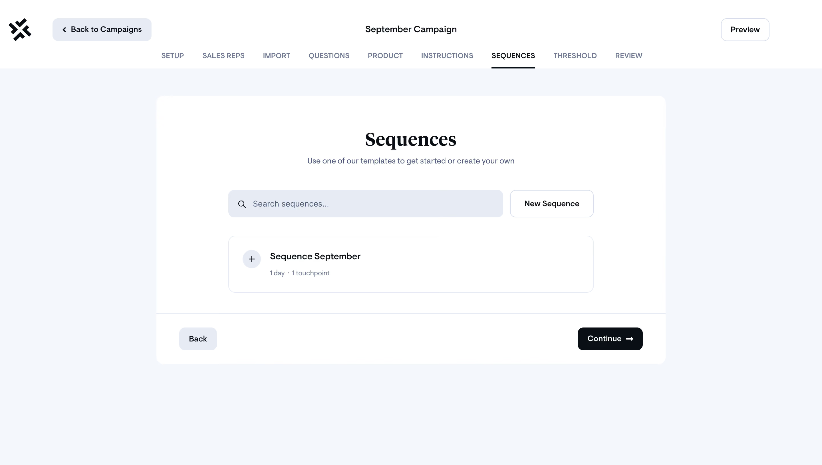
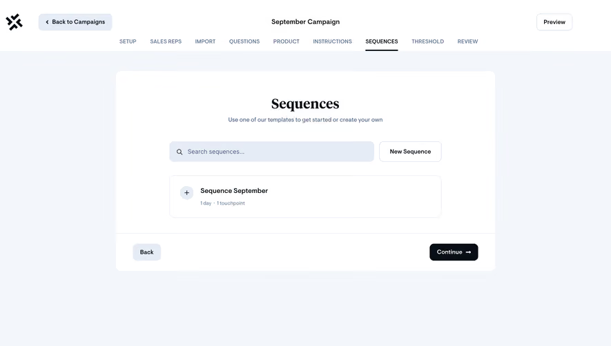
Sellx Campaign Setup

Sellx
Sales engagement platform
Designed by
No items found.

Bookmark
Bookmark

Design with AI
Thank you! Your submission has been received!
Oops! Something went wrong while submitting the form.
# Design from Reference: Sellx Campaign Setup
Create an original, high-fidelity visual design inspired by the reference. Prioritize composition, typography, colors, spacing, and component styling over technical implementation.
## Reference
- **Product:** Sellx
- **Category:** Add & Edit
- **Screenshot:** https://cdn.prod.website-files.com/5e9dc792e1210c5325f7ebbc/6acadab2d5603a17eba7e5a0_6acada3ffbf1299940ab9eec_cms-bdd96b1743939fecc6a012be.webp
Analyze the screenshot first. If inaccessible, request it rather than guessing.
## Content
{{content.instructions}}
{{content.data}}
Preserve essential messaging and factual accuracy. Adapt structure and copy length for visual balance; never invent product claims.
## Visual Design
### Overall aesthetic
- **Character:** A spacious campaign-setup interface pairs a pale blue-gray workspace with a clean white panel and minimal dark controls.
- **Distinctive contrast:** A large serif section title contrasts with small, practical sans-serif navigation and form elements.
### Page composition
- **Capture scale:** The source is 2880 × 1630 pixels. An estimated 2× capture would correspond to 1440 × 815 CSS pixels; this ratio is unverified. Sizes below are estimated CSS values.
- **Global header:** A white band contains the symbol and back-to-campaigns control left, campaign name centered, and outlined Preview control right.
- **Stage navigation:** Nine uppercase steps form a centered horizontal row below the header controls; the selected Sequences step has a dark underline.
- **Workspace:** A centered white panel is approximately 890 pixels wide and 470 pixels high, with generous surrounding pale canvas.
- **Panel structure:** Centered title and helper copy sit above a search/action row and one sequence card. A ruled footer places Back left and Continue right.
### Information hierarchy
- **Page context:** Campaign name and stage navigation establish the broader workflow before the panel content.
- **Panel heading:** The serif Sequences title is the dominant text; a short muted instruction sits immediately beneath.
- **Action hierarchy:** Search occupies most of the control row; New Sequence is a smaller outlined companion. Continue is the strongest filled control.
- **Record detail:** A sequence name leads its card, with a small duration-and-touchpoint line beneath.
### Typography
- **Title:** The serif heading is approximately 36 CSS pixels, bold, with tight line height. Its font identity is unverified.
- **Interface family:** Navigation, buttons, labels and body copy use a rounded-looking sans serif; the exact family is unverified.
- **UI roles:** Campaign name and sequence name are about 16 pixels, medium or semibold; helper and search text about 14 pixels; metadata and uppercase stages around 12 pixels.
- **Color hierarchy:** Dark text marks active labels and actions; muted blue-gray text reduces the priority of instructions and metadata.
### Colors & surfaces
- **Measured canvas:** Image samples include #F3F7FB for the workspace and #FFFFFF for the header and panel.
- **Control fill:** Pale blue-gray #E6ECF5 distinguishes the search field, back controls and circular plus background.
- **Text and emphasis:** Near-black #080F16 supplies strong ink and the Continue button; sampled secondary tones include #6D7B92 and #495C78.
- **Borders:** Fine cool-gray outlines define secondary buttons, the sequence card and panel-footer divider; there is no prominent panel shadow.
### Components
- **Main panel:** Approximately 12-pixel corner radius, with a broad inset content column about 640 pixels wide.
- **Search row:** Search is about 480 × 48 pixels with a leading magnifier and rounded corners; New Sequence is about 145 × 48 pixels with a thin border.
- **Sequence card:** Approximately 640 × 100 pixels, subtly outlined with roughly 12-pixel radius. A 32-pixel pale circle holds a plus, beside two text lines.
- **Footer actions:** Back is a small pale rounded rectangle. Continue is a roughly 114 × 40-pixel dark button with white text and a right arrow.
- **Navigation state:** A narrow dark rule below Sequences signals selection. Hover, focus and disabled states are not shown.
### Visual rhythm
- **Horizontal rhythm:** The panel is centered on the viewport, and its heading, search row and card share a balanced central axis.
- **Vertical rhythm:** Around 40–50 pixels separate title area from controls; the card follows the search row after roughly 30 pixels.
- **Footer separation:** A full-width thin divider separates selection content from navigation actions, with approximately 24-pixel footer padding.
### Responsive
- **Evidence:** A single wide desktop view is observed; no responsive behavior is established.
- **Recommended panel:** Make the white panel fluid below its desktop maximum, retaining 20–24-pixel mobile insets.
- **Recommended controls:** Stack search and creation controls when needed; permit stage navigation to scroll horizontally with a visible selected indicator.
- **Recommended actions:** Keep Back and Continue reachable and separated, with comfortable touch targets and visible keyboard focus.
### Adaptation guidance
- **Preserve:** Retain the serif/sans-serif contrast, cool canvas, central white panel and clearly selected stage.
- **Structure:** Build separate header, stage navigation, selection panel and footer-action regions; preserve the sequence card's name/metadata hierarchy.
- **Sizing:** Validate the assumed 2× capture before using the estimated CSS sizes. Use flexible widths for the search and card.
- **Interaction:** Treat the plus, creation button and navigation controls as distinct actions; define accessible focus and selected states rather than inferring unseen behavior.
Use this context to reproduce the reference's visual language: layout, typography, colors, spacing, borders, radii, and distinctive elements. The screenshot takes priority if descriptions conflict.
## Direction
{{preferences.fidelityInstructions}}
## Output
{{output.instructions}}
Deliver a polished, cohesive design with precise alignment, hierarchy, and spacing. Produce the requested visual artifact, not just a description. If unsupported, explain the limitation.


Category


Added on
September 8, 2023


Similar screens
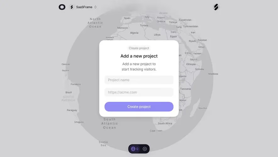



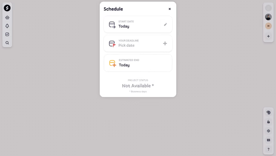

Upgrade to SaaSFrame Pro now to see similar examples.
Monthly
$18 /month
Billed $18 monthly
Browse all screens & flows
Filter and search screens & flows
Search text in screenshots
Access Figma files
Access mobile versions
Join now
Quarterly
$16 /month
Billed $48 quarterly
Browse all screens & flows
Filter and search screens & flows
Search text in screenshots
Access Figma files
Access mobile versions
Join now
Yearly
$15 /month
Billed $180 yearly
Browse all screens & flows
Filter and search screens & flows
Search text in screenshots
Access Figma files
Access mobile versions
Join now