Design with AI
Generate a new design based on this screen using your own content.
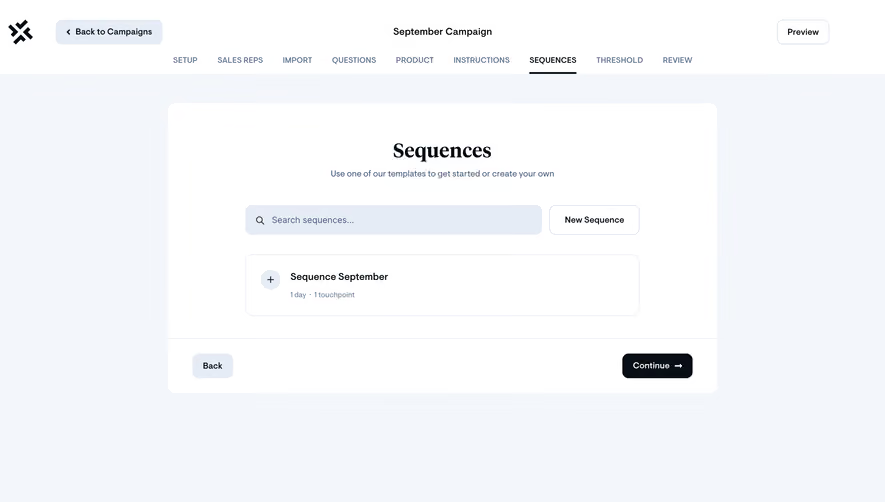
# Design from Reference: Sellx Campaign Setup
Create an original, high-fidelity visual design inspired by the reference. Prioritize composition, typography, colors, spacing, and component styling over technical implementation.
## Reference
- **Product:** Sellx
- **Category:** Add & Edit
- **Screenshot:** https://cdn.prod.website-files.com/5e9dc792e1210c5325f7ebbc/6acadab9d5603a17eba7e69e_6acada475f2661b16657f883_cms-d283d1ef227c5606656e72f8.webp
Analyze the screenshot first. If inaccessible, request it rather than guessing.
## Content
{{content.instructions}}
{{content.data}}
Preserve essential messaging and factual accuracy. Adapt structure and copy length for visual balance; never invent product claims.
## Visual Design
### Overall aesthetic
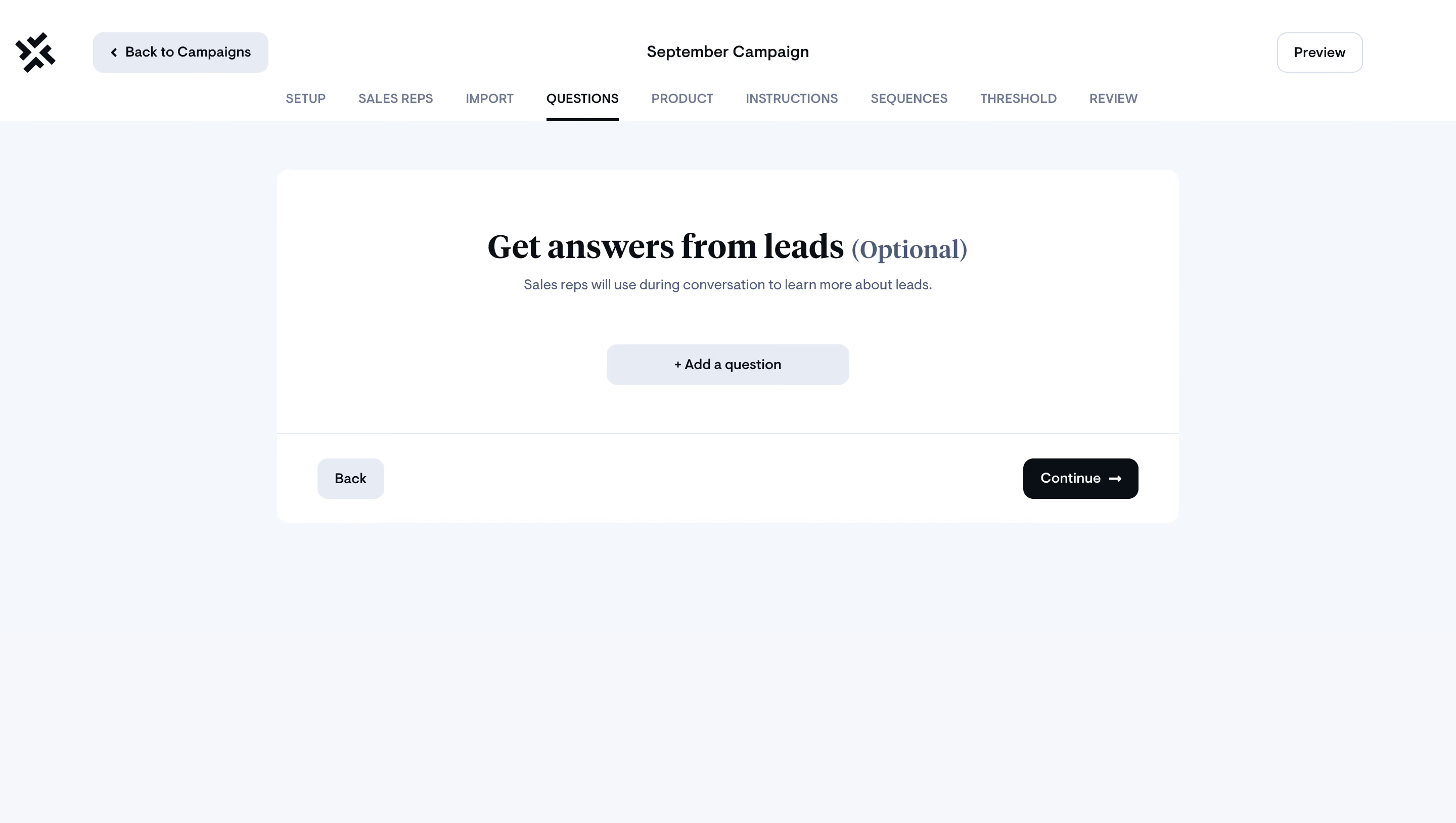
- **Style:** Minimal campaign wizard with cool pale canvas, white card, and editorial serif heading.
### Page composition
- **Canvas:** 2880 × 1630 image px; CSS estimates assume unverified 2×.
- **Header:** Back to Campaigns, campaign name, Preview, and nine-step navigation.
- **Main:** Large centered white panel with optional-questions prompt and Add a question.
- **Footer:** Back and dark Continue inside panel.
### Information hierarchy
- **Primary:** Get answers from leads heading with Optional qualifier.
- **Action:** Add a question.
- **Progress:** Questions tab underlined.
- **Next:** Dark Continue at lower-right.
### Typography
- **Family:** Serif display heading paired with sans-serif UI; exact families unverified.
- **Heading:** Approximately 36px CSS.
- **Subtitle/controls:** Approximately 14px.
- **Tabs:** Approximately 12px uppercase.
- **Precision:** Estimated under 2×.
### Colors & surfaces
- **Canvas:** #F3F7FB and #F6F7FB.
- **Panel:** #FFFFFF.
- **Secondary buttons:** #E6ECF5.
- **Primary dark:** #080F16.
- **Muted text:** #6D7B92.
- **Precision:** Flat samples.
### Components
- **Panel:** Approximately 12px radius.
- **Add:** Broad pale rounded button with plus.
- **Continue:** Dark rounded rectangle with arrow.
- **Tabs:** Compact horizontal sequence.
- **Footer separator:** Thin pale rule.
### Visual rhythm
- **Whitespace:** Large empty center reinforces optional setup.
- **Alignment:** Centered prompt/add control; footer actions at opposite ends.
### Responsive
- **Observed:** Desktop only.
- **Recommendation:** Scroll/wrap step navigation, make panel fluid, preserve optional qualifier.
### Adaptation guidance
- **Preserve:** Optional-input clarity and simple progression.
- **Content:** Use supplied lead questions.
- **Behavior:** Adding questions and moving steps unverified.
Use this context to reproduce the reference's visual language: layout, typography, colors, spacing, borders, radii, and distinctive elements. The screenshot takes priority if descriptions conflict.
## Direction
{{preferences.fidelityInstructions}}
## Output
{{output.instructions}}
Deliver a polished, cohesive design with precise alignment, hierarchy, and spacing. Produce the requested visual artifact, not just a description. If unsupported, explain the limitation.